Clarkson Black
Your work focuses on the female form – what initially drew you to this subject, and how has your perception of it evolved over time?
The female form has always held a hypnotic fascination for me. Originally I was captivated by its aesthetic complexity as captured in some of my earlier work. Focused very much on the elegant beauty and wonder of the female form, my work celebrated the visual impact on the viewer, something to be looked at and admired, like many of the classic pieces.
However, my perception has evolved over time, to combine this more classical ‘male gaze’ form of expression, with the two way narrative power of the female form. I find my later works portraying the female form through this more contemporary lens, as a thinking, feeling being, with a rich inner landscape to explore, rather than a simple passive spectacle.
I love to engage with the muses I draw where I can and learn more about them as individuals – their experiences, their memories, their hopes and dreams. I find this enables me to bring a much richer feeling and emotion to each pencil stroke, and allow my art to become a living breathing expression of an individual, capturing their story.
In some of my more recent work for example, the female subjects are looking back directly at the viewer, claiming space as their own and asserting their presence as a declaration rather than just an ornament.
You emphasize the relationship between the body and fabric. What fascinates you most about this interaction?
If I could sum up this fascination, it lies in the tension between the hidden and the revealed. The interaction between skin and fabric creating a sensory map of the body, without needing to show everything, never static but always in dialogue with one another.
Three elements fascinate me most. Firstly, sculpting through motion. Unlike a rigid stone statue, the female form breathes and moves. Fabric acts as a second skin that reveals the architecture of the body one moment, and completely masks it the next. I love how a heavy curtain can impose a new shape, while a gentle silk surrenders to the curves and detail beneath.
Secondly, the language of the fabric. I find there is a psychological depth to how fabric falls over a body. Tight, structured fabrics like a bikini or lingerie signal protection or power, while loose, fluid fabric, like a draping cotton sheet or an evening dress suggest vulnerability or grace. The way a fabric pools at the hips or clings to the small of the back tells a story of the person’s presence in that space.
Thirdly, tactile intimacy. There is something deeply personal about the way fabric interacts with skin. The contrast between the softness of the body and the texture of the material—whether it’s the rigidity of rope or the sensuality of lace – creates a sensory experience that defines how a woman feels in her own silhouette in that moment.
Essentially, I see fabric not just as a covering, but as a medium for expression that allows the body to be both a canvas and the artist simultaneously. It is a dialogue of shadow and light played out in the fold of a waist or the sweep of a hip.
For example in my piece ‘Draped in Memories’, Jasz has her face slightly tilted, gazing into the distance, with her hands clutched to her chest, as if searching to recall memories she holds dear. The contrast of the creases and folds, and the detailed patterns in the cloth as it drapes and flows across the curves of her naked body, then build on this and conjure a picture of vulnerable memories, experiences which make her complete.
‘A silhouette in morning light,
Draped in folds of quiet white.
No silk, unclothed, yet covered skin,
Drawing her back to where memories begin.
A breath of laughter, long ago,
A tear that fell as soft as snow.
She wraps the memories in the sheet,
And makes this moment silently complete.’
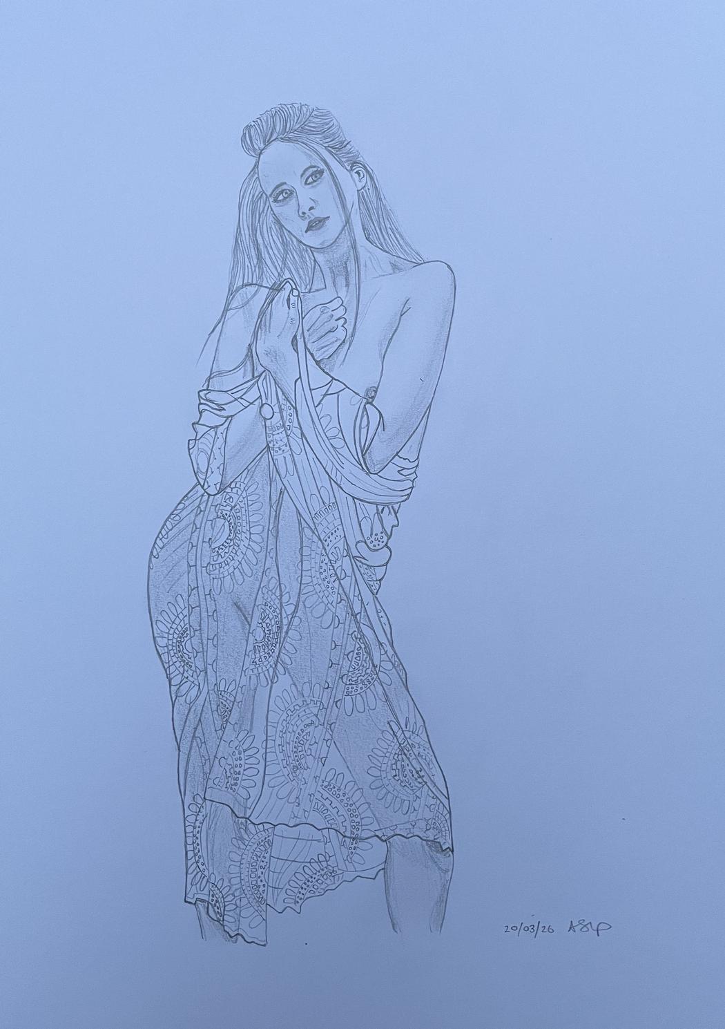 Clarkson Black | Draped in Memories | 2026
Your drawings often combine realism with selective color accents. How do you decide where and when to introduce color?
My first drawings were mostly graphite pencil drawings, however after a while I wanted to see how introducing a single colour accent would shift the focus of the drawing and highlight a specific feature. By stripping away use of a full palette, a single colour emphasises the raw structural and emotional elements of the female form, creating a sense of importance or clarity. It is very much now a deliberate choice for my work, to guide the viewer’s experience.
I did try more than one colour, but I found that a single colour allowed me to concentrate on the play of light and shadow within that colour. Without the distraction of multiple colours, the viewer’s eye is led by the composition, lines, and textures of the body or fabric. It becomes the emotional heartbeat of the drawing.
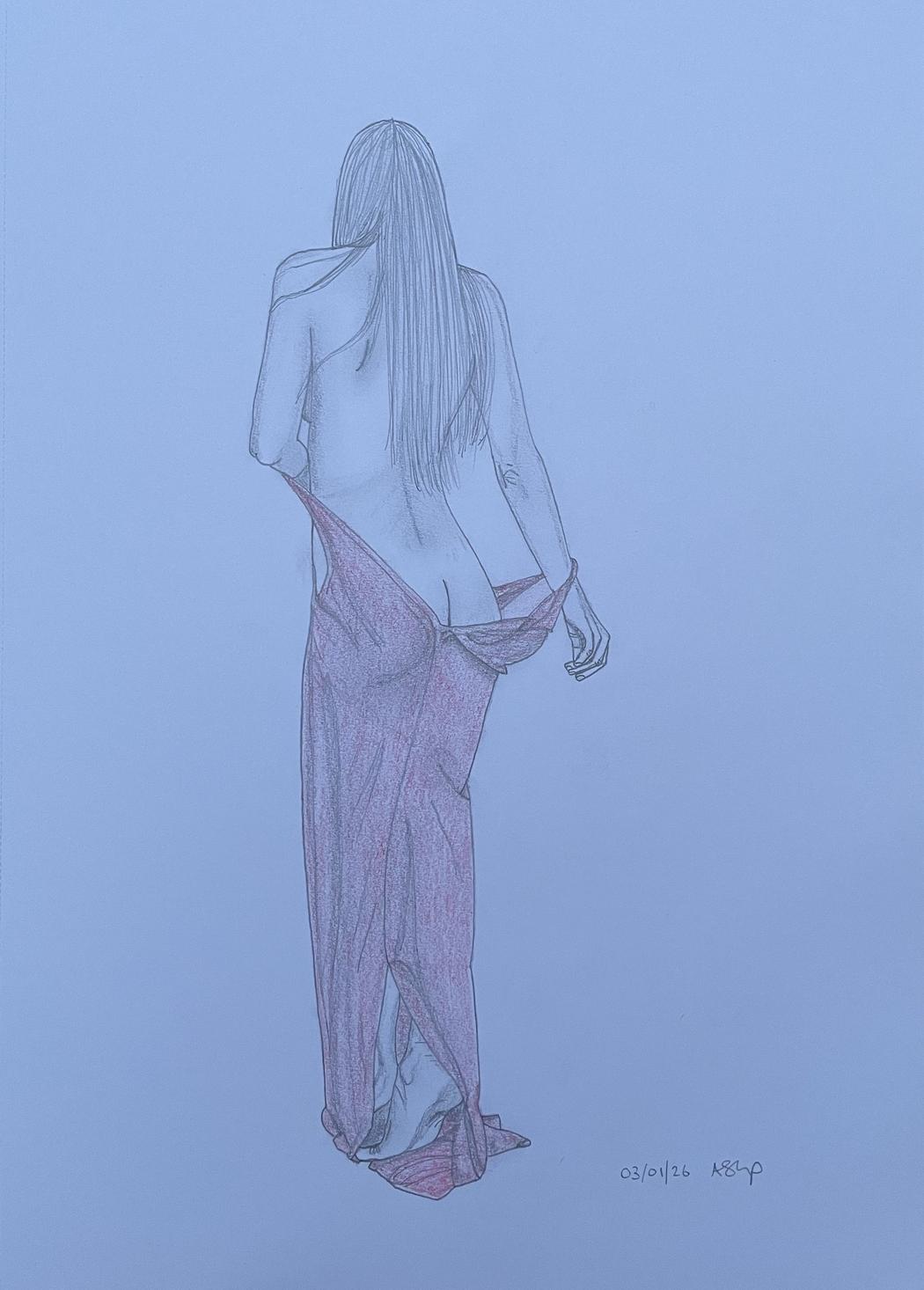
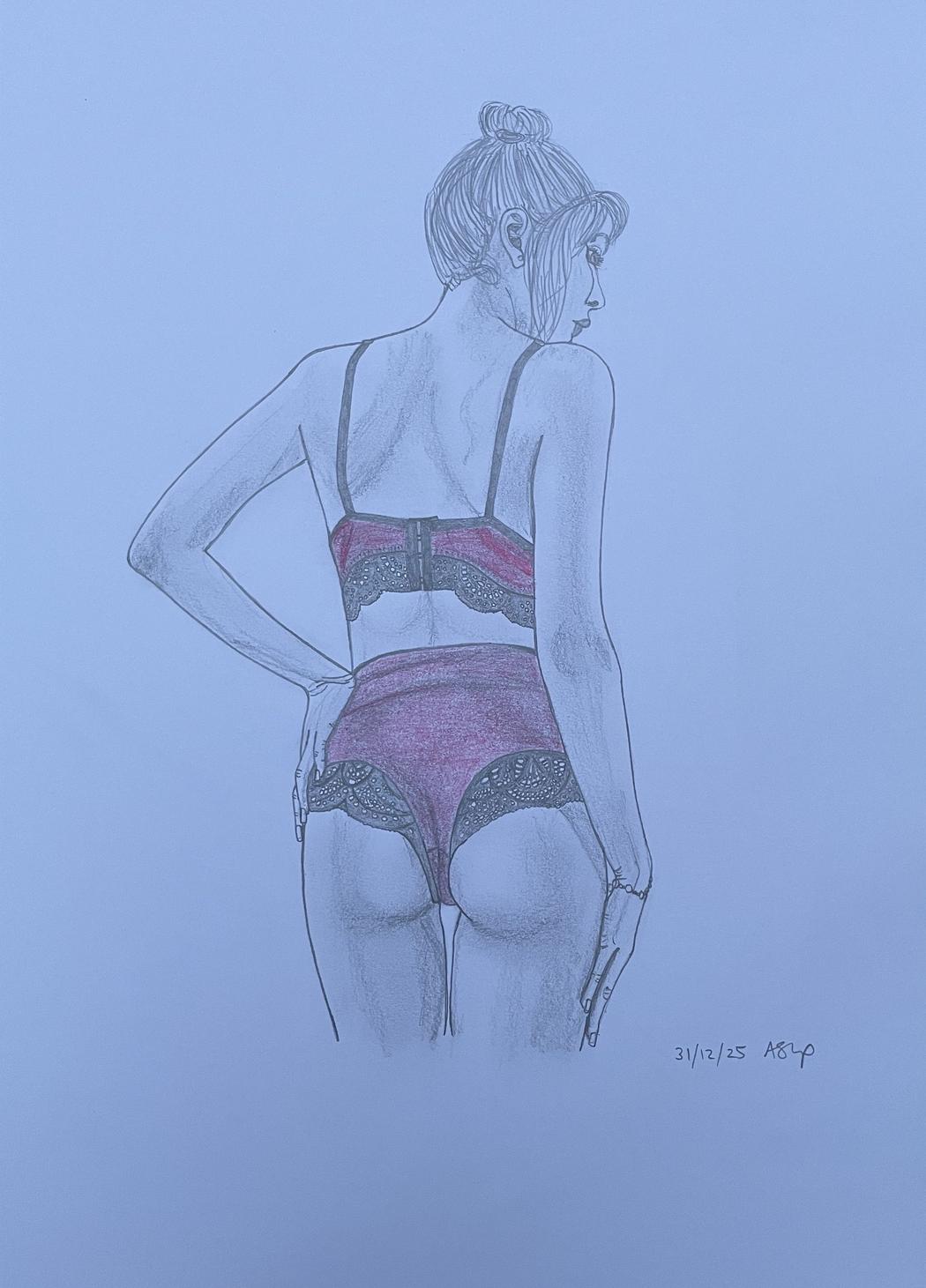
So for me, the introduction of a single colour can act like a mood anchor. For example the red I introduce to Elizabeth’s evening dress in ‘Falling Grace’ signifies passion and danger as she lets her dress fall from her body. It creates a lyrical symphony, an intimate moment filled with potential energy, where time slows and the viewer is invited to narrate the next chapter of the story.
 Clarkson Black | Dreamlover | 2026
As a self-taught artist, how did you develop your technical skills in draftsmanship?
I think I’d best describe my artistic style as realism based. That style emerges from some limited graduate training in technical draftsmanship, which I have been able to hone and sharpen into the self taught artistic style you see in my work today.
The precision required for pencil drawings of the female form has been very much trial and error, a continuing learning journey of mastering anatomical landmarks of the female form, a keen observation of my muse and pencil mileage on the page.
Using high-contrast photographic references to see how light breaks across the skin and where fabric creates tension points, is a nod to my engineering background.
 Clarkson Black | Falling Grace | 2026
Your works capture both vulnerability and strength. How do you approach balancing these emotional states in your figures?
In my works, I find balancing vulnerability and strength is a little like a technical dance between the architecture of the body and the use of light, shade and accent colour.
Strength often comes from the internal structure of the body. Even in a quiet or seated position, showing the tension in a shoulder blade or the firm planting of a foot suggests a body capable of action. Vulnerability, conversely, I find in the exposure of soft points—the curve of the neck, the underside of the wrist, or a slight slump in the spine that suggests a moment of submission.
Fabric is the ultimate tool for this balance though. A body might be standing in a powerful, defiant stance but the way thin fabric clings to the skin or breaks across the ribs reveals the fragile vulnerable reality of the human frame. The cloth or material acts as both a shield and a storyteller.
By keeping the drawing minimalist without too much background the viewer is forced to sit with these contradictions. There is no background noise—just the raw honesty of the female form.
This contrasting vulnerability and strength can be seen in my drawing ‘Freedom’. When Rosie asked me to draw one of her Shibari (rope) photos, I didn’t fully appreciate the contrast of the intricate calculated discipline of the cord, with the delicate organic fluidity of her body. It was a joy to capture the detail in the cord and do justice to the intimacy of geometry, where her body is cherished through the discipline of the line. Even though bound, the drawing speaks to me of freedom, freedom of expression, freedom to explore, freedom to be.
’Sturdy strands in a careful line,
Where strength and softness intertwine.
Patterns woven with steady grace,
Finding peace in a quiet space.
No silk to shield, no cloth to hide,
Just skin and cord, with nowhere to slide.
Each intricate knot a point of rest,
A rhythmic weight against her chest.
The cord is the mountain, majestic and still,
Her skin the river, bending at will.
In this marriage of textures, the story is spun:
Where roughness and softness finally become one.’
 Clarkson Black | Glamour Nights | 2026
Many of your compositions feel intimate and quiet. What kind of atmosphere or emotional response do you hope to evoke in the viewer?
My goal is to create a space for stillness and introspection and I hope my work achieves that. By using a single pencil and a limited colour palette, I hope the noise of the world is stripped away, leaving only the viewer and the subject in a shared, private moment.
By keeping the compositions minimalist and leaving much of the paper white, I think the drawings feel light. I hope this breathability encourages the viewer to slow down and become lost in the moment. The silence of the paper reflects the silence of the pose, evoking a sense of peace or melancholy in a fast paced world.
I want the viewer to feel like they’ve stumbled upon a quiet, unobserved second, a moment caught in time – someone adjusting their clothes, lost in thought, or simply breathing. I hope this creates a sense of empathy rather than voyeurism; you aren’t just looking at a body, you are witnessing a person’s internal state, sharing an intimate moment.
In my drawing ‘Unbridled Happiness’ my focus was capturing the intricacy of Alexia’s sumptuous lingerie – the delicate lace detail, the mesh shaping, the warm orange colour, all capture a sense of quiet intimate happiness.
‘A vision in orange, soft as a sigh,
Lace like a whisper, catching the eye.
With every movement, a delicate tease,
Floating like petals on a warm spring breeze.
Mesh and satin, light and fine,
In a delicate, shimmering, pink design.
She moves with a grace so quiet and deep,
A promise of secrets the night will keep.’
Ultimately, I want the viewer to leave celebrating a small moment in life, feeling energised, having just shared a deep, wordless conversation with the figure on the page.
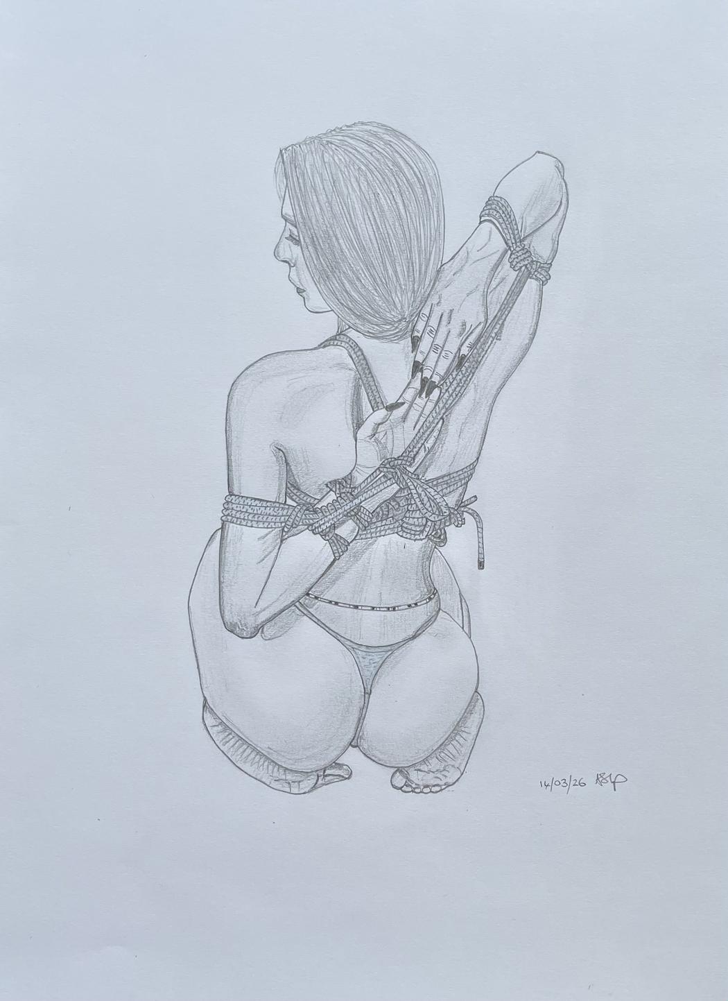 Clarkson Black | Freedom | 2026
How important is observation from life versus working from references in your process?
For the majority of drawings, I take my general observations from life and combine that with the practical necessity of reference photos to achieve my unique blend of fabric and body.
I was privileged to be invited to photograph one of my muses recently before using one of the photographs as a reference to draw. This allowed me to soak in the energy of the individual. The subtle tremors, confidence, breathing and shifts in body weight that allowed the fabric to float across her body. These tiny, organic movements allowed me to experience and learn the honesty of the interaction of her body with the fabric.
High-resolution references aid the micro-detailing of a single colour accent or the specific grain of the pencil. A photograph allows me to zoom in on the complex tension points where skin meets cloth, ensuring my work maximises the realism while embracing my creative flare.
Ultimately, life gives the drawing its spirit, while references provides the precision needed for that quiet confident finished piece.
Leave a Reply
You must be logged in to post a comment.