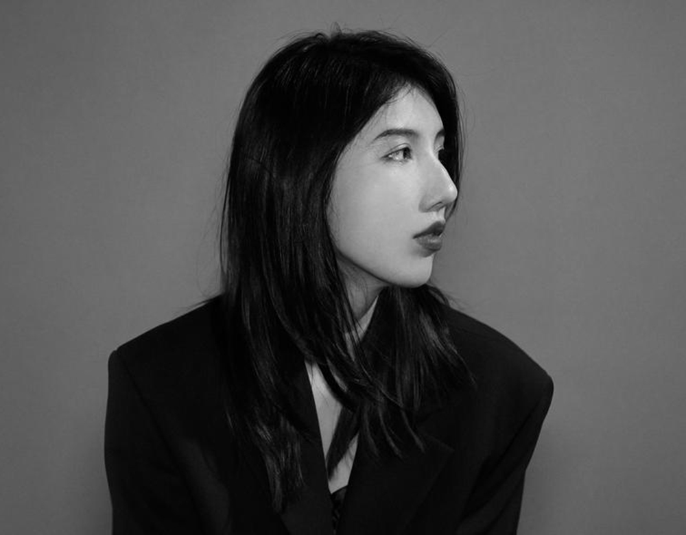
Aiqi Zhang
Your practice spans brand identity, typography, motion, and spatial design. What first drew you to working across disciplines, and what connects these different areas in your practice?
I think it started with curiosity. I’ve always been drawn to different areas of design, and I never really wanted to limit myself to just one. I enjoyed exploring what each discipline had to offer, and over time, working across them became a natural part of my practice.
Working in advertising has also shaped the way I think about this. I’ve come to appreciate that the choice of medium can be a creative idea in itself. I don’t necessarily begin a project knowing what form it should take. Through research and exploration, I try to understand what the idea needs and how it might best come to life.
What connects these areas is how they continue to inform one another. The attention to form, structure, and composition that comes from my graphic design background influences how I approach motion and physical space, while working in those disciplines has also changed the way I think about graphic design. I find that moving between disciplines often leads me to possibilities I wouldn’t have discovered by staying within just one.
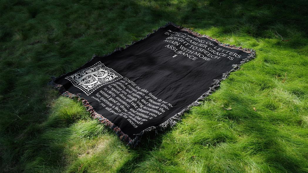 Aiqi Zhang | Credence Display | 2022
You explore how form, space, and narrative shape one another. Could you walk us through a project in which changing the form or spatial arrangement fundamentally changed the story being told?
One project that comes to mind is Firstborn, a restaurant identity I created for a contemporary Chinese American restaurant in LA Chinatown. The concept grew from a shared memory of the fish tanks commonly found in Hong Kong restaurants, which often sit near the entrance and become part of the experience of arriving. I translated this familiar image into a goldfish symbol that became central to the restaurant’s visual identity.
What changed the story was bringing that symbol into the physical environment. Rather than recreating a fish tank, I wanted to reinterpret its presence in a more abstract way. By placing the goldfish on the restaurant’s exterior signage, it became something people could encounter before even stepping inside, much like the fish tanks that originally inspired it. The form was different, but the connection to that familiar experience remained.
Over time, I began seeing people stop to photograph the signage. That was a meaningful moment for me because a symbol rooted in a shared cultural memory had begun to find its own place in another neighborhood. What started as a reference to one environment gradually became part of the everyday visual landscape of another.
I think that’s what interests me about spatial design. Once a piece of work enters the world, its meaning is no longer shaped by the designer alone. The environment and the people who encounter it begin to add their own layers to the story.
When translating an abstract concept into a visual system, what do you establish first? How do you assess whether the original idea remains clear as the system develops?
I usually start by understanding the idea behind the brand before thinking about individual visual elements. I’m interested in approaching identity design as a whole rather than building everything around a logo. Through research and exploration, I try to find a central idea that can become the foundation of a visual language.
I particularly enjoy developing systems that allow for variation. Once that central idea is established, I begin exploring how it might translate into typography, imagery, composition, or other applications. I think a strong identity should have enough flexibility to respond to different contexts without requiring everything to look exactly the same.
As the system grows, I often return to the original concept and ask whether each new expression still feels connected to it. I’m less concerned with repeating the same visual elements than with maintaining a consistent way of thinking. Sometimes exploring a new application can even reveal another side of the idea, and I think that’s what makes a visual system interesting to develop over time.
How does your approach change when a design moves from a page or screen into a physical environment? What new possibilities emerge when viewers can move around or through the work?
I’ve always enjoyed exploring how typography behaves at different scales. The same letterforms can take on entirely new qualities simply through changes in size, material, or presentation.
I think the approach really depends on the context of each project. Sometimes, the scale comes from a historical reference, like creating a miniature type specimen inspired by La Perle, an 18th-century French publication measuring just 6 × 7 cm, as a way of reflecting the historical influences behind my typeface. Other times, it’s shaped by the exhibition and its curatorial direction, leading me to translate typography into a human-scale woven blanket that brings out the ornamental qualities of the letterforms. In other cases, the goal might be to encourage participation within a space, turning typography into an installation that visitors can actually walk through.
What excites me is how these decisions change the way people engage with the work. The miniature specimen invites people to hold it close and examine the letterforms, while recalling the extraordinary precision that historical metal type printing could achieve at such a small scale. At a larger scale, intricate forms become more visible, while spatial installations allow people to discover typography through movement and shifting perspectives. I love how it can move from something intimate to something immersive, opening up possibilities beyond reading alone.
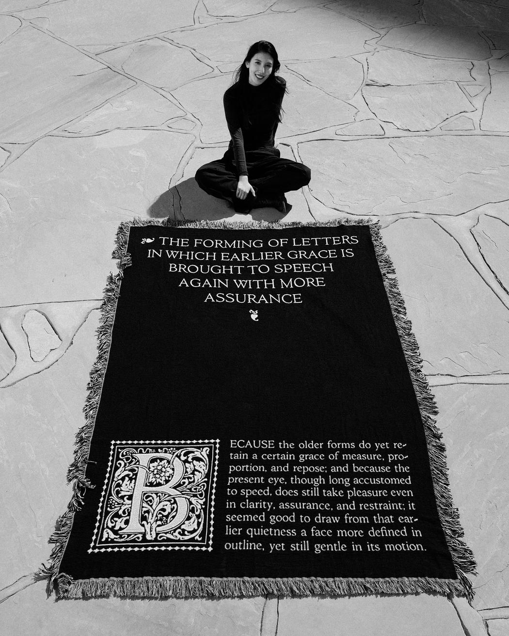 Aiqi Zhang | Credence Display | 2026
You contributed as a designer to Apple’s Fuzzy Feelings. What was your specific role, and what did the experience teach you about creating an emotional narrative through design?
As one of two designers on the project at TBWA\Media Arts Lab, I worked on the bespoke Fuzzy Alphabets for Apple’s holiday film Fuzzy Feelings. My involvement ranged from initial letterform sketches and tracing to typographic refinement, felt-letter production, the photoshoot, and final execution. Working closely with the creative team, I helped bring both the serif and sans serif alphabets into their final tactile forms.
The letterforms drew inspiration from Apple’s established typefaces, reinterpreted with an intentionally imperfect, whimsical character. Each letter was handcrafted from real felt, so its texture and small irregularities became part of its personality. Those qualities helped connect the typography to the handmade world of the film.
What stayed with me was how much emotional meaning a small design decision can carry. The softness of a material or the slight unevenness of an edge can make a letter feel warm and human. The experience taught me to think about typography as part of the storytelling itself: the way words are made and presented can help people feel the story, even before they read them.
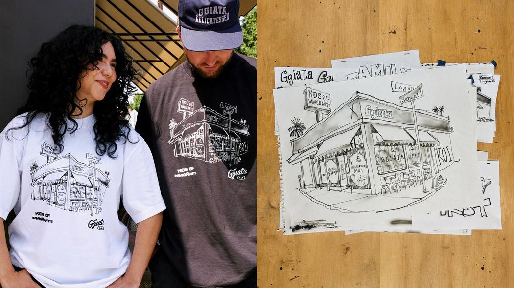 Aiqi Zhang | Ggiatax Koi | 2026
In multidisciplinary collaborations, how do you communicate your ideas to people working in different creative fields? Can you recall a moment when a collaborator’s perspective changed your approach?
The same idea can mean different things to people working in different creative fields. I try to bridge those perspectives by finding a common starting point in the strategy and the story we want to tell, using storytelling and visual references to make ideas more tangible. Often, the most interesting part is seeing how someone else’s interpretation can shift my own thinking.
One example is Public Displays of Encouragement, a campaign for Apple TV+’s Ted Lasso that I worked on at TBWA\Media Arts Lab. The campaign featured personalized messages of encouragement for U.S. national soccer players, displayed on billboards in their hometowns. Working with the creative team, I explored how typography and copywriting could come together to capture Ted Lasso’s personality. The handwriting needed to feel casual, imperfect, and personal, as though Ted himself had written each message. The collaboration encouraged me to think about typography not simply as a way to present words, but as an extension of the voice behind them. Even small decisions about scale, spacing, and irregularity could change how the message was perceived.
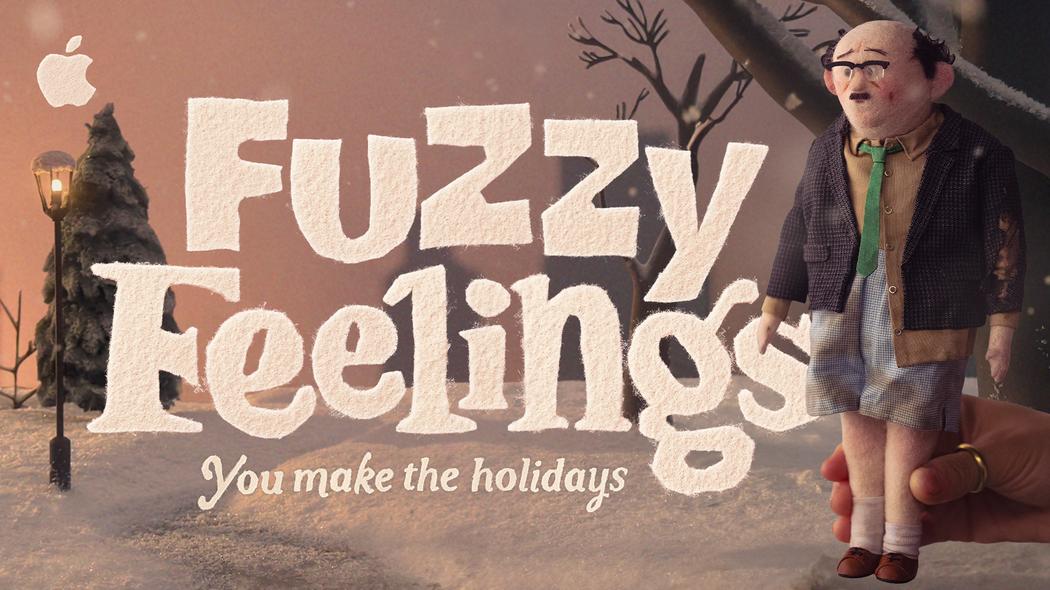 Aiqi Zhang | Fuzzy Feelings | 2023
You are interested in graphic design as a broader cultural and spatial experience. What would you like people to feel, notice, or do when they encounter your work in a shared physical space?
I hope my work creates a sense of connection between people and the places around them. Sometimes, it’s a familiar gesture, a symbol that carries a shared memory, or an unexpected use of color or material. These quiet moments of recognition and discovery might invite someone to pause and gradually become part of how they remember a place. Over time, I’d like the work to become part of everyday life, growing alongside the city and gathering meaning through people’s experiences.
That is something I’m drawn to in land art: the way a work can coexist with its surroundings and be shaped by time and natural conditions. I hope my work can have a similar openness, leaving room for people to find their own meanings in it as its relationship with the place evolves.