JB Burke
Your drawings transform familiar objects into scenes that feel both recognizable and strange. What first draws you to a subject, and how do you know it can sustain a drawing?
I am very drawn to anatomical objects because they symbolize humanity without being easy to dismiss as a specific person. I am drawn to objects that explore the fragility of life and memento mori. What catches my eye initially isn’t just their color, texture or physical form, but the invisible cultural baggage they carry. I look for subjects that feel comforting or familiar on the surface, but hold a subtle psychological friction underneath. Because my drawing process in colored pencil and digital media is so slow and labor-intensive, an object has to do more than just look interesting, it has to be capable of world-building, acting as an anchor that can carry themes of consumption, myth, and identity. If an object allows me to explore that delicate space between intimacy and isolation, then it can hold my own curiosity across dozens of hours of meticulous layering.
How do you build your compositions? Do you arrange objects in front of you, work from photographs, invent elements, or move between these approaches?
My composition process is primarily direct reference where I gather/source or build physical objects and arrange them in the studio (anatomical models, consumer artifacts, or natural specimens). My lighting is pretty basic just to create a value pattern and highlight surface textures. I usually use a single light stand with a daylight bulb so I get a strong range of value and then I apply color theory principles to transform the value map into the color scheme of my choice. I don’t usually work from photo references unless my set up includes things that can rot/deteriorate or if the objects are really fragile and a tiny bump to the table could send them tumbling. Once I am drawing, the process is more intuitive and I allow for decisions to be made that respond to the moment. This allows me to anchor the image in believable, tactile realism while giving me complete freedom to construct a fictional, narrative world.
Your work can feel playful and unsettling at the same time. How do you decide where to place that balance?
That balance is really the heart of my work. I’m fascinated by how easily nostalgia, playfulness, and comfort can slip into vulnerability or unease. For me, playfulness acts as an invitation—it’s the visual hook that draws a viewer in before they realize they are engaging with deeper themes of mortality, consumption, and human fragility. I don’t follow a rigid formula for that ratio; it’s something I respond to intuitively during both the setup and drawing process.
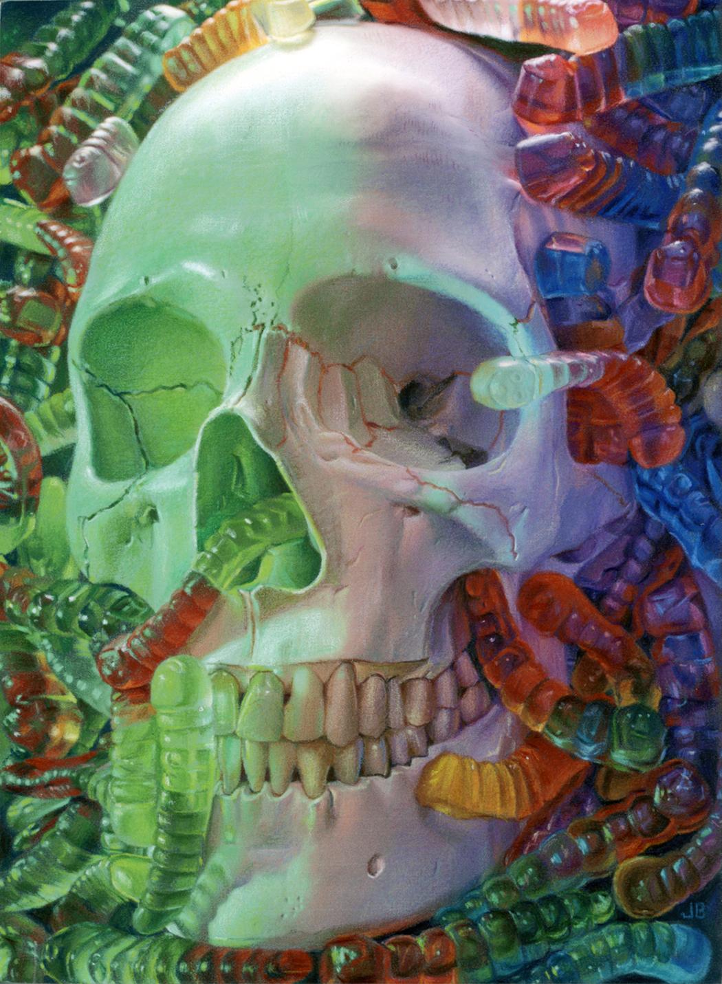 JB Burke | Whispers From The Worms | 2026
Color and light give these objects an almost tangible presence. What role do they play in creating the atmosphere of a drawing?
For me, light establishes the physical reality and tactile weight of an object, while color creates its psychological temperature. Light makes the subject feel touchable and grounded in space. Color, on the other hand, is where I step away from literal representation and engage more in narrative and world-building. By applying color theory principles directly to those value maps rather than just copying local color, I can manipulate the mood of the entire composition.
Your images are meticulously rendered, yet they leave room for uncertainty about what we are seeing. What does realism allow you to do that a less detailed approach might not?
For me, realism is a way to establish trust with the viewer. When an object or surface is rendered with tactile precision, it carries a sense of physical weight and truth. The viewer’s brain immediately accepts that the object exists in space, which creates a feeling of familiarity and security. Once that trust is established, I can subvert it. Realism allows the bizarre or surreal elements to land with more psychological force. The meticulous detail also forces a shift in pacing because the process of building up layers of colored pencil is so slow, the resulting drawing demands a similar slowness from the viewer. It invites them to lean in and inspect the surface, and in that moment of close inspection, the initial certainty of what they are looking at begins to dissolve.
How do you think about titles? Do they offer viewers a way into a work, or do you prefer them to raise further questions?
Titles are important to me as a way to close the chapter on a drawing since I typically title the work after it is finished. I think of it as a conceptual frame that can invite the viewer into the world I’ve constructed, but I never want a title to be purely descriptive or to “solve” the image. I believe the title is meant to open up the narrative while also leaving room for the viewer to navigate their own questions and associations.
Has teaching changed the way you examine your own choices or take risks in the studio?
Teaching art majors acts as a constant mirror for my own creative habits. When you spend your days asking students to articulate why a specific composition, value map, or color palette works, you can’t go back to your own studio and operate on autopilot. It forces me to rigorously audit my own decisions: Am I choosing this color scheme because it serves the atmosphere, or simply because it feels safe? Teaching has also reshaped how I approach risk, particularly in a slow, labor-intensive medium like colored pencil there is a natural temptation to stick strictly to what you know will work. But watching students throw themselves into unfamiliar territory and discover unexpected solutions reminds me to remain a student in my own studio and to stay curious and prioritize discovery over comfort.