Zhihan Qian
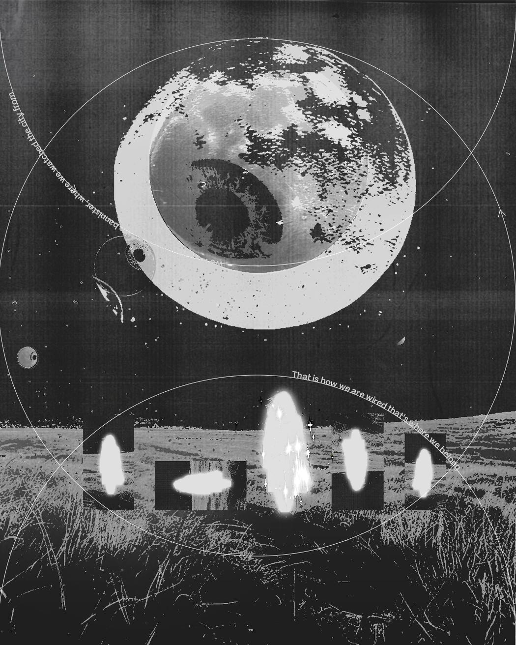 Zhihan Qian | Circle | 2025
Your work often transforms text into a visual system rather than a carrier of direct meaning. How do you decide when language should be read – and when it should be felt?
It really depends on the “distance” and “intention.” The distance between my audience and the information I want to share. Take The Memeing of Political Discourse as an example. It’s clearer for people who have similar experiences to understand the full meaning. The closer you are to the topic, the better you understand the content hidden in this visual language. But if you’re not that into it, that’s also fine. I tried my best to create a strong first impact regardless. That said, I don’t decide or control it. In that project, my intention for the work is only to show the things happening in my mind. It’s the audience’s choice if they want to read more.
But when we’re talking about something in the “semi-free” category, for example, the book Lines of Control I designed for a history PhD, I need to control myself a bit and make sure the information is direct enough. Because the intention of that project is to tell the story clearly.
Many of your projects explore bilingualism and superstition. How does working between languages influence your thinking as a designer and storyteller?
It wasn’t until I realized viewing things in another language is a luxury. There’s this idea in linguistics that language shapes how we think. I really believe that. When I switch between English and Chinese, I’m not just translating words. I’m switching between two different ways of seeing things. Chinese is more visual to me. The characters themselves are little pictures. English is more linear, more about the flow of sentences. As a designer, that difference matters. It gives me two different toolkits for storytelling. Sometimes something gets lost in translation, and that gap becomes interesting. That’s where new visual possibilities show up.
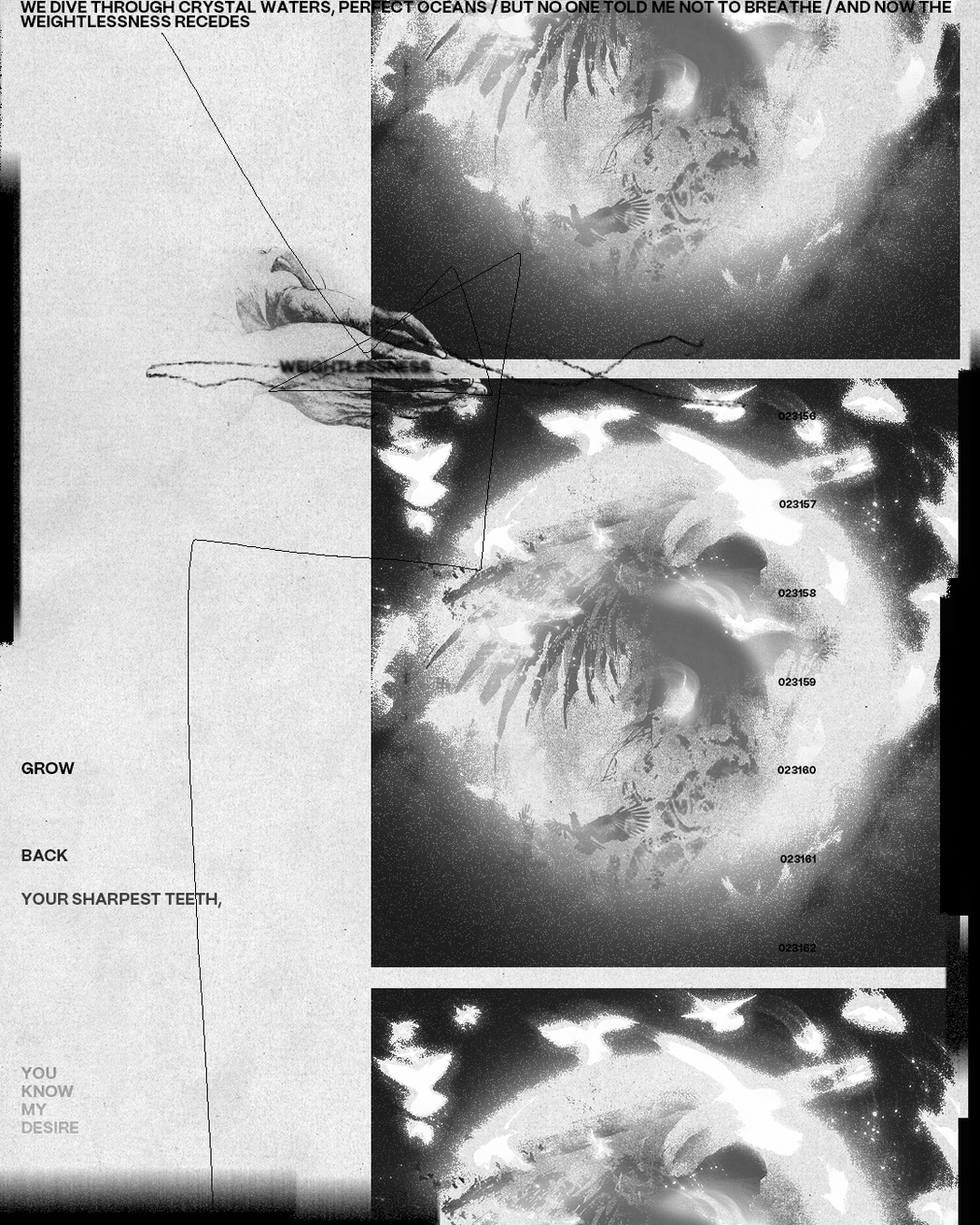 Zhihan Qian | Circle | 2025
Typography in your work feels almost architectural – modular, ornamental, and rhythmic. What role does structure play in your creative process?
Honestly, I never thought about my typography as architectural, but maybe it just naturally became that way. At the start of a project, my sketchbook is a complete mess. Everything is chaotic and all over the place. I know I’m someone who wants a little bit of everything, so I give myself permission to try every possible direction until I hit a wall and can’t push it further. I need to exhaust all the options before I can commit to one.
Once I realize some ideas just can’t work, I’m satisfied. Then I can focus on one path without second questioning myself. That’s where structure comes in. The grid, the system, the rules help me not spiral out of control. In some ways, structure is what keeps me from being too scattered. It’s not about limiting creativity. It’s about giving myself a container so I don’t drown in all the possibilities.
You frequently use repetition, cycles, and mirrored forms. Are these visual strategies connected to ideas of ritual, belief, or emotional reassurance?
I would say it’s more about emotional things. Most of the time, I believe if I repeat something well enough, I would get the deeper meaning. Like a monk counting prayer beads in front of Buddha. They repeat the sutras again and again, and suddenly, that moment of enlightenment happens. There’s a saying in the creative industry, more like a joke. If you don’t know what to do, make it really big or really small or repeat it a massive amount of times.
I’m not a naturally gifted designer compared to some of my talented friends. I don’t always have that instant clarity about what works. So repetition becomes a way for me to find my own way out. It’s almost meditative. When I keep working with the same form or element over and over, something shifts. The meaning reveals itself through the process, not before it. It’s less about planning and more about trusting that the repetition will lead me somewhere I couldn’t have predicted at the start.
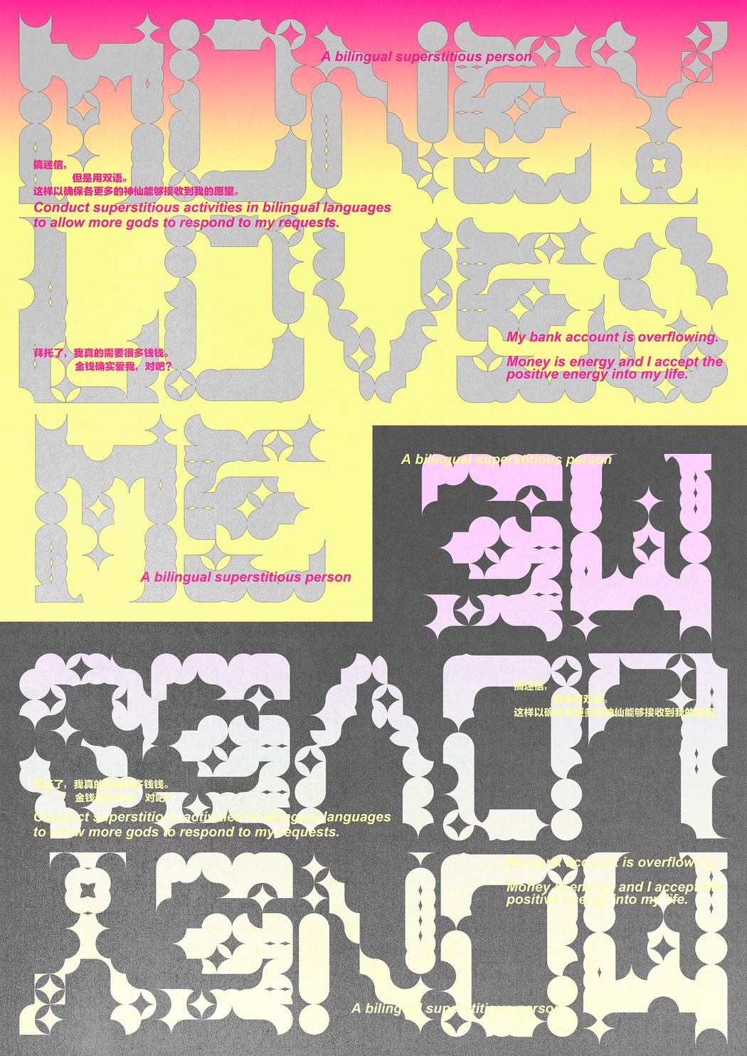 Zhihan Qian | Coin | 2024
Your compositions balance clarity and overload – order and visual noise. How do you navigate this tension when designing editorial or experimental pieces?
It’s like how novelists say their characters eventually grow flesh and blood on their own. Sometimes when I design, I don’t feel like I’m “creating” something. It’s more like pulling something that already exists out of a black hole. At some point, I surrender to the vibe of the work itself. I can only call it “a certain feeling.” I really enjoy that uncertainty.
Of course, some people call this the “curse of knowledge.” Once you master a certain skill or technique, you forget what it felt like not to know it. For me, that tension between clarity and overload isn’t something I consciously navigate. The work tells me where it needs to go. Sometimes it needs to be quiet and direct, like when I’m designing for a history book. Sometimes it needs to be loud and overwhelming, like when I’m trying to capture the chaos in my own head. I don’t decide that in advance. I just follow what the work is becoming.
As the co-founder of Dream Labor Press, how does publishing expand or challenge your role as a graphic designer?
It gives me a perfect place to design and show my personal passion projects. While I work as an in-house designer, there are so many fixed rules to follow. What I can do is very limited. The foundation of DLP was based on a very simple reason. My friends and I didn’t want to waste our well-designed books. And books and zines are such perfect and freeform media for us to tell stories, show emotions, and be as narcissistic as possible.
I need something that belongs to nobody but myself. At work, I’m always designing for someone else’s vision, someone else’s brand, someone else’s audience. With Dream Labor Press, I get to be selfish. I can explore ideas that don’t need to serve a client or follow market logic. It’s where I can take risks without needing approval. The press also challenges me in ways client work doesn’t. I’m not just the designer anymore. I’m the editor, the decision maker, the one who has to figure out production and distribution. It forces me to think beyond aesthetics and consider the entire lifecycle of a project. In that sense, publishing has made me a more complete designer. It’s taught me that design isn’t just about making things look good. It’s about making things exist in the world on your own terms.
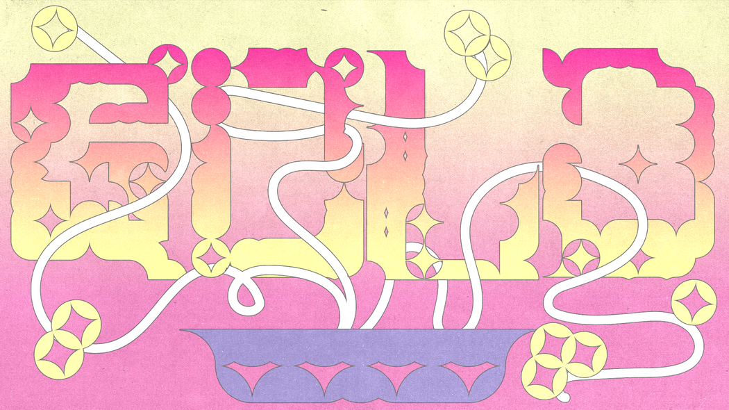 Zhihan Qian | Coin | 2024
How do you want viewers to engage with your work – slow reading, intuitive absorption, or something else entirely?
A glimpse is enough. I do appreciate deep, slow reading, but I don’t really want the viewers to do anything specific. That’s one of the reasons some of my works are very visually heavy. In some ways, this is attention-seeking behavior. I won’t deny it, because I believe a strong first impression helps. If someone only spends three seconds looking at my work, I want those three seconds to matter. I want them to feel something, even if they don’t fully understand it yet.
The heavy visuals are like a hook. They pull you in. What happens after that is up to the viewer. Some people will walk away with just that initial impact, and that’s fine. Others might come back and dig deeper. Both responses are valid. I’m not trying to force anyone into a particular way of seeing. I just want to make sure my work doesn’t get ignored in the first place.
Leave a Reply
You must be logged in to post a comment.