
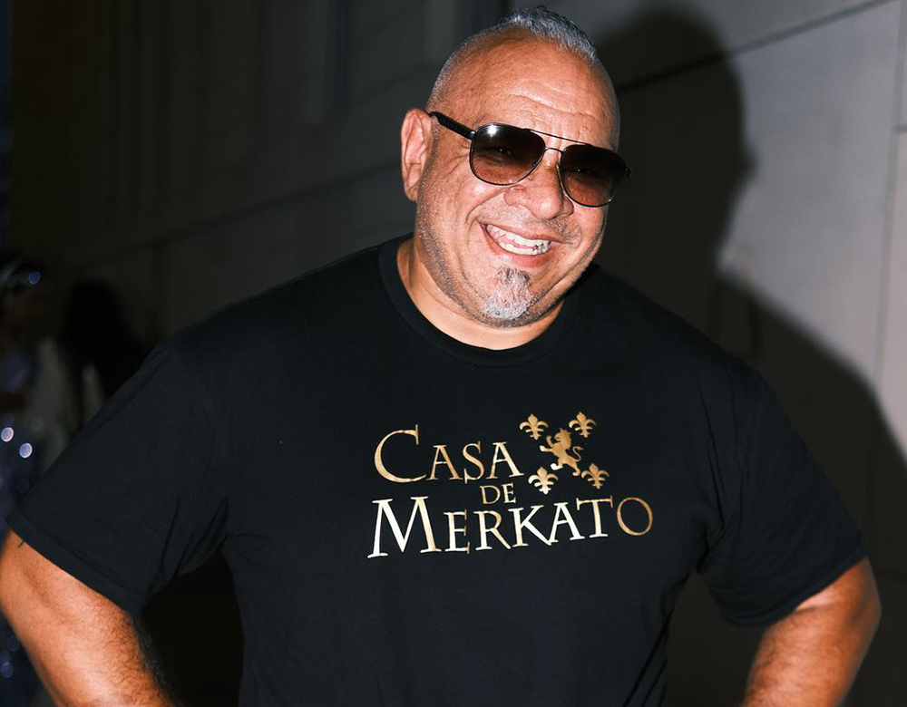
Geraldo Mercado
You have worked in advertising, television, and fashion for more than two decades. How has moving between these fields shaped the way you think about design?
Hopping from profession to profession was super helpful in many ways. I had to learn to stay current, see trends, Designing for shows, you looked at a lot of pop culture. For fashion it was all about trends and colours. Combining all these things helped to design garments for teams, and athletes. I started out designing urban baseball caps and t-shirts for a company back in High school, Had my Garments featured on magazines, worn by musicians. It’s funny how i’ve gone full circle and am back where I started 25-30 years later.
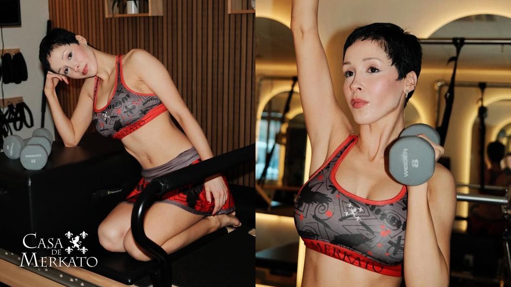 Geraldo Mercado | Casa De Merkato Raven Alyssa Spread
During what you call your “Renaissance Year”, you wrote a children’s book and songs while working as a senior designer at NBCUniversal. What prompted that period of experimentation, and what did it teach you about your creative process?
I never wanted to be labeled and put into one box. I have always been a “utility knife” of sorts, it’s what’s kept me employed. Learning as many disciplines as possible and seeing how to utilize them. As for the children’s book and country song, they were a form of therapy for me. Starting a new life of sorts, I needed an outlet. Writing did that for me.
What led you to create Casa De Merkato, and what does the brand allow you to express that your work for other companies does not?
Merkato is a labor of love. I’ve learned so much designing under the other houses. Designing for nations competing in events, designing for branches of the Armed Forces, Ninja Houses, Obstacle racing Teams, all great experiences. Each project had a logo, a theme, a look. With Merkato, I get to narrate the story, choose my colours, images and dictate the message and mood. Finding the balance to make it match the athlete is always a challenge. Looking at trends and upcoming colours is my palette of sorts
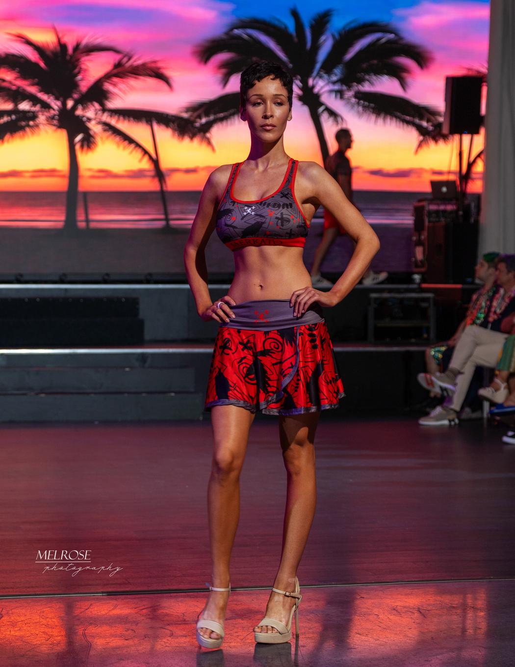
Your Bones and Butterflies collection brings together two striking visual motifs. How did the idea for this collection develop, and what do those images mean to you?
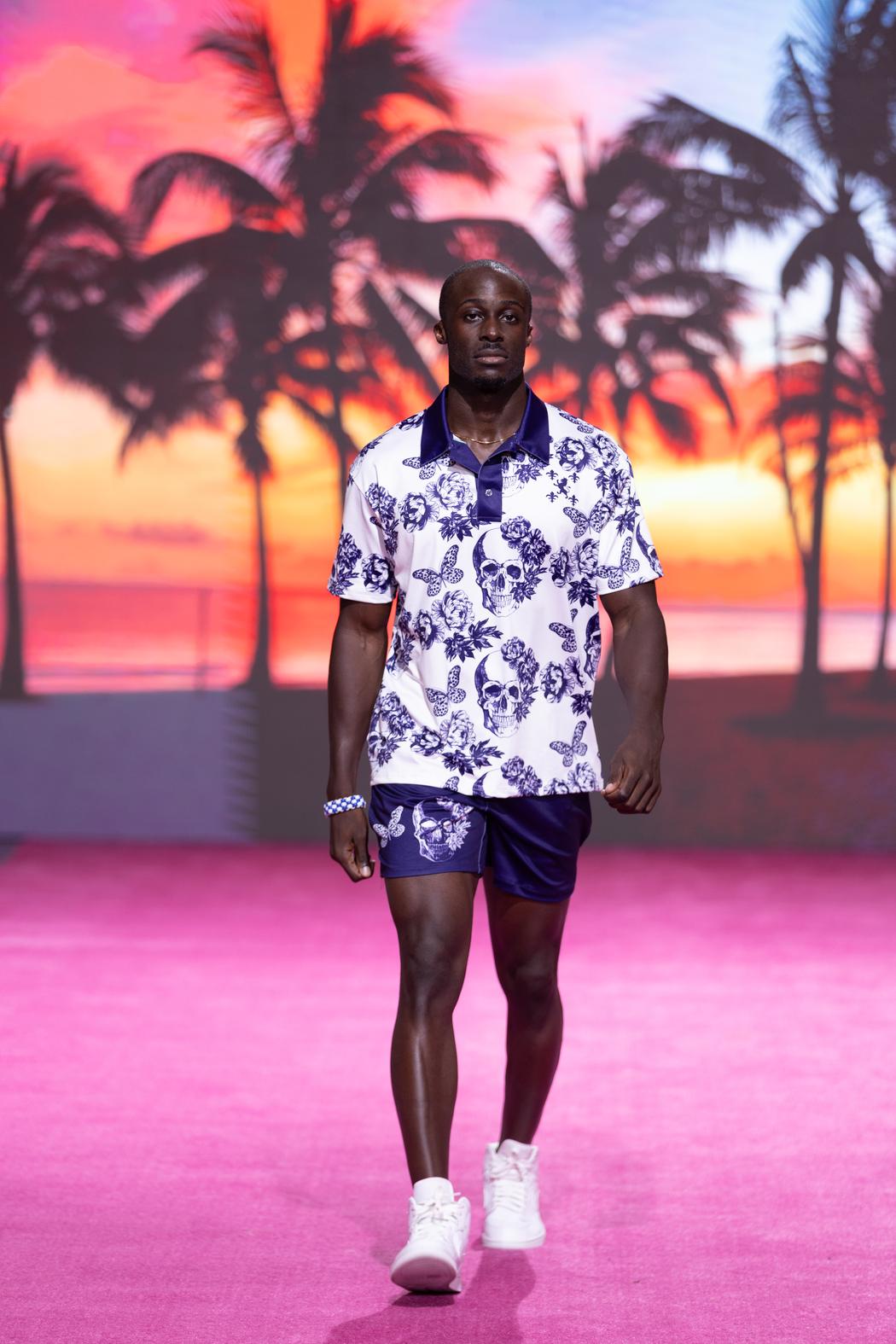
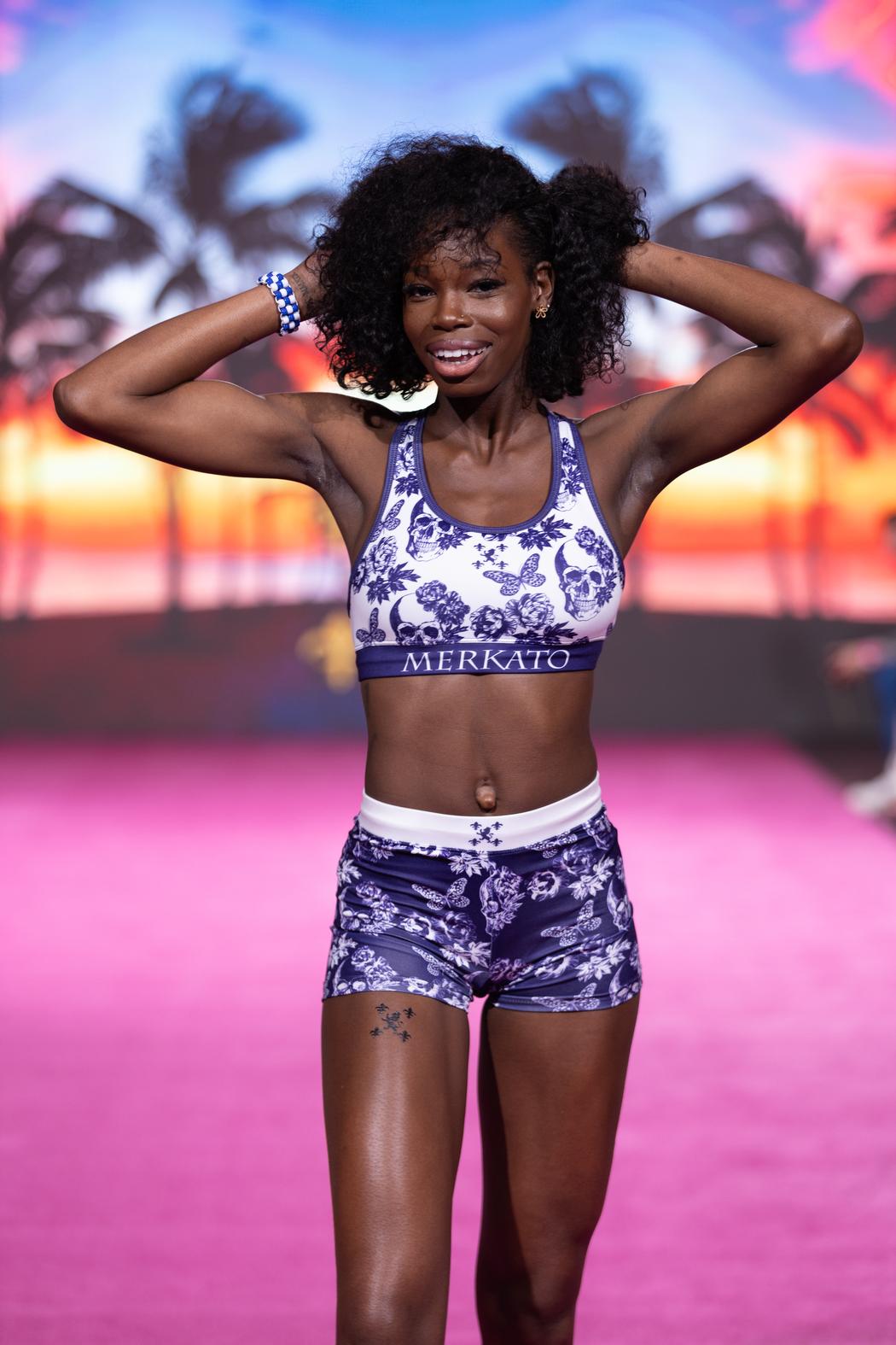
Bones and butterflies is my homage to “Balance”
The Yin and the Yang if you will. It represents the life of a person and what they do with it in between. A bit cliché but its the best way I can explain it.
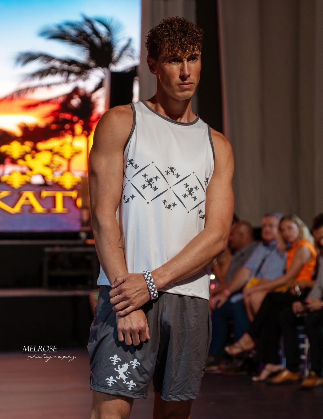
When designing a garment for an athlete, where do you begin: with its visual identity, the demands of movement, or the experience of the person wearing it?
It’s actually all 3. What needs to be the dominant factor? Is it the team logo, the message they are trying to get across, or the individuality of the athlete looking to wear something different and break from traditional gear. Experience is key too, If they are bigger on top, how will it drape, are the sleeves restricting, Should i switch to a sleeveless? Do I make it a loose fit, or give it a compression cut and heavier weight? What event/events are they going to be involved in? All these questions all come into play when designing a garment.
How do you balance your own visual instincts with the needs of a client or the expectations of a market? Can you recall a project where that balance was particularly difficult?
I put myself in their shoes. As an athlete myself, there are certain “needs” I would want, and those needs vary from event to event. What I would wear for an outdoor event on the mountains, is not what I would wear for an event indoors on a track or course. So I use those same markers when designing for an athlete or team.
Across apparel, branding, books, and music, are there themes or ideas that you find yourself returning to?
Because I had to solve the problem of the team or athlete, I couldn’t return to a certain theme.
For myself now, it’s different, I’m influenced by Artists like Philip Tsiaras. His dot portraits, and control of colour always amazes me. For designers, I love Christian Siriano and Zang Toi, I’ve been to both of their shows and seen up close and backstage the garments on and off the models. I’ve loved constructivism art, Black, White, Red, high contrast, sharp edges.
To be honest, I go where the mood takes me on these projects. There could be something in the logo that inspires me, the colour of the team, the mood or message they want to portray. Nothing is cooler than making an athlete look “fast and sleek” while they are standing still.