Lara-Ann Guerreiro
Your Block & Form series brings together childhood memories, Mediterranean landscapes, and domestic scenes. How did these different sources of inspiration first become part of a single visual project?
Motherhood slowly made its way into my studio over the past several years. Finding sources of inspiration look different as I’m surrounded by childhood more than my studio walls. So it came from the unexpected; stacking building blocks with my children during play time. The white and orange blocks reminded me of the homes scattered cross Madeira’s hillside, and the concept grew from there.
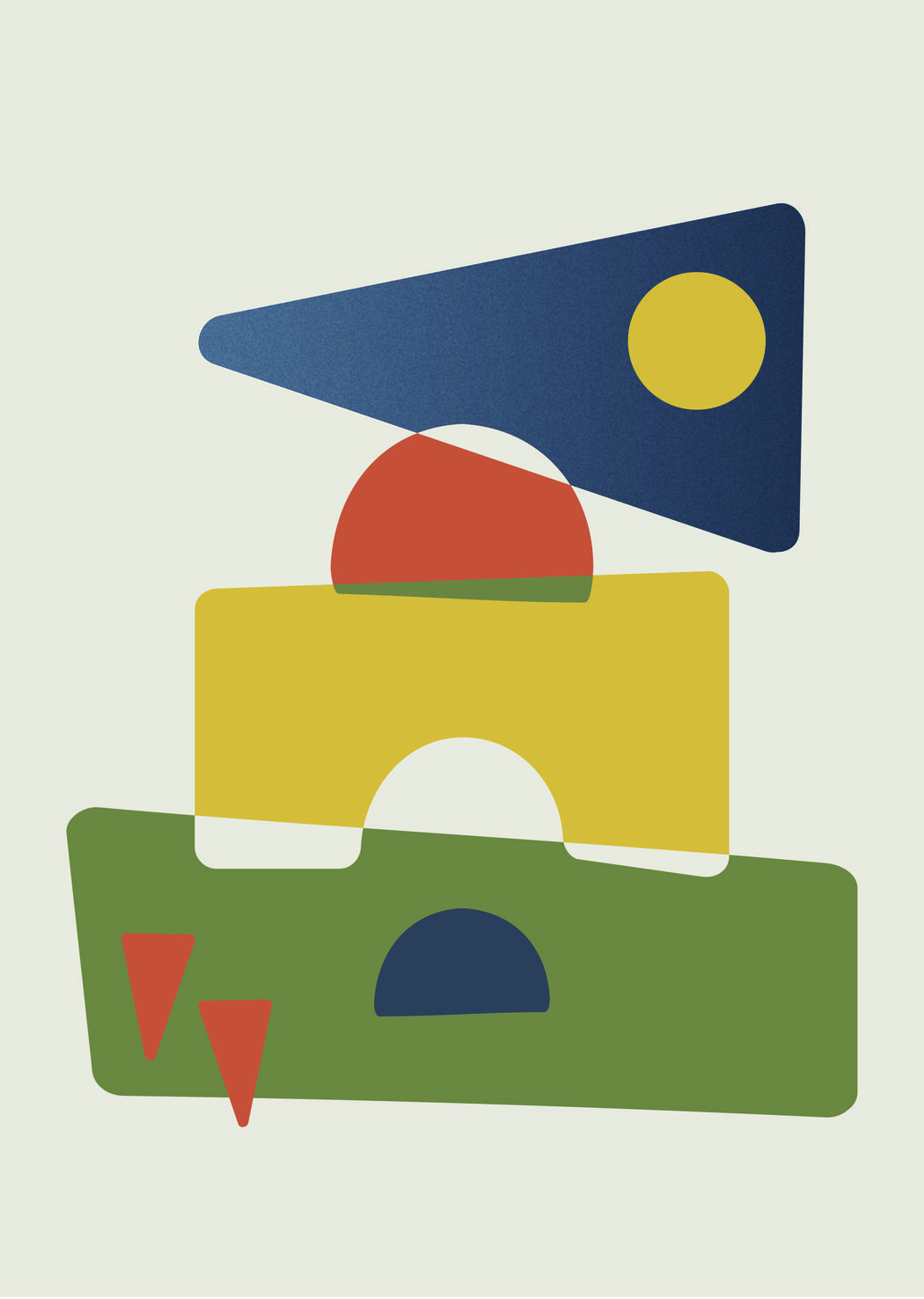 Lara-Ann Guerreiro | Casablanca At Night
You were born in South Africa and draw strongly on your Portuguese heritage. How does living between these cultural references influence your understanding of place, belonging, and memory?
Although I was born in South Africa, I grew up in a very Portuguese household, so I never felt as though I had to choose between the two cultures. They’ve always existed alongside one another.
Portugal has always represented something deeply familiar to me. I don’t look at the Mediterranean with curiosity—I look at it with adoration, almost the way a child looks at their mother and instinctively sees her beauty. It’s a connection that’s been shaped by family, tradition, language, food, and the stories that were passed down long before I was old enough to appreciate them.
Living between those two cultural references has taught me that belonging isn’t always about where you’re born. Sometimes it’s built through heritage, memory, and the values you’re raised with. South Africa is my home and where my life has unfolded, while Portugal is part of the foundation of who I am. Rather than feeling divided between them, I feel enriched by both.
Your compositions often resemble arrangements made from children’s building blocks. What does this visual connection to play and childhood allow you to express?
Simplicity, that less is more. A departure from my previous detail oriented work. Young children are so content with simple objects, yet create immersive worlds and this made its way into my work. I often needed to revisit pieces simply because they contained too many parts, distorting the sense of place and burdening the viewers eye.
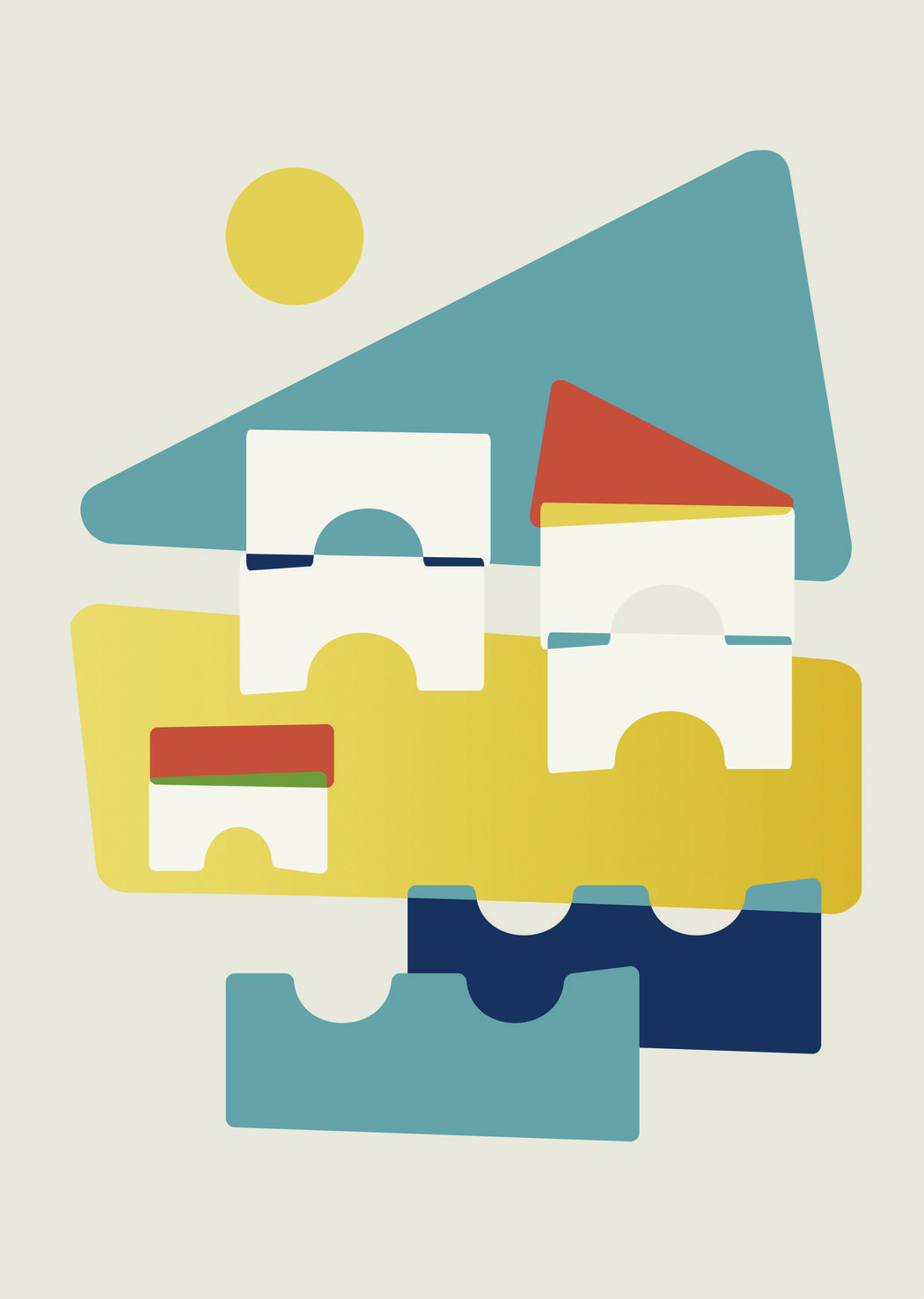 Lara-Ann Guerreiro | Albufeira Block&Form
How do you decide which elements of a landscape or still life should remain recognisable and which should be reduced to pure geometric form?
The hero element is what makes the piece most recognisable. Most of the time its a colour deeply associated with a place or a particular form in general. This element evokes a sense of place or the object to the viewer; like the lime-washed walls in Faro. The rest of the elements are supporting actors, just enough to help carry the lead.
Your works are carefully balanced, yet they also feel spontaneous and playful. How do you develop a composition, and how do you know when the relationship between its forms is complete?
Before I started my studio I worked in editorial design; so the grid system became my playground. Most of my work has its feet rooted in some sort of grid. I like to contrast the rigidity with playful elements.
A piece will either be lacking something definitive or it’s fighting with itself. Once I’ve processed what it needs, there’s a visual harmony that settles into place and I can send the piece off.
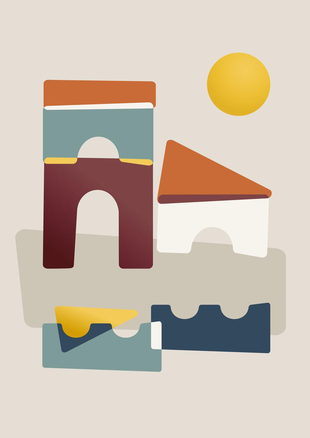 Lara-Ann Guerreiro | Porto Day Trip
Although your editions are produced as Giclée prints, their surfaces evoke block printing and risograph techniques. How important are texture, grain, transparency, and imperfection to the atmosphere of the works?
Because my works are digitally hand-made, depth and contrast are two very important elements to me. it creates this lovely harmonious balance; contemporary technology and old-school print.
I love retro printing techniques and block-print in general, and Risograph inspired me to add depth to over lapping blocks by introducing a layered colour, and to recreate the vibrant matte soy-oil based inks in my work.
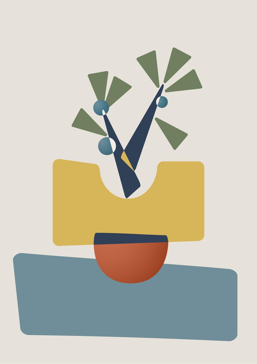 Lara-Ann Guerreiro | Olive Harvest
Your background in communication design is visible in the clarity and structure of your compositions. In what ways does design thinking support your fine-art practice, and where do you try to move beyond it?
I’ve married the two. I did fine art from a very young age and when I went to university I left that behind for communication design. Over the years I’ve learnt to use both and I’d like to think I’ve found a good balance. I find that they needed one another, they keep each other level head. There’s beauty in art, and structure in design and together they work very well.