
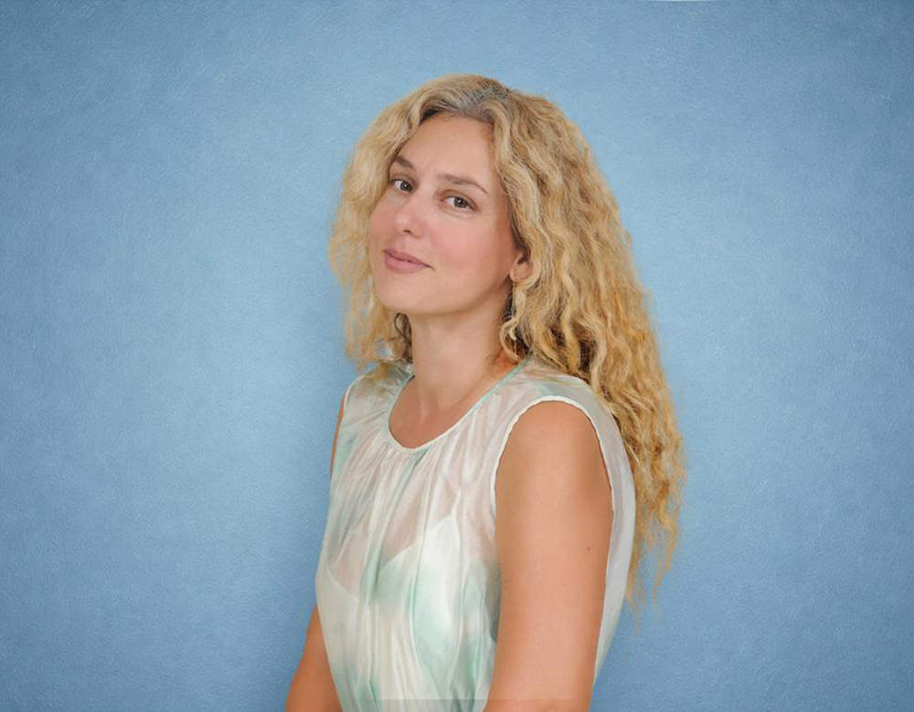
Zoe Nikolopoulou
You often work on a small, intimate scale while addressing sensations of vastness. How does the physical size of a painting shape the viewer’s relationship with the space inside it?
A small painting asks you to come closer, and in that act of leaning in, you give up your peripheral vision. The room falls away. So paradoxically, the smaller the object, the more total the immersion can be — because intimacy of scale demands intimacy of attention.
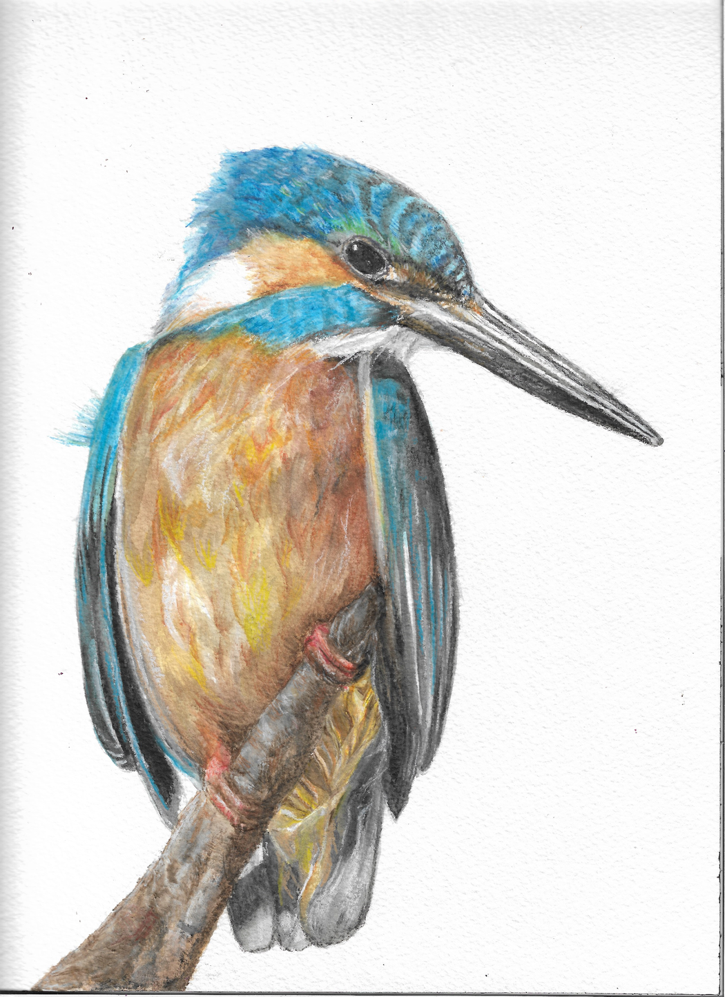 Zoe Nikolopoulou | Ceyx Azureus
Living and working in Athens, how have the light, sea, and landscape of Greece influenced your visual language, even when your paintings do not depict a specific place?
Athens isn’t muse, it’s friction. I endure it, I don’t draw from it. The sea is different. It’s not material, it’s relief — the one place that gives without asking anything back. Maybe that’s why it shows up in the work more honestly than the city ever could: I’m not studying it, I’m depending on it.
Your cloud studies attempt to hold something inherently temporary and constantly changing. What attracts you to clouds, and what emotional states do they allow you to explore?
Clouds attract me because they refuse to be finished. Every other subject eventually holds still enough to be resolved — a rock, a wall, even the sea has a kind of average shape. Clouds don’t. The thing you’re looking at is already gone by the time you’ve mixed the color for it. So painting them isn’t really documentation, it’s negotiation with loss. You’re always painting a memory of something that happened four seconds ago.
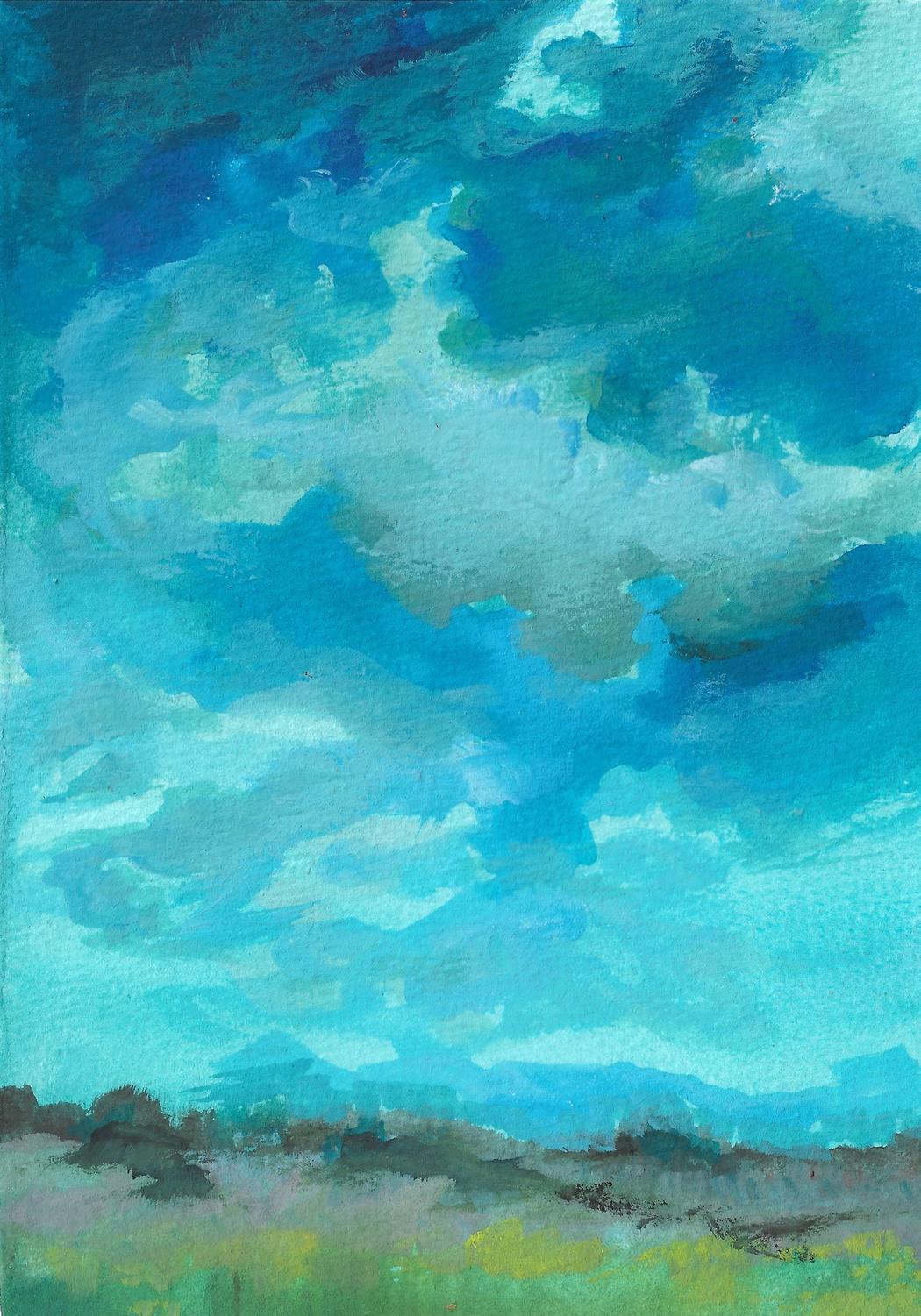 Zoe Nikolopoulou | Fields
Blue, turquoise, and green recur throughout your work, yet their emotional effect shifts from painting to painting. How do you distinguish between different emotional qualities within such a closely related palette?
The distinctions are almost never about the hues themselves — they’re about temperature, value, and what’s sitting next to them. The same turquoise can feel like relief or like cold isolation depending on whether it’s warmed by a hair of yellow underneath or pushed toward gray. I work in a narrow family of colors on purpose, because it forces the emotional weight onto smaller decisions. When your palette is wide, color itself does the emotional signaling. When it’s narrow, everything has to be earned by nuance — how saturated, how much white, how much of its neighbor bleeds in.
You work with watercolor, gouache, and acrylic – materials with very different relationships to transparency and opacity. What determines which medium, or combination of media, a particular work requires?
It comes down to what the color needs to do. Watercolor when the paper has to stay alive underneath — light coming through, not sitting on top. Non-negotiable for something like a cloud; it dies if it loses translucency. Gouache sits between the two — luminous but with more control, more density without going glassy. Acrylic is for when something needs to stop moving. Opaque, committed, it seals the layer beneath.
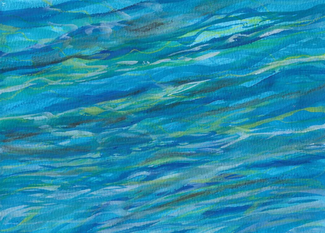 Zoe Nikolopoulou | Sea
Human figures are absent from these works, yet they retain a strong sense of presence and emotion. Is solitude in your paintings a form of refuge, vulnerability, freedom—or something more ambiguous?
I think of the paintings less as images and more as a kind of held space. Quiet enough that your own thoughts don’t have to compete with anything. If there’s stillness in the work, it’s not because I’m depicting calm — it’s because I’m trying to build a surface with nothing on it demanding your attention away from yourself. The absence isn’t a void. It’s clearance. Room being made, on purpose, so the only presence left in front of the painting is the viewer’s own.
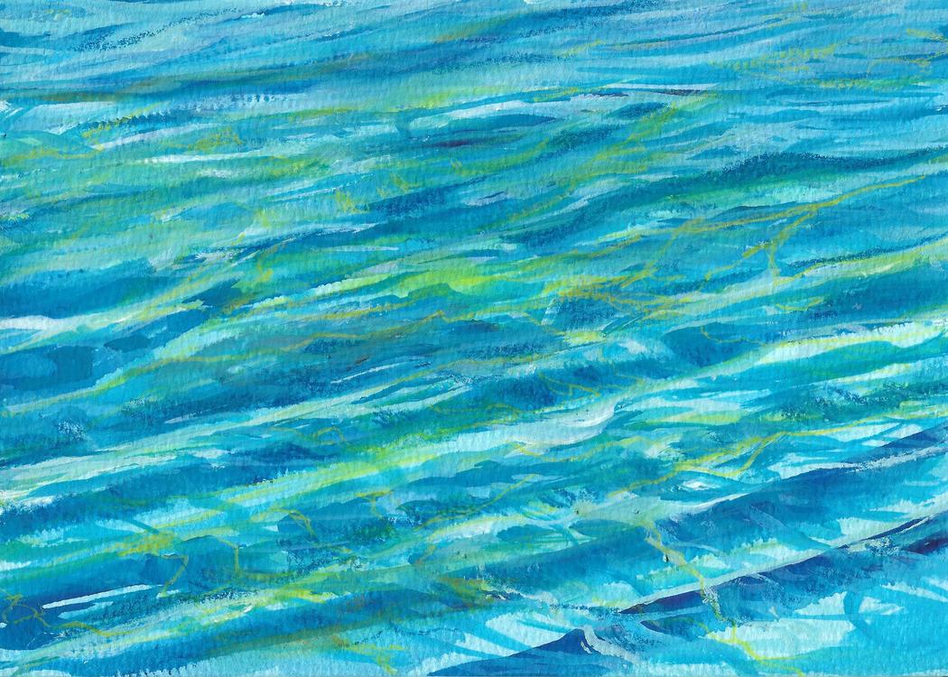 Zoe Nikolopoulou | Sea No.1
You have described color as a symbolic language and the viewer as someone who completes the emotion of the work. Have viewers ever found meanings in your paintings that surprised you or changed how you understood them?
Yes, more than once — and those moments usually tell me something I couldn’t have gotten to alone in the studio. A cloud study I associated with impermanence and calm got read by someone as anger — something about the way the gouache had dried unevenly, a kind of turbulence they saw as barely contained. I went back and looked at it again and I couldn’t unsee what they’d pointed out. It didn’t erase my original intention, but it sat right next to it, equally true. That’s actually the part I trust most about the work — the fact that it can hold readings I didn’t put there on purpose. If a color language is really working, it shouldn’t just transmit my meaning, it should be loose enough to receive someone else’s.