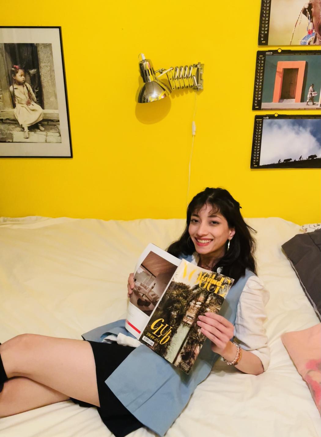
Janki Mashruwala
Growing up in Gujarat, how did the textile hub environment influence your artistic perspective?
I think living in Gujarat, especially Surat, which is known as the textile hub of India as well as my family working with the manufacturing of fabrics played a huge role on how I perceive patterns, shapes and forms. I believe them being embedded at such a young age in my memory helps me draw them. These patterns usually use flowers, leaves, mango and elements as the base form. As a child my mother used to take me along to get fabrics for ‘chaniya choli’. Chaniya choli is the traditional outfit mainly from Gujarat. As a child I always wanted to wear new clothes and chaniya choli every day, I think my fascination for fashion began there. Also I think my mother’s choices in colours and design gave me a perspective because she usually goes for secondary colours and then she would also choose different fabrics and I think my dad also has a good taste when it comes to colours. Growing up with these experiences also helps me correlate those shapes in different compositions. Living in the older region of Surat city where the houses have intricately carved doors and furniture got me acquainted and inspired which often reflects in my illustrations.
You mentioned being fascinated by colours and their effect on human emotions. Can you share a moment or project where this fascination shaped your work the most?
I try to inculcate colour psychology in all of my works but my graduation project, a graphics novel based on the history and culture of Udaipur, also called the lake city of India stands out in that subject. This project uses colour theory as most of the characters are depicted by silhouettes and the colours. They convey the overall mood and intentions of the scene or a person. For instance, black used to show evil and red used to show danger this makes it easier for the audience to understand the overall mood of the story. I find the impact of colours on human emotions and how they affect their mood very intriguing.
How do you usually choose the colour palette for your illustrations? Do you follow intuition, theory, or both?
I tend to use both. I think I used to struggle with differentiating between art and design. To understand that art is meant to express the feelings of the artist while design is to express the brand persona and appeal the audience. When I make something to express myself I usually start with intuition and then use theory. However when I design for a brand, I follow the process. To create a good design, the context is extremely important. Thus, while designing something, I use theory and then use my intuition to make it aesthetically pleasing. It is essential to use both in order to have a good outcome in both the cases for it to be original and lucid.
The breakfast table illustration comes from Kaamini’s Cookery. What inspired you to visually interpret this cookbook?
Kaamini’s cookery is a project that’s very close to me as Kaamini is my mother’s name and most of the recipes in the book are hers. I think just working along with her on this project was so wholesome. While making that cookbook, I was living in a different city, so sometimes my mom would take photos of the ingredients and that’s when I realised that she can take amazing food pictures. And sometime I used to go back home to work on it and she would have to make another delicious dish for the book at the same time we all ate a lot of treats. The idea behind Kaamini’s cookery is that, the cookbook explains the process in the form of infographics. I believe that food shouldn’t have barriers and learning to cook shouldn’t be limited to one language. Thus, Kaamini’s cookery uses text only wherever necessary. Helping people who don’t understand English but can still understand numbers can also interpret the method of cooking these recipes.
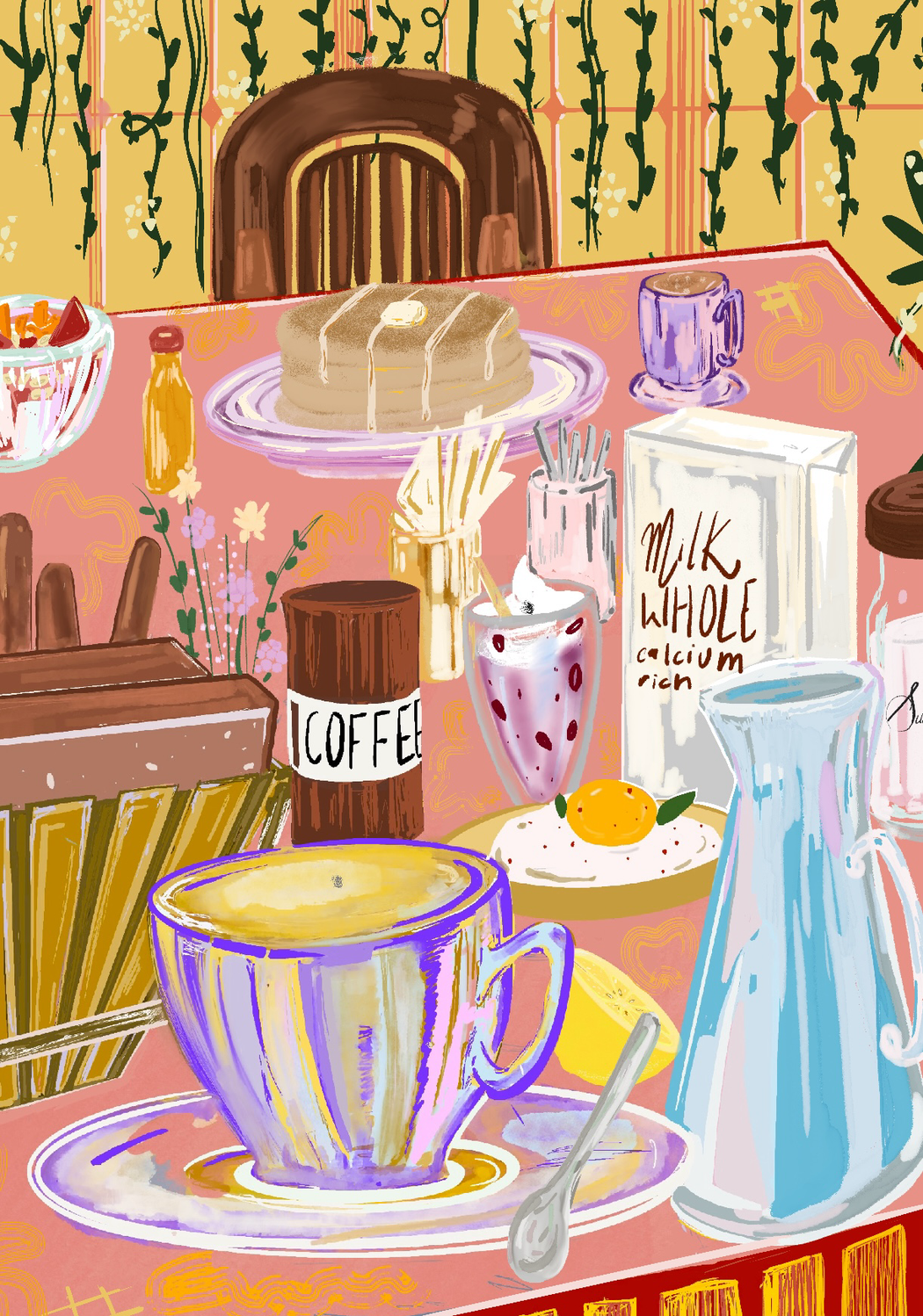 Janki Mashruwala | The Breakfast Table
When creating food illustrations, how do you balance between realism and artistic expression?
I think i have made a lot of food illustrations for menus of cafés, I tend to have a specific style in mind from the beginning so it’s usually to achieve a desired outcome and it’s oriented towards that. Also because I worked with Nomads Cafe, Surat, for two years and there they changed their menu every season, which is why I had to diversify my style making it not repetitive for the viewers. I like making food illustrations because I make them like I make food, gradually putting different ingredients on layers. I think that is also the reason why I enjoyed working on Kaamini’s cookery. While making the illustration ‘The Breakfast Table’ I didn’t start working on the cook book. I just started making a breakfast table putting different elements each day and then I went with my intuition.
Which mediums do you most enjoy working with, and how do they differ in the way they allow you to express your ideas?
I think I enjoy working with microns or just different pens on paper the most because it feels very natural to me to just start doodling or make line drawings. I believe the reason behind that might be, ever since I was 4 years old, my parents put me in art classes and as you advance they make you practice lines. I remember filling two drawing books just practicing to make confident strokes. I often enjoy working with different mediums like paints, pencils, digital art or even scrapbooking. I think it helps me express myself in different ways and is often therapeutic. I think I paint with soft pastels when I really want to focus and channel my energy on a canvas, while I doodle when I feel the most like myself and I use acrylics when I just want to sit down and do something with nothing in mind but just paint. I believe these mediums reflect more on how I feel at a certain moment more than what I feel comfortable with. Digital art is the easiest because I can undo a lot of unwanted strokes but when I paint on canvas with acrylics or any other medium, the mistakes that i improvise and the originality of the outcome feels more rewarding.
Has your knowledge of textile patterns influenced the way you design details in your artworks?
Yes, I believe being exposed to textile patterns for my entire life influenced the way I design in a major way, the observations that I’ve been making consciously and subconsciously often reflect in my designs especially whenever I design something that needs such patterns. It comes very naturally to me. Often times when I doodle I see those patterns showing up repeatedly. I think the use of such elements is inevitable for me because it’s embedded in my mind. I take this in a very positive way because knowing these vivid and beautiful elements have only made my work more versatile and aesthetically pleasing.
Leave a Reply
You must be logged in to post a comment.