Dana Karyn Legg
Year of birth: 1984
Where do you live: Surrey, BC, Canada
Your education: Studied color theory but self-taught painter
Describe your art in three words: Colourful, Harmonious, Whimsical
Your discipline: Color Theory
Website | Instagram

What inspired you to start using color so prominently in your artwork?
Color has always been a powerful tool for me—it allows me to convey emotion, movement, and energy. My background in color theory has helped me harness its impact, and over time, I’ve developed a love for using bold, metallic vibrant hues to bring my geometric designs to life. I’m fascinated by how different hues interact and how they can completely transform a piece.
Could you describe how your love for nature influences the themes you explore in your art?
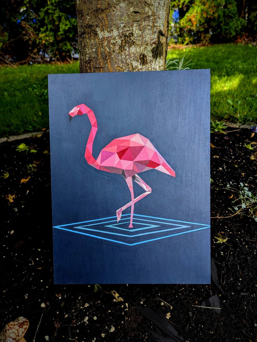
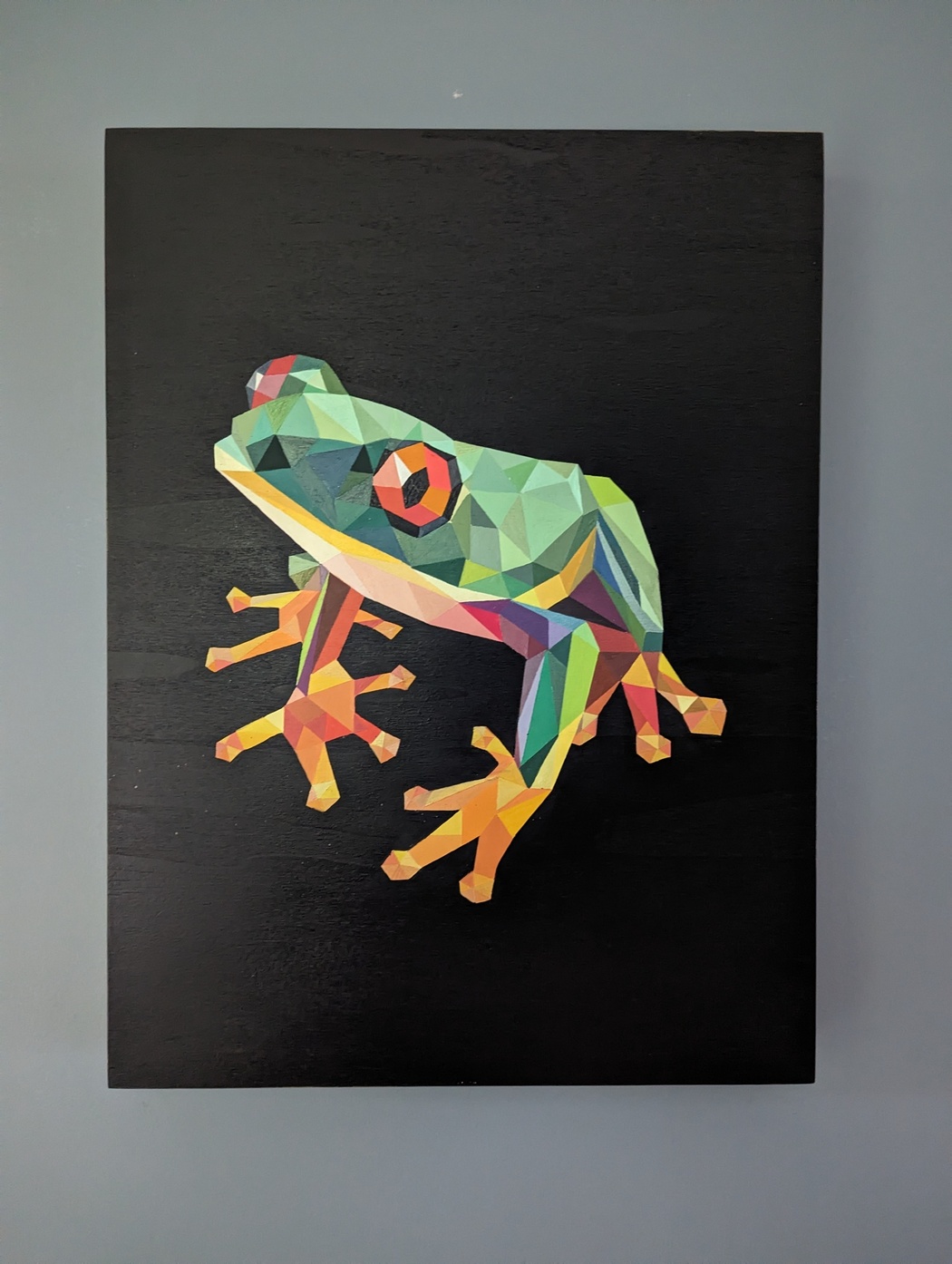
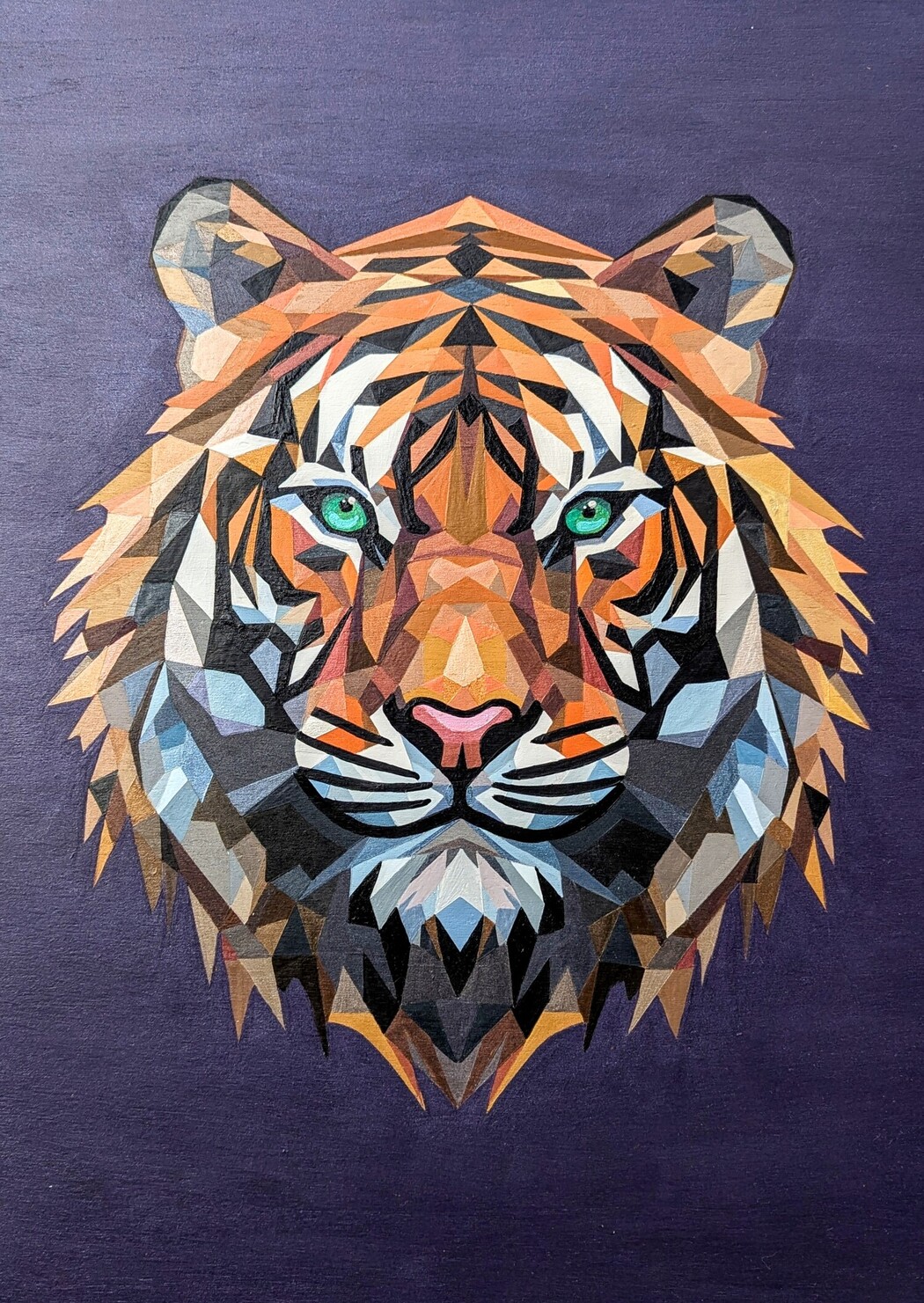
Nature is my biggest inspiration, especially the landscapes, an animals of the West Coast. The geometry of mountains, the organic flow of forests, and the play of light and shadow all influence my work. I aim to capture nature’s essence through structured, polygonal compositions while maintaining an organic feel.
As a mother of four, how do you balance your family life with your creative practice?
Finding time for art is a balancing act. My children inspire me, their curiosity and creativity fuel my own. When they were little, there were more challenges but my husband Rob has always stepped up to help and support me, giving me the time to be creative. They’re now older and support my art, encourage me, while also making sure I care for myself. I’ve developed a structured yet flexible routine that allows me to create while still being present for my family. Art is my passion, but also a grounding force in my busy life.
Do you have a specific process or ritual when creating a new piece of art?
My process often begins with an idea sparked by something I’ve seen in nature or something someone has mentioned. I start with sketches and photo references, experiment with color palettes, and then translate the concept onto wood using geometric forms. Wood is my canvas of choice over anything else, the grain of the wood helps translate the feel of nature.
How do you approach the challenge of capturing the beauty of nature through your use of color and form?
My geometric approach distills organic shapes into something structured yet fluid. Color is the bridge—it evokes the emotional depth and vibrancy of the world. The goal is not to replicate but to reinterpret nature’s patterns and energy, creating something familiar yet uniquely abstract.
What emotions or messages do you aim to evoke in your audience through your vibrant artworks?
Growing up in the mountains and being surrounded by the beautiful west coast has made me want to evoke that feeling of calm and serenity while in nature. I want my work to feel alive and immersive, sparking joy, curiosity, and connection. By using color boldly and deliberately, I hope to inspire joy, wonder, and a deeper connection to the natural world.
How has your understanding of color and its impact on your work evolved over time?
Early on, I was drawn to bold colors instinctively, but over time, I’ve deepened my understanding of color theory. Over the years, I’ve become more intentional with my color choices, considering not just aesthetics but also psychological impact. I’ve refined my approach, experimenting with contrast, harmony, and saturation to create pieces that feel both balanced and alive.
Leave a Reply
You must be logged in to post a comment.