
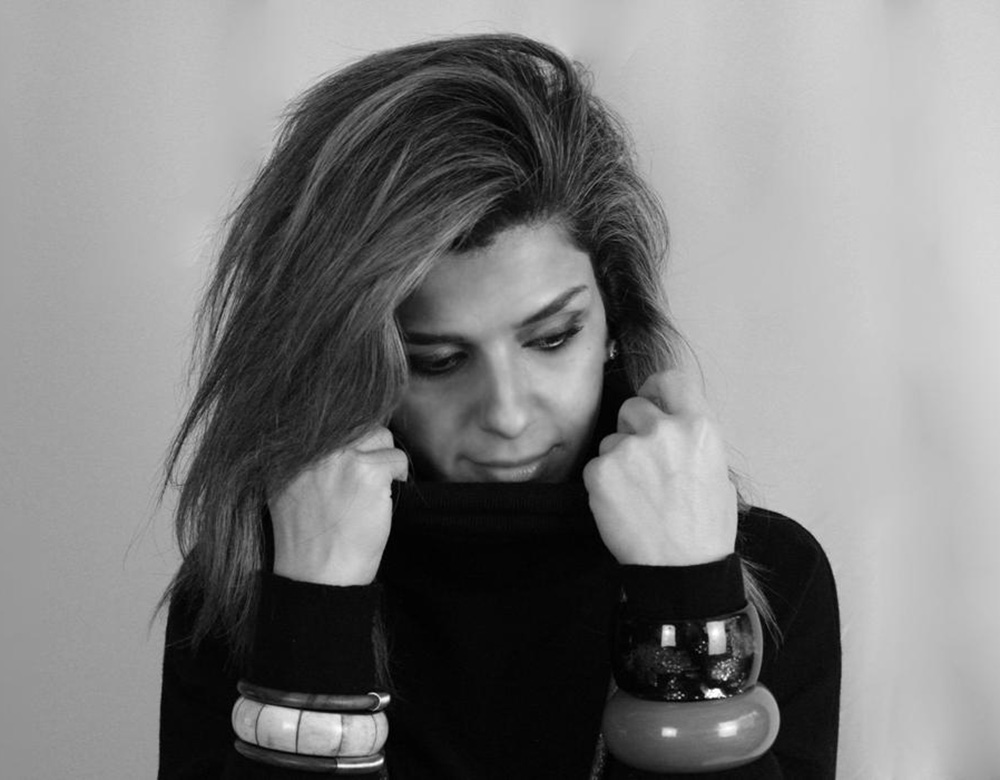
Farah Kadhimi
Your work often begins with the silhouette. How do you decide what kind of shape, proportion, or volume will best express the idea behind a new collection?
For me, silhouette is almost like the first sentence of a story. Before I think about decoration or even sometimes the exact fabrication, I think about how I want the woman to feel and what kind of presence I want the garment to create around her.
I usually begin with an emotion or an idea rather than a specific product. From there, I explore proportion — where the shoulder should sit, how closely the waist should follow the body, whether a skirt should move away from it or fall quietly against it. I am very interested in the relationship between the garment and the space around the body.
There is often a process of exaggeration and reduction. I may begin with a very architectural shape and then remove elements until it feels resolved. I never want structure simply for the sake of drama. Every volume has to contribute something to the character of the woman wearing it.
Ultimately, I know the silhouette is right when it feels strong without overpowering the woman inside it.
Many of your designs combine sharply defined tailoring with softer, more fluid elements. What draws you to this contrast between strength and delicacy?
I think that contrast reflects how I understand femininity.
I have never seen strength and delicacy as opposites. A woman can be incredibly strong and still possess softness, sensitivity and grace. In fact, I often think the combination is far more interesting than either quality on its own.
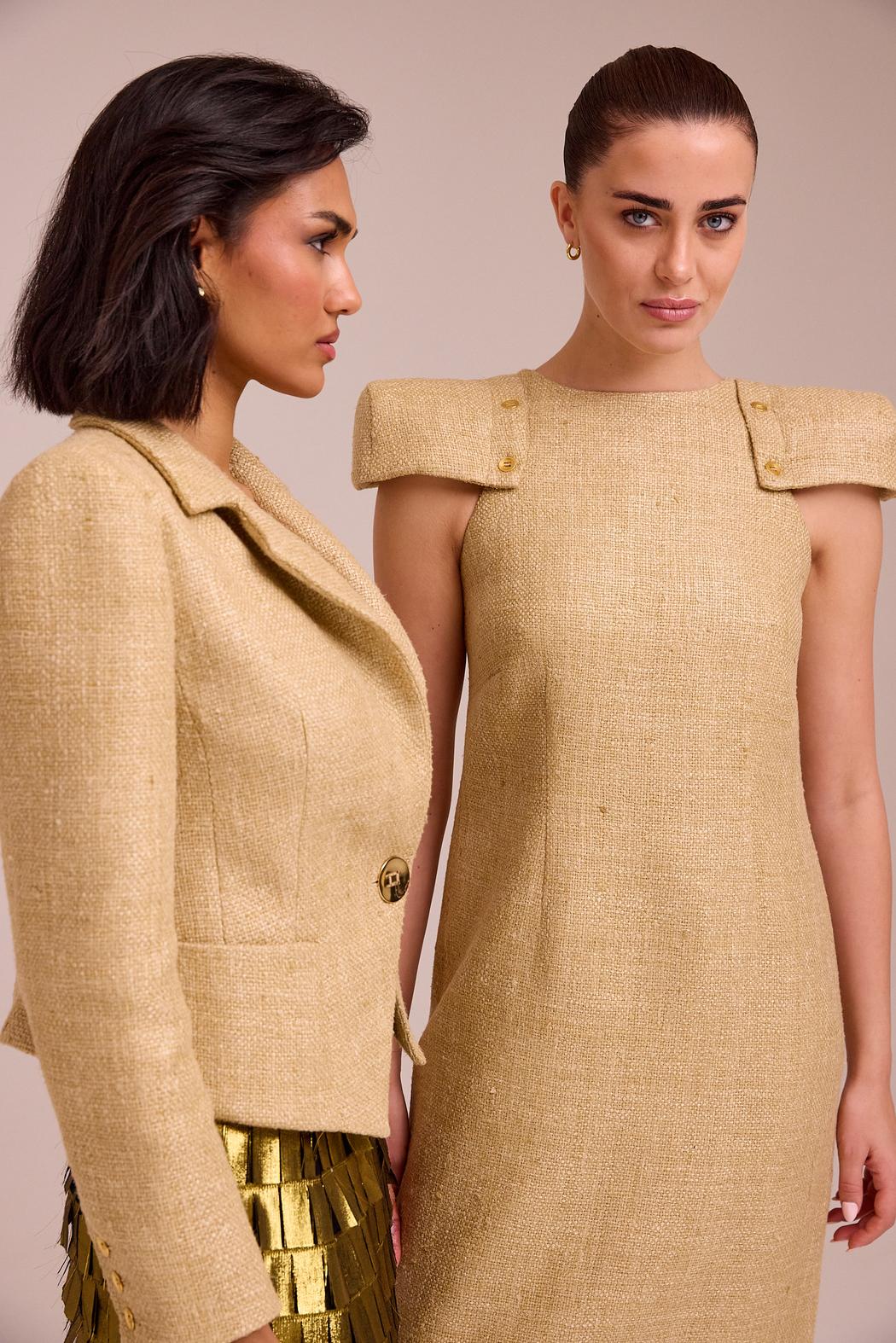
That is why you might see a very commanding shoulder alongside transparent silk, or a precisely constructed jacket paired with something that moves almost weightlessly around the body.
The tailoring creates presence and protection, while the softer fabrics introduce vulnerability and movement. There is a tension between the two, and that tension is very important to my work.
I am interested in clothes that allow women to feel powerful without asking them to become harder.
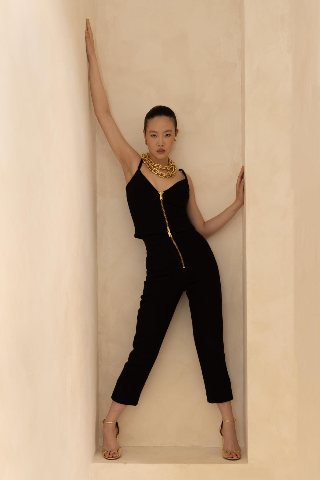
Movement is central to your design philosophy. How do you balance a sculptural silhouette with the need for the garment to respond naturally to the wearer’s body?
A garment can look beautiful standing still, but for me that is only half of its life. Clothes are ultimately experienced through movement.
Even when I am creating something highly sculptural, I am constantly thinking about what happens when the woman walks, sits, turns or raises her arm. The construction has to support the architecture of the garment without making the body feel imprisoned by it.
Fabric choice becomes extremely important. I work extensively with silk because it can behave in very different ways — some silks can hold an architectural form while others respond immediately to the smallest movement of the body.
I like creating a dialogue between those qualities. One part of a garment may define the silhouette very precisely, while another moves freely.
The ideal result is something that has a strong identity from a distance but becomes much more alive when the woman begins to move.
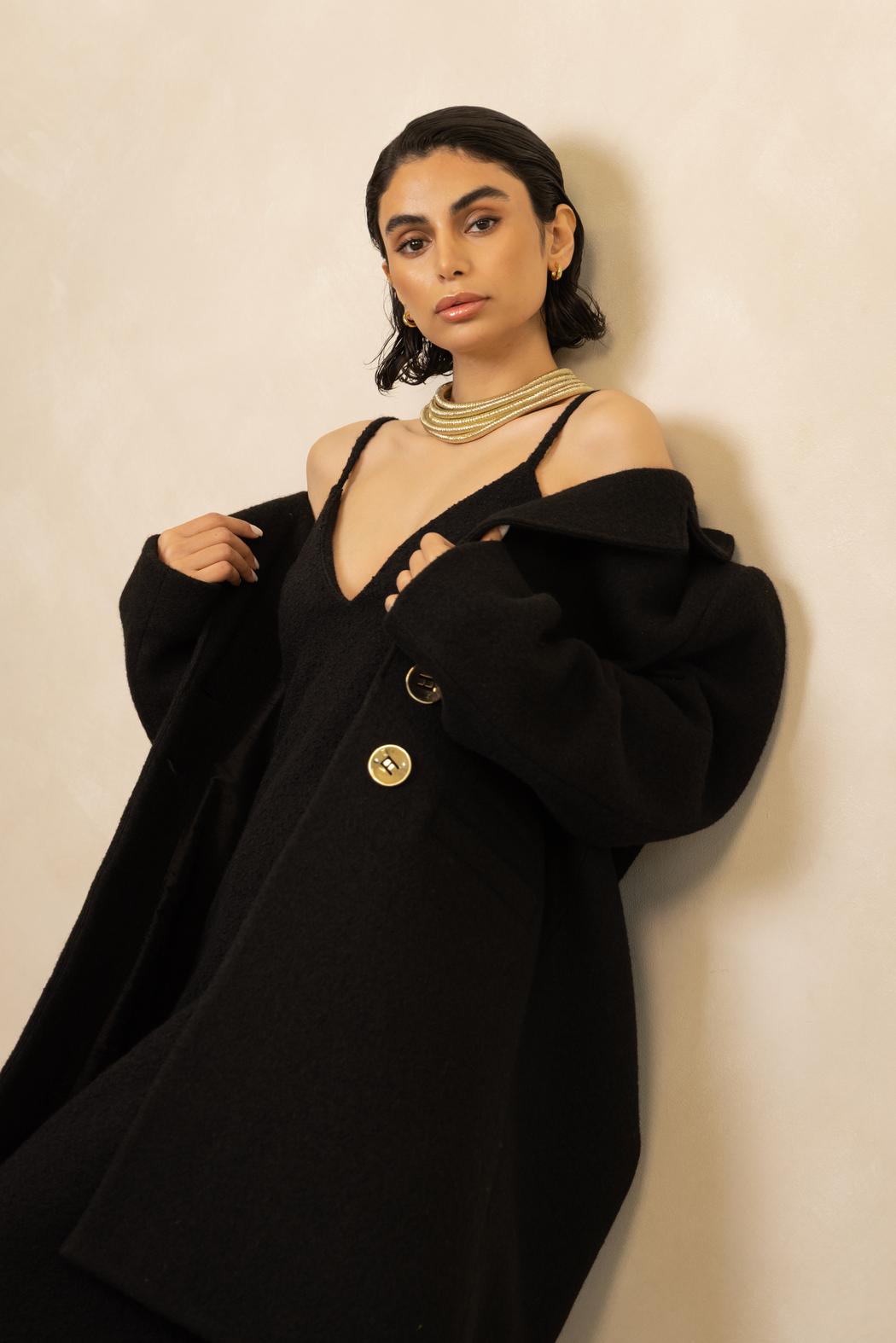
Gold, black, white, and warm neutral tones create a distinctive visual language throughout your portfolio. What emotional or symbolic meanings do these colours hold for you?
I have always been drawn to a very focused palette because it allows the construction and silhouette to speak more clearly.
Black has a particular importance to me. It has authority, mystery and elegance, but it can also create an extraordinary sense of calm. I use it almost as an architectural material.
White and ivory bring a completely different energy. They reveal construction in a very honest way because there is nowhere for the garment to hide. They also have a sense of purity and lightness that I find very beautiful.
Gold is more emotional. There is warmth, history and a certain ceremonial quality to it. It naturally connects with some of the visual memories of my Middle Eastern background, but I like using it in a restrained, contemporary way rather than as ornament for its own sake.
Together, these colours have gradually become part of FJK’s visual language. They allow me to explore different expressions of strength, femininity and light without relying on constant colour change from season to season.
Your work brings together European technical training and elements of your Middle Eastern heritage. How do these different cultural perspectives influence your approach to contemporary womenswear?
They are both part of me, so the influence happens quite naturally.
My education and professional development in Europe gave me a very technical relationship with clothing — an understanding of construction, proportion, tailoring and the discipline required to resolve a garment properly.
At the same time, growing up with an Iraqi cultural background gave me another visual vocabulary. There is an appreciation of femininity, ceremony, richness, jewellery, draping and the importance of dressing with presence that has always stayed with me.
I am not particularly interested in translating heritage literally into garments. You will rarely see me take a traditional reference and reproduce it directly. What interests me much more is memory — a proportion, a sense of grandeur, the movement of fabric, the warmth of gold, or the way a woman carries herself.
London has also had an enormous influence on me because it encourages individuality and experimentation.
So FJK exists somewhere between these worlds. The clothes are contemporary, but there are layers of different cultures and experiences underneath them.
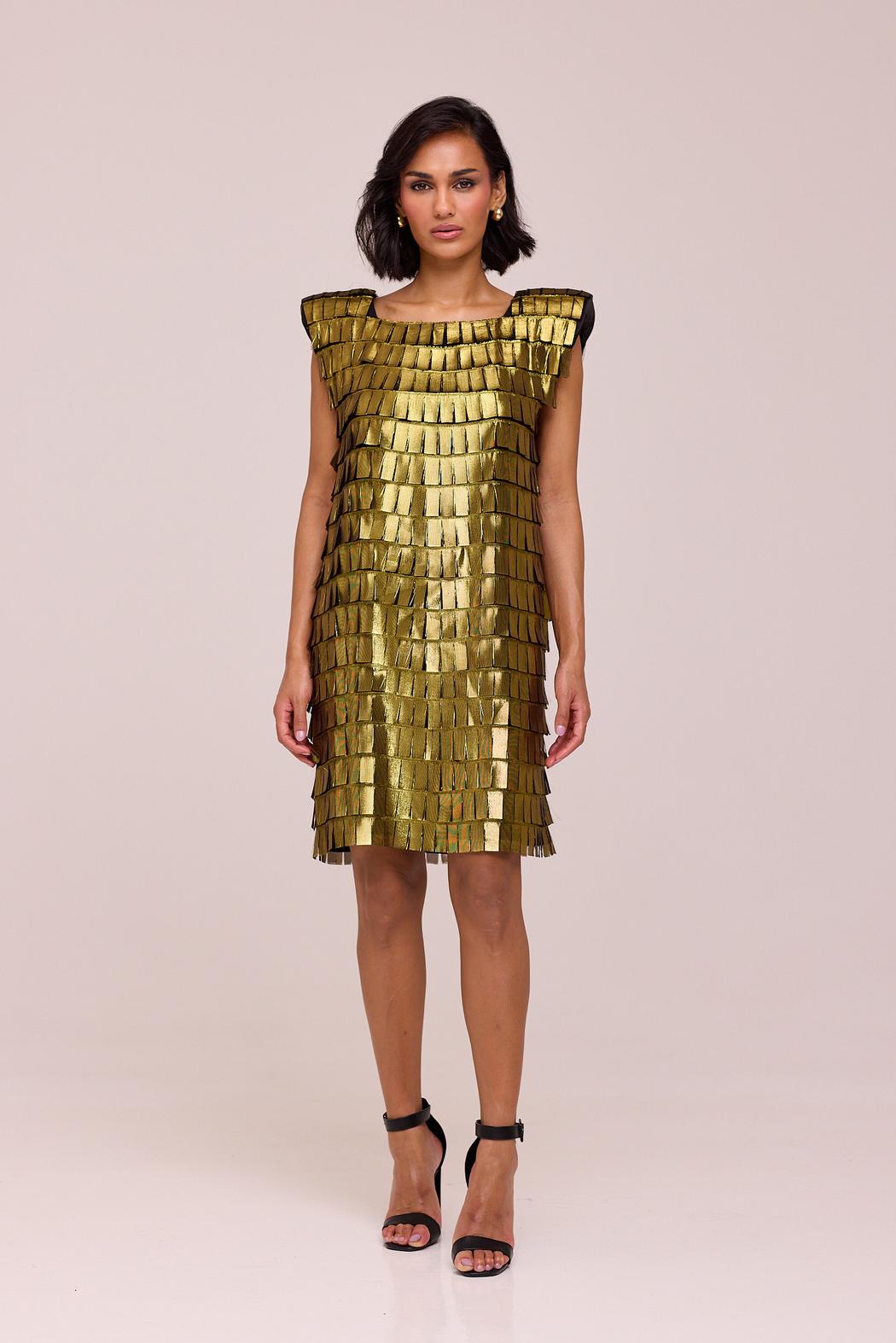
Your portfolio presents femininity as confident, powerful, and highly individual. What kind of woman do you imagine when designing for FJK by Farah Kadhimi?
I don’t imagine her primarily by age, nationality or profession. I imagine her through character.
She has a very strong sense of herself. She does not need clothing to transform her into somebody else, but she understands that what she wears can communicate something about her before she even speaks.
There is confidence to her, but it is not necessarily loud. I am very interested in quiet authority — the kind of woman who enters a room and has presence without needing to demand attention.
She appreciates design, construction and materials, and she buys pieces because she has connected with them rather than because they belong to a particular trend.
Most importantly, I want her individuality to remain visible. The clothes should frame the woman, not consume her.
That is probably the woman I am always designing around: strong, feminine, intelligent and completely herself.
You aim to create garments that remain relevant beyond a single season. How do you define timelessness, and how does sustainability inform that approach?
For me, timelessness does not mean creating something neutral or anonymous.
A garment can have a very distinctive silhouette and still remain relevant for many years. Timelessness comes from integrity — when the proportions, materials and construction feel resolved enough that the piece does not depend on a temporary trend to justify its existence. I would rather design something recognisable that a woman wants to keep than something fashionable that becomes irrelevant six months later.
That philosophy is closely connected to sustainability at FJK. We work predominantly with natural materials, particularly silk and wool, and our made-to-order approach is deliberately designed to avoid producing unnecessary inventory.
I think sustainability in luxury should begin with value: valuing materials, valuing the people who make the garment and valuing the garment enough for it to remain in someone’s wardrobe. Producing less and creating pieces that deserve to be kept is fundamental to the way I want to build FJK.