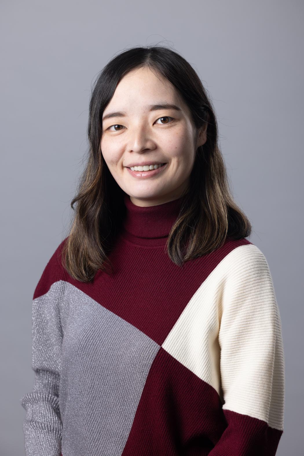
Emiko Kawakubo
Growing up between Japan and the United States, how did navigating two cultures shape your visual sensitivity and approach to design?
Growing up between Japan and the United States shaped the way I perceive and communicate visually in a very natural way. I’ve always been sensitive to non-verbal forms of communication—expressions, gestures, atmosphere—and being exposed to both cultures made that sensitivity more flexible and expansive. From Japanese culture, I’ve inherited an awareness of “sensing” rather than simply being told, which deeply influences how I approach design: I instinctively think about not only what people physically see, but also what they might imagine or feel beyond the visible. At the same time, the American emphasis on direct communication helps ground that intuition, guiding me to clarify priorities and make conscious decisions about what truly needs to be communicated. Together, these two perspectives allow me to balance subtlety with clarity in my work.
 Emiko Kawakubo | Pastel Adventures
You studied International Relations and architectural design before graphic design. How do these disciplines continue to influence the way you think visually?
Studying international relations gave me a strong foundation in understanding hierarchy, balance, and the subtle negotiations that shape relationships between different systems. It taught me that structure is not only about simple rankings, but about navigating complex layers of meaning, priorities, and influence—an approach that strongly informs how I organize information visually today. Architectural design further refined that mindset through its emphasis on discipline and precision. Being trained in an environment where grids, alignment, and structural logic are essential helped me develop a deep respect for order, while also giving me the confidence to intentionally challenge it when needed. Together, these backgrounds continue to shape the way I build visual systems that feel both thoughtful and grounded.
Many of your works balance softness, playfulness, and structure. How do you consciously work with contrast in your compositions?
When I design, my primary intention—often even subconsciously—is to create something that feels positive and uplifting to the viewer. Even in situations where simplicity is required or emphasized, I’m mindful of maintaining a sense of warmth and beauty within that restraint. This naturally leads me to incorporate gentle curves and approachable visual elements, even within highly structured compositions. For me, contrast is not about relying on obvious “soft” palettes or familiar combinations, but about exploring subtler relationships—playing with color density, scale, and sequence to shape how a composition is experienced. I’m always interested in challenging myself to find where structure and softness can coexist in a way that feels both thoughtful and inviting.
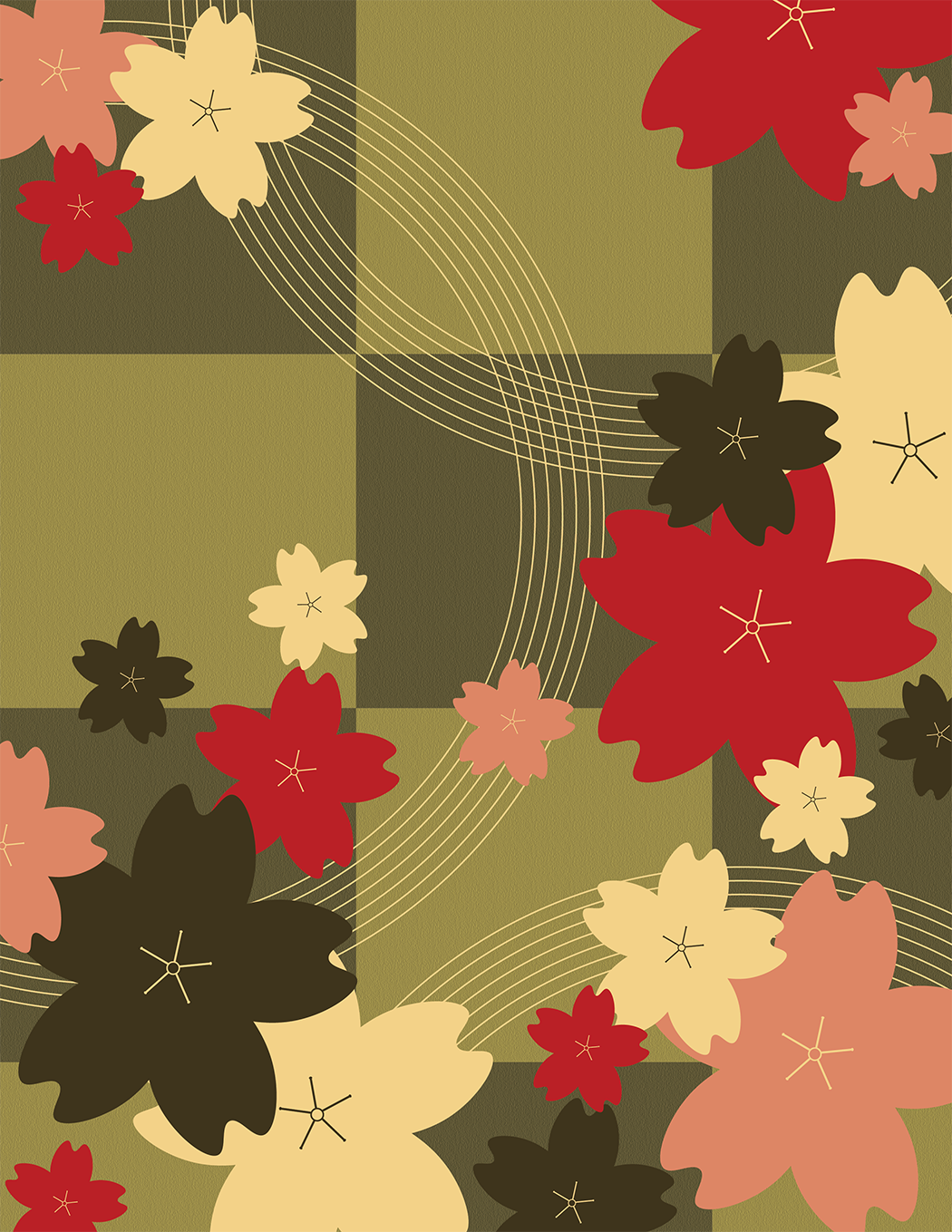 Emiko Kawakubo | Iroha
Japanese aesthetics often emphasize restraint, while American design can be bold and expressive. How do you negotiate these sensibilities in your work?
Growing up spending part of my childhood in the United States, and continuing to travel there periodically, has been a real support in maintaining my expressive side. In Japan, there is often a strong emphasis on restraint, which I experience not just in aesthetics but in daily life. At the same time, this sense of subtlety has deepened my sensitivity. During my life in Japan, I would sometimes express myself in ways influenced by my experiences in America. The “surprise” or sense of wonder that others felt when encountering these expressions—not as criticism but as genuine amazement at something new—made me aware of how experiences across different cultures can resonate with people. This, in turn, encouraged me early on to explore how my sensibilities shaped by both countries could blend, and to embrace the challenge of experimentation. As a result, I feel that today I am able to naturally merge these influences in the mood, color, and atmosphere of my illustrations.
Your patterns and illustrations feel both decorative and conceptual. What usually comes first for you: an idea, an emotion, or a visual form?
For me, ideas usually come first. I spend time thinking about what I want to communicate and what concept I want to explore, whether by looking at designs, going for walks, or listening to music, allowing my thoughts to wander. At a certain point, a clear idea will suddenly emerge, and I start by making quick sketches. The colors are then determined while looking at these sketches, reflecting the vision I had in my mind. On the rare occasions when ideas don’t come easily—even after trying different approaches and letting a night pass—I begin by choosing colors or fonts first. Establishing these constraints can sometimes help the design expand naturally. Emotional impulses rarely guide my work directly, and even when they do, I tend to check myself by reflecting on the concept I am working around. That concept can be broad, like a season, or more specific, depending on the project.
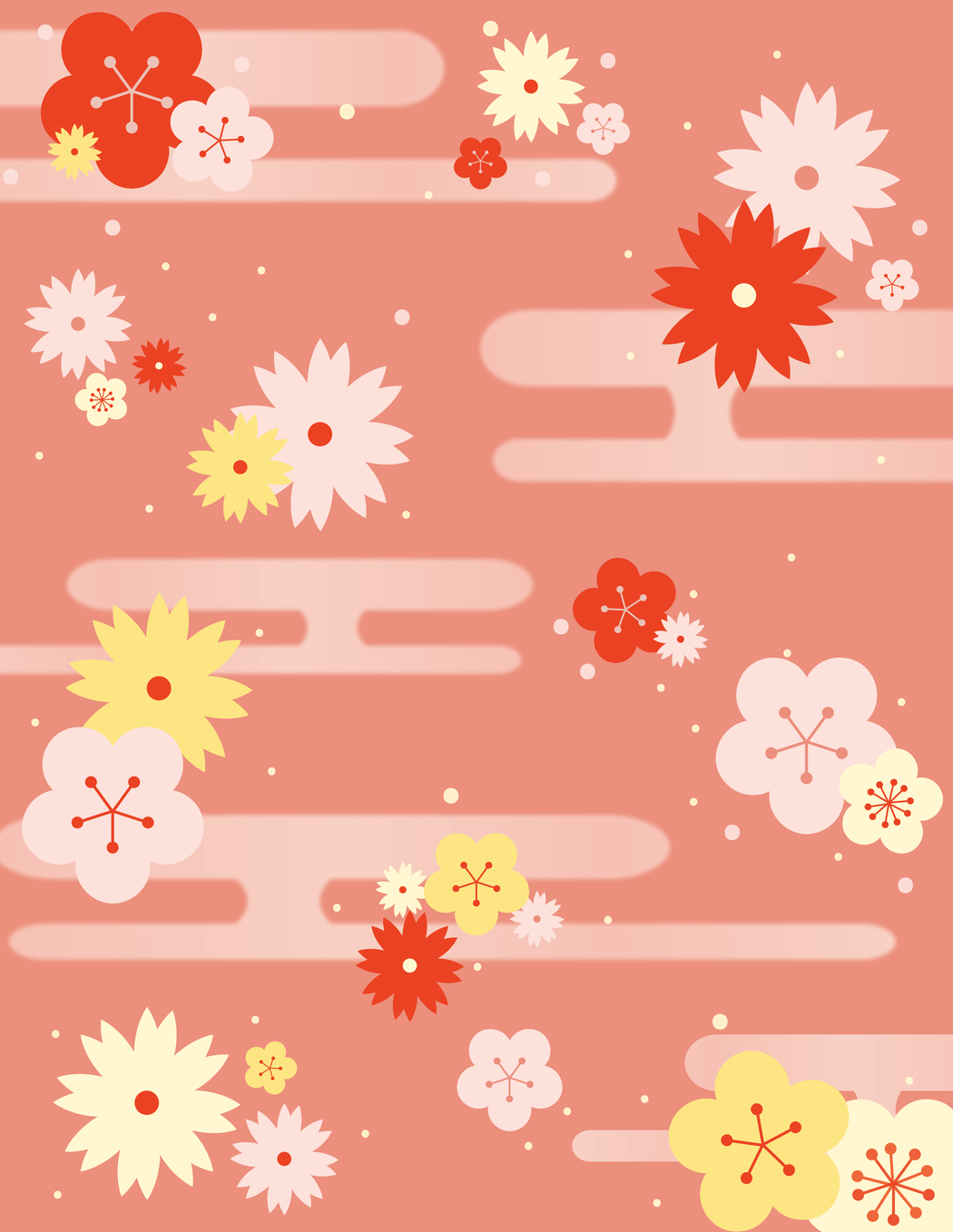 Emiko Kawakubo | Iroha
How do you approach storytelling in graphic design, especially when working on posters or campaigns for music and cultural events?
When working on posters and campaigns for music and cultural events with UMA (The Unprecedented
Music Association), I always start by understanding the clear concept behind each project. In this
2025–2026 season, I learned that each concert is themed around one of the five senses, so my goal is to explore designs that reflect those themes. We’ve already completed two concerts: “Visions,” which combined piano with visual experiences, involved collaborating with a visual artist. I listened to both the artist and UMA members to understand their vision, and then considered how I could translate the concept into design. For “Licks!” which focused on taste and the fusion of jazz with light food and drinks, I carefully listened to the member who created the menu to understand her intentions. Based on her input and the atmosphere UMA was imagining, I created a visual that evoked a retro bar where instruments from the jazz band seemed to float in the cocktails. While the concept is provided by UMA, the design itself is my own, and I approach it by immersing myself in their music and ideas to imagine how I would bring it to life visually.
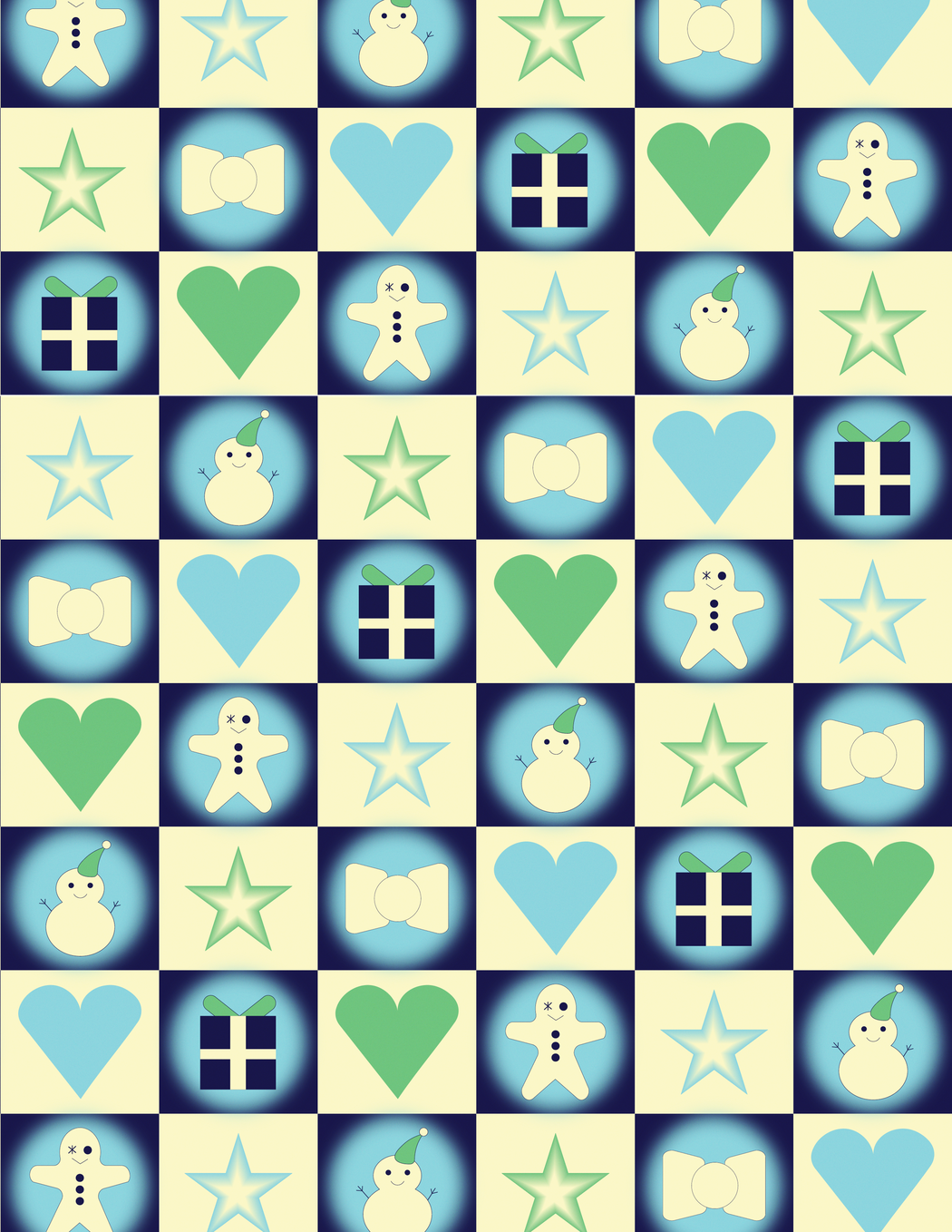 Emiko Kawakubo | Cozy Noel
Looking ahead, how do you envision your design practice evolving as you collaborate with global brands like Netflix or Disney?
If I were given the opportunity to collaborate with global brands such as Netflix or Disney, I believe the experience would offer far more than I have gained from my past challenges and learning so far. Being surrounded by highly skilled professionals would naturally lead me to reflect deeply on what my own design truly represents, and would encourage me to further refine my practice. I have often been described, by myself and by others, as someone driven by a strong desire to grow, and this motivation becomes especially strong when I am working alongside people whose skills inspire me. While the process would certainly involve new difficulties and longer, deeper paths of exploration, I believe those experiences would further cultivate my sensitivity, flexibility, and personal voice, ultimately shaping me into a more refined designer.
Leave a Reply
You must be logged in to post a comment.