Nadezhda Mursalimova
Your prints feature mesmerizing flows of color and form. Can you describe the process of creating these fluid patterns, from digital concept to finished fabric design?
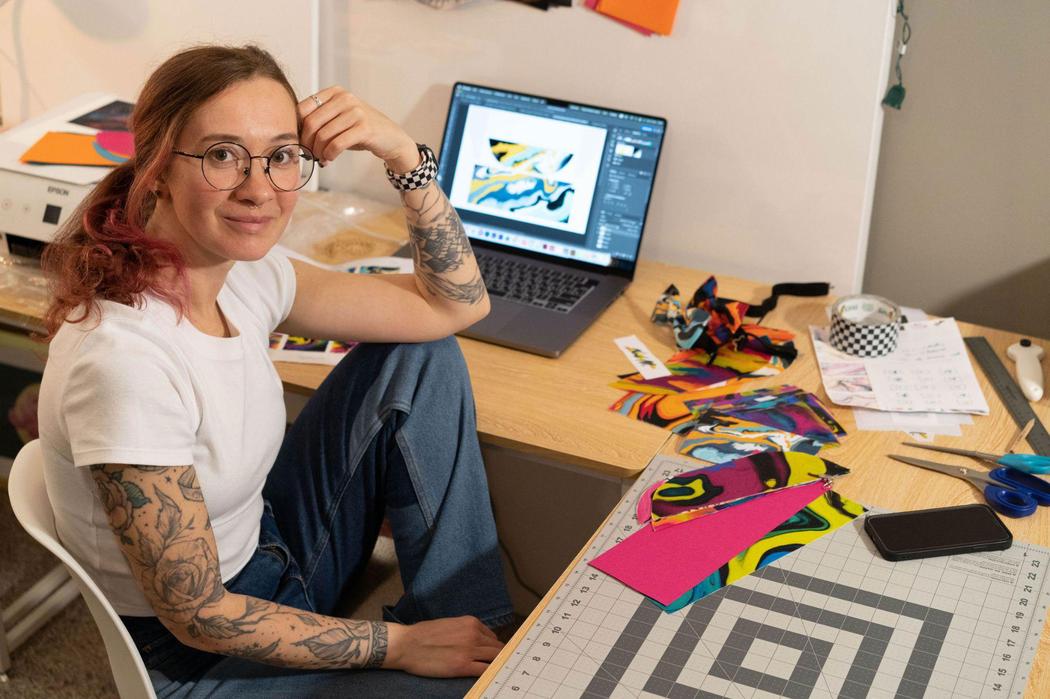
I sketch gesture-based strokes on a tablet, then refine structure and rhythm in Illustrator, building a half-drop repeat at 300 dpi. Color is managed with custom ICC profiles and verified on swatches before full-width roll printing. I sublimate onto 100% polyester sateen via calender press at ~200 °C for ~60 s, which locks dye into the fiber for a zero-hand finish. Afterward, I cut and sew with pattern-matched seams and edge finishing, so the print’s geometry reshapes on the body and completes the design.
How do you choose color palettes for your prints, and what emotions or associations do you aim to convey through them?
Color for me is a language of emotions. I often choose bold contrasts – pink with black, yellow with emerald – because they create rhythm and vitality. I build palettes from research notes and swatch studies, often pairing high-contrast complements (e.g., pink/black, yellow/emerald) to create visual cadence. Each hue has a functional role: structure, lift, rest. Palettes are defined in Pantone and checked for contrast and legibility across substrates, so the emotional intent, movement and transformation, survives from screen to fabric.
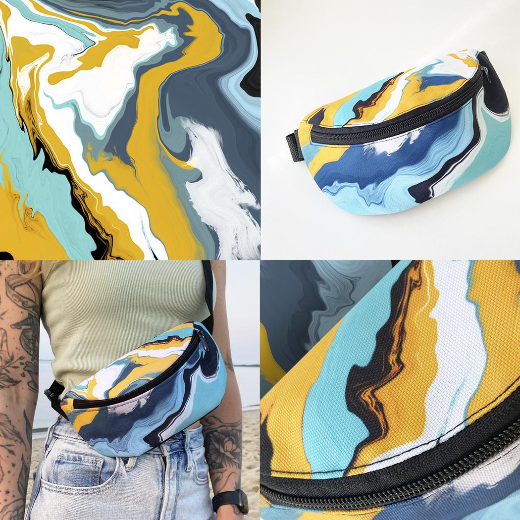 Nadezhda Mursalimova | Yellow Blue White
What first drew you to sublimation printing, and how do you see its possibilities compared to other textile-printing methods?
I use disperse-dye sublimation for its saturation, permanence, and unchanged hand. Because the dye bonds inside polyester, detail and gradients stay crisp through wear and washing. Versus reactive or pigment printing, it’s water-lean and excels at soft transitions; versus screen printing, it favors complexity over special-effect inks. The tradeoffs are real, primarily polyester substrates and light grounds, but for my visual language, sublimation is the most faithful translation of digital nuance to textile.
Swallow Blue combines design experimentation with scientific research. How do your academic studies in textile printing technologies influence the artistic side of your work?
My training in physics and print technology taught me how materials respond to temperature, pressure, and structure. This knowledge gives me freedom to push boundaries in color blending and pattern precision. Science brings discipline and accuracy, while art allows intuition and spontaneity. Swallow Blue exists exactly at that intersection, where research meets creative transformation.
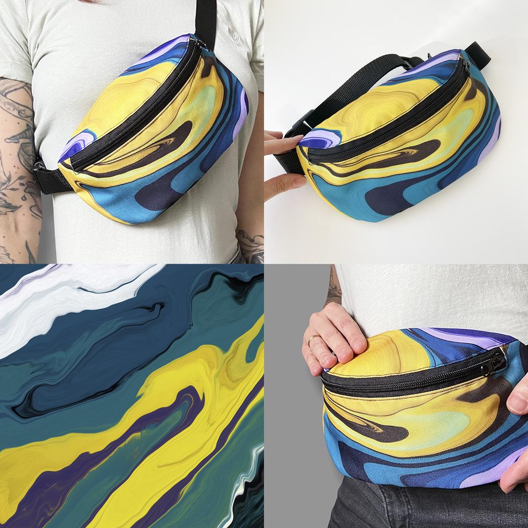 Nadezhda Mursalimova | Yellow Green
Your accessories, like bow ties and fanny packs, turn digital art into wearable objects. What inspired you to bring your prints into fashion and everyday life?
I wanted my work to step off the digital canvas and enter people’s lives. Accessories like bow ties and fanny packs are close to the body, visible, and personal. They turn abstract art into something intimate and expressive. In this way, everyday life itself becomes a gallery.
As a Russian-born artist now based in the U.S., how do your cultural experiences shape the aesthetic and conceptual aspects of your collections?
I carry a discipline of craft and ornament from Russia, attention to line, repetition, and structure, and combine it with the U.S. environment of cross-cultural mixing and risk. The collections balance those forces: motif logic and engineered detail alongside freer, improvisational color.
 Nadezhda Mursalimova | Motion
How do you balance working with both physical materials and purely digital media in your creative practice?
For me, digital and physical are not opposites but two stages of the same process. Digital media allows me to experiment endlessly, test scale, and refine details. Physical craft like printing, cutting, sewing brings unpredictability, tactility, and human touch. The dialogue between them is what makes my work complete.
Leave a Reply
You must be logged in to post a comment.