Yolanda Tian
You come from an artistic family – how did that early environment shape your sensitivity to aesthetics and visual storytelling?
Growing up in an artistic family definitely shaped the way I see the world. Creativity was just part of daily life. I was always surrounded by sketchbooks, paintings, and little experiments happening around the house. Because of that, I learned to pay attention to colors, shapes, and compositions, and the tiny details that often communicate more than words from a young age. What stayed with me most is the idea that visuals carry emotion and intention. What a piece made you feel is much more important than perfect techniques. Even when I’m designing complex digital systems, I’m always thinking about storytelling: what users should feel, how the interface guides them, and how to create clarity without losing warmth.
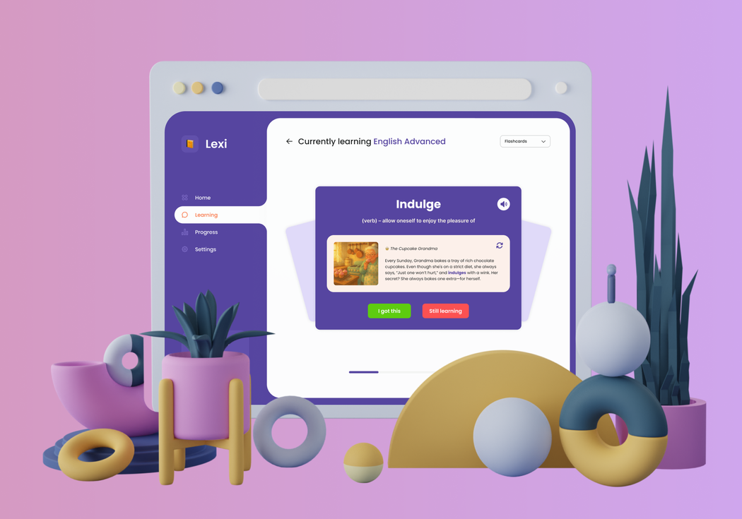 Yolanda Tian | Lexi
When did you realize that design, rather than traditional art, would become your creative path?
It clicked for me in high school. I joined a small graphic design club and took a UX/UI curriculum that introduced me to the idea of designing experiences rather than just visuals. For our final project, I collaborated with a friend who loved coding, and together we built a student-facing app for choosing elective classes. Looking back, the design wasn’t great. The screen layouts were not well-organized, and the design elements definitely weren’t elegant. But it was the first time I realized my work could actually solve someone’s problem and make their day easier. That sense of purpose felt really different from creating something just to be looked at. I still love art, but design gives impact. That’s when I knew this was the path I wanted to follow.
Your work often simplifies highly complex systems. What is your process for turning complexity into clarity?
My process always starts with listening. I want to understand users’ reality: what they’re trying to do, what slows them down, and what stresses them out. Then I map out the journey, process, and pain points before I even think about visuals. When you understand the system deeply, the priorities naturally emerge. That’s when clarity becomes possible. After that, it’s all about progressive disclosure: showing people what they need at the moment they need it, and hiding the rest without taking away access.
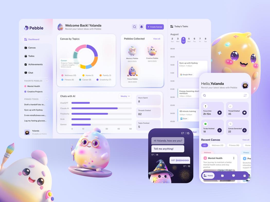 Yolanda Tian | Pebble
How do you balance functionality, accessibility, and visual expression in digital interfaces?
For me, those three aren’t opposites. They’re different layers of the same design intention. Functionality is the foundation: if it doesn’t work, nothing else matters. Accessibility is the responsibility. Design should serve everyone, not just people who fit a narrow profile. And visual expression is how you create personality, trust, and emotional resonance. I start with what users need to accomplish, then make sure every path is accessible, understandable, and able to recover from errors. Once that structure is solid, I layer in visual expression to bring delight and tone. When those three elements support each other, the interface becomes both practical and human-centered.
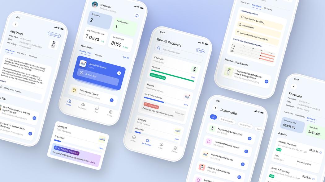 Yolanda Tian | Rx Ready
Several of your products integrate AI. What excites you most about AI-assisted interaction design?
What excites me most is how AI can speed up exploration. Instead of spending hours wiring together prototypes, I can describe an idea and instantly see a version of it. That lets teams validate concepts earlier and focus more energy on the nuanced parts of design. But what really interests me is how AI opens up new interaction patterns. We’re not just designing screens anymore. We’re designing collaborative experiences between humans and intelligent systems. At the same time, AI can’t replace the thoughtful, context-driven decisions designers make. It doesn’t know the constraints of a niche industry. And that’s why I think designers become even more important in the AI era. We’re the ones working with real users and shaping how these systems behave under real-life constraints.
What challenges do you face when designing for healthcare, where clarity and trust are essential?
The biggest challenge is trust building. People need to feel confident that what they’re seeing is accurate, complete, and trustworthy. Even small design details, such as tone, spacing, color, and the way information is grouped, can influence someone’s sense of safety. And healthcare workflows vary a lot depending on the role. A layout that makes perfect sense to a doctor can feel totally wrong to a nurse. That’s why user research is everything. My goal isn’t to create a “beautiful interface”. It’s to build something that actually supports real clinicians in stressful situations where everyone values time and efficiency.
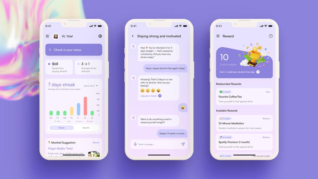 Yolanda Tian | Sip Control
You’ve won international design awards – what project feels most personally meaningful to you, and why?
The most meaningful projects to me are the ones where I got to see real users benefit, for example, the medication cost search tools I designed in 2024. Hearing users say things like, “This helped me finally afford my prescription,” or “I didn’t know I had cheaper options,” made me realize how design can directly impact someone’s health. Awards are motivating, but those moments of seeing a real person feel relief because of something I designed stay with me the longest. They remind me of why I chose this career in the first place.
Leave a Reply
You must be logged in to post a comment.