Brittany Ellis
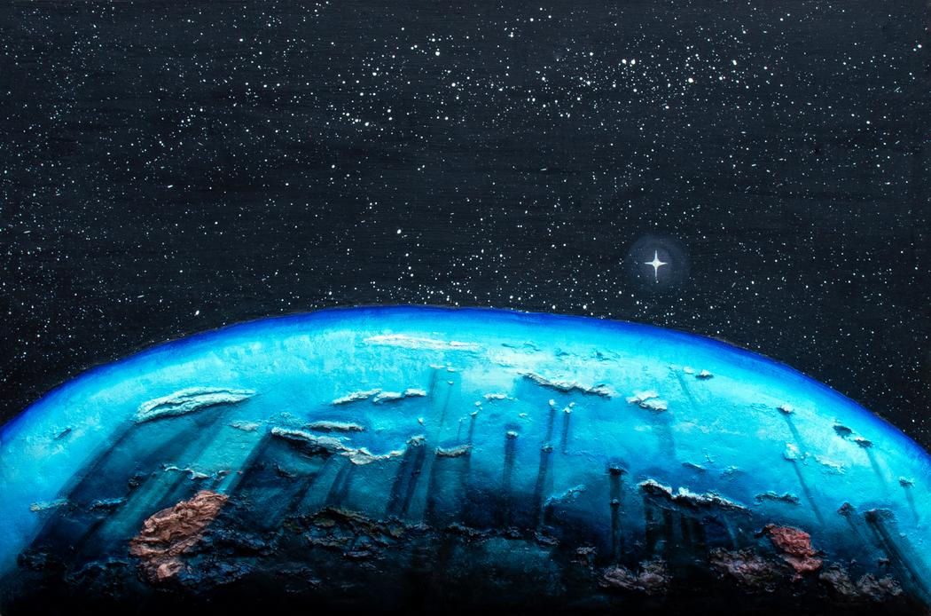 Brittany Ellis | Planet Earth
Your works often feature a sense of movement—whether through swirling clouds or drifting stars. How do you approach the concept of time and motion in your art?
Clear and opaque swirls are added to the backgrounds of my space and cloud narratives to represent motion and movement, rather than serving as a representation of time. In my junior year of college, I began studying the artworks of Van Gogh and experimenting with assemblage materials. I aspired to integrate his principles of movement, balance, and texture into my paintings, but in ways that translated to my compositions. The acrylic swirls pay homage to Van Gogh’s Starry Night, representing turbulent flow. The swirls are clear within the paintings to avoid overworking the complexity of the composition, while also revealing the layers beneath the surface.
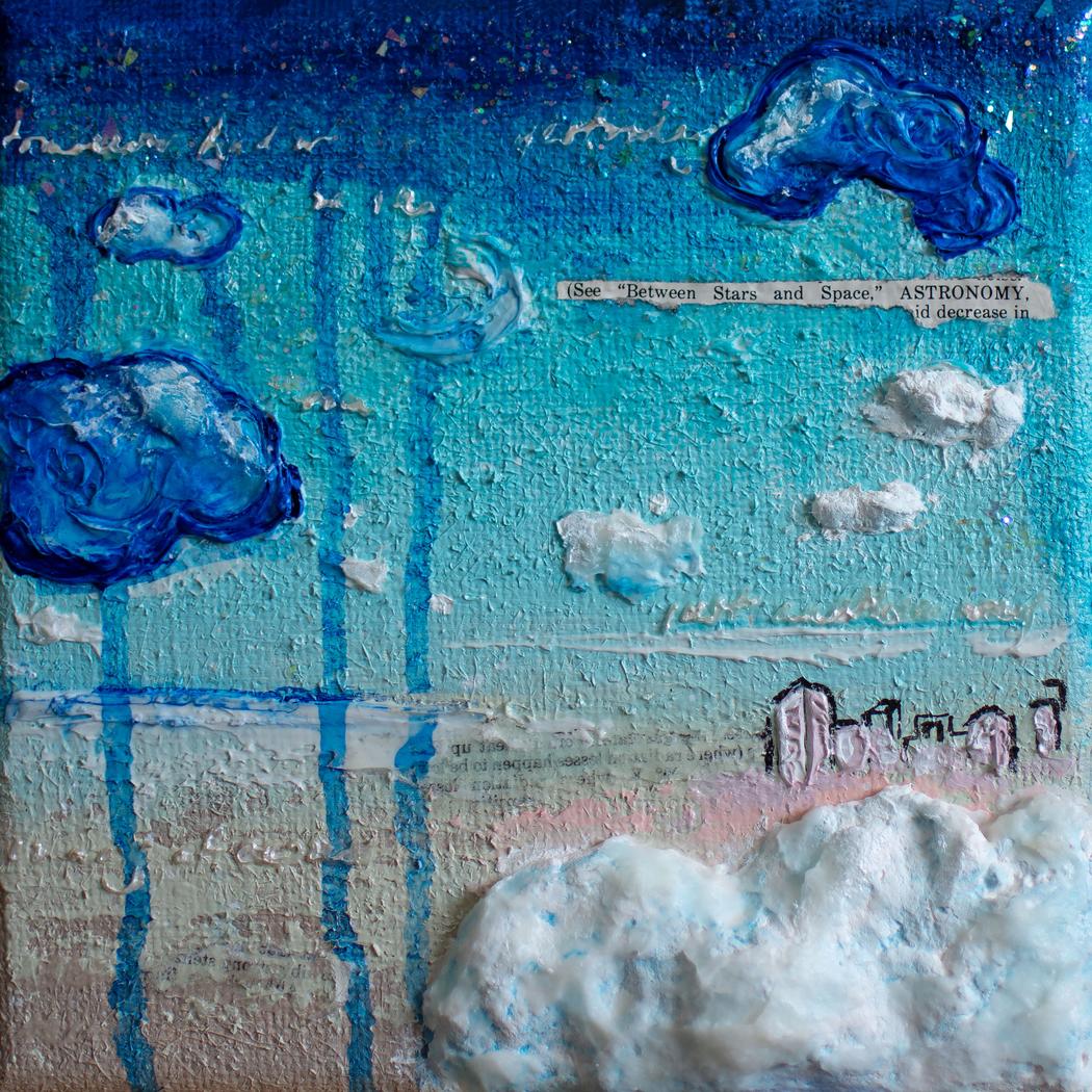
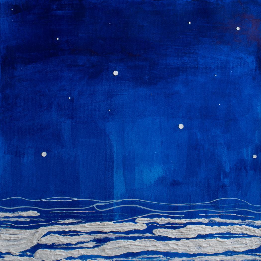 Brittany Ellis | Space Above The Clouds
You incorporate a variety of tactile materials—wood, paper, glitter, and paint. How do you choose which textures to use for a specific piece?
The textures I use vary based on the concept for each composition I’m creating. The artworks I create often possess the staple materials of acrylic, glitter paper, and a molding material such as clay or papier-mâché. After each artwork’s completion, I review the artwork and decide if it needs other materials that would enhance the artwork. I am very careful to review the artwork in the final stages to avoid overworking the art.
Many of your works feature books and pages as central motifs. What books or authors have personally inspired your artistic vision?
I would read many science-based textbooks when I was younger that sparked my love of science, which I began to meld with my love of art. As an adult, my artworks are inspired by instances, moments, or even objects I have seen that spark an idea for the compositions I create. The books I decide to paint in color are models after art books I possess, based on artists such as Helen Lundeberg, Van Gogh, and art history textbooks.
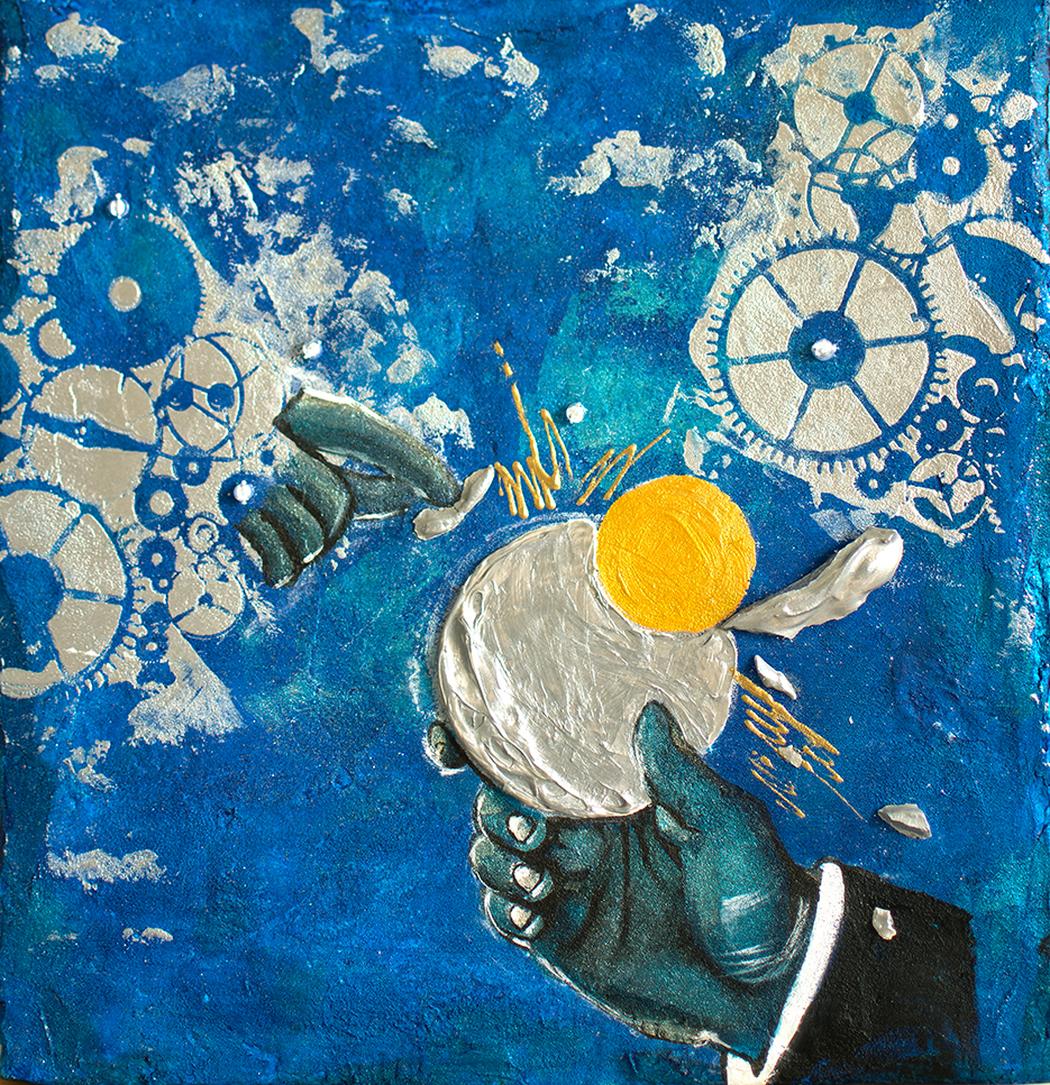 Brittany Ellis | In The Beginning
Can you describe a moment when an unexpected material or “mistake” transformed a piece for the better?
I’ve never made a mistake that transformed any of my works because usually the mistakes I’ve made are detrimental, being issues that can cause structural effects. There are always unexpected materials that I use that have become signature materials within the paintings I create. Celluclay from Activa products has become a staple material I began to use in the majority of my paintings. I became familiar with Celluclay in a mixed media course I took in college. At first, the material was hard to use until I began using it as a material enhancer to the sculpture forms, I began using. I first began using the material to strengthen structures I was creating, until I began experimenting with the material to form structures.
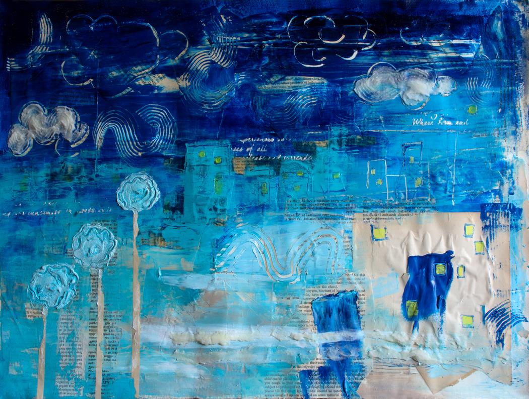 Brittany Ellis | Havana Summer Night
Some of your works include grids, charts, and numbers. Are these references to science, or do they carry symbolic meaning for you?
Using a grid is a reference to scientific elements as well as a representation of the viewer and daydreamer transitioning from reading to the realm of imagination, in addition to the vertical format of the artwork. Although the text at the bottom of the narratives is seen as an afterthought, they are still a feature that grounds the viewer within the narrative. Whether they begin to question why it’s there or notice the stark difference in texture to the smooth section of the canvas, the separation is there as a juxtaposition of the differences between the daydream and reality.
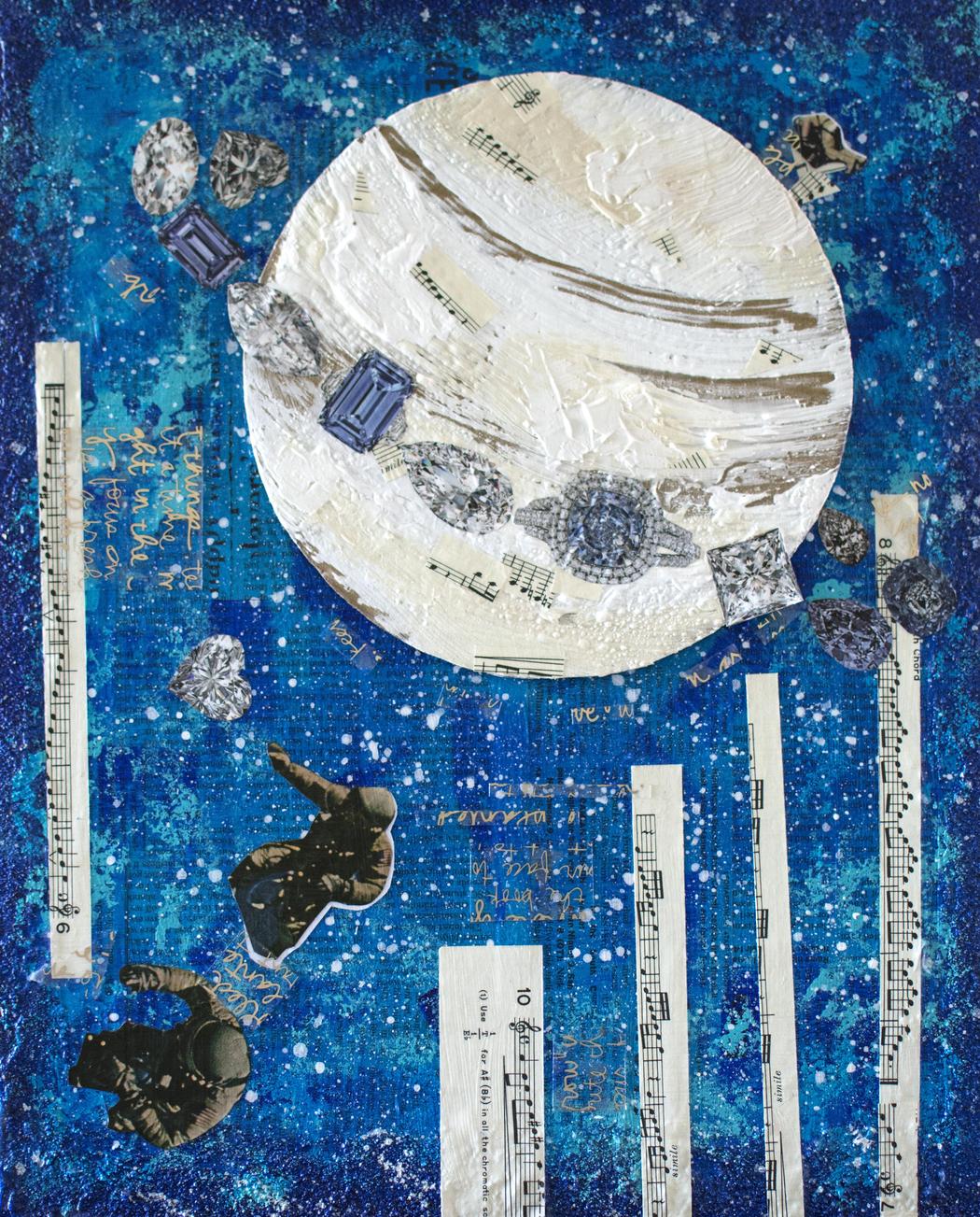 Brittany Ellis | Falling Saturn Rings
Your pieces feel both dreamlike and structured. How do you balance free expression with intentional composition?
Being artistically aware is how I balance expression with my intentional compositions. I’ve always been an aware artist who painted with feelings, which allowed me to know when to stop painting to avoid overworking them.
What role does color play in your storytelling, especially the frequent use of blues and silvers?
Phthalo blue is a prominent color that I use in almost all of the space-themed paintings I create. I experimented with various blue colors, such as ultramarine, cerulean, and cobalt, before I gravitated to Phthalo blue. I loved the versatility of the depth, the tone, and the color possessed from light applications vs dark applications. I wanted to express a realistic representation of space with some colors our eyes aren’t able to capture, being able to see only the visible light spectrum.
 Brittany Ellis | Between Space And Stars
You mentioned “transitioning from reality into the daydream state.” Are there any recurring symbols in your art that represent that moment of crossing over?
There aren’t any symbols that represent the transition; however, there are elements I incorporate to represent the stark distinction, such as the flat aspects of the painting vs the bold 3D elements. Books, being a 3D element that sparked the daydream, are a marker of reality, while the flat parts of the composition, such as the flat text and areas that lack texture, are not.
Leave a Reply
You must be logged in to post a comment.