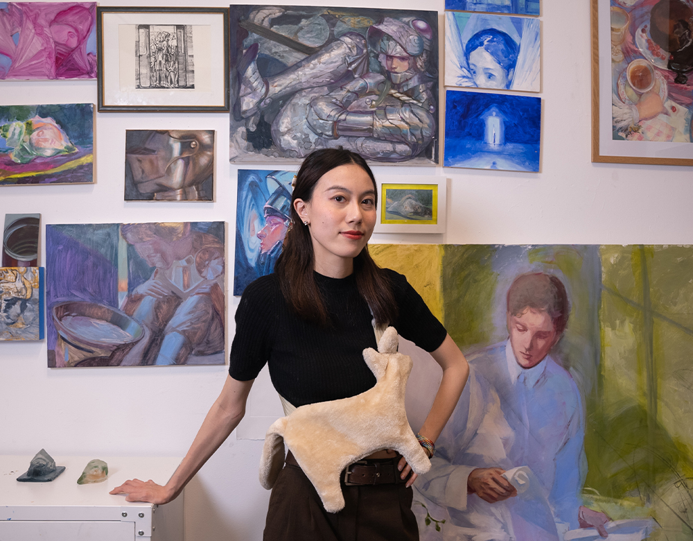
Theresia Zhang
Year of birth: 2000
Where do you live: New York City
Your education: Maryland Institute College of Art BFA 2023 in Illustration New York Academy of Art MFA 2025 in Painting
Describe your art in three words: Reverse-Chinoiserie, Hermaphroditic Emotional Imagination
Your discipline: Painter, writer, sculptor.
Website | Instagram
Can you tell us about your journey as an artist, from your early inspirations to studying at the Maryland Institute College of Art and your current work at the New York Academy of Art?
The only thing I was certain about as a lost high school kid was my love for beautiful things and figures (humans). So at first I applied to somewhere that I thought I could do fashion illustration. COVID hit half way through my first year at Parsons School of Design, and by that time I realized my focus is not dressing up dolls, but the stories these dolls might have—aka relationships that form society. This interest may have stemmed from all the comic books and illustrated literature I collected since childhood. So, in 2020, I transferred to the Maryland Institute College of Art which has a strong illustration program.
However, even within the illustration department, I was somewhat of an outlier. Due to my obsession with the Golden Age of Illustration from the late 19th to early 20th century, I almost exclusively painted digital illustrations with an oil painting finish. Later this desire escalated, and I picked up a real bristle brush. Narration has always been at the heart of my work—I paint literature and also write my own novels. So I took a narrative painting class in the painting department. My painting professor saw my assignments and recommended the New York Academy of Art as a potential graduate option. A small but prestigious school that hides in the heart of New York, and perhaps the only representative-focused contemporary art school in the United States. Thereafter I have never considered other graduate school options.
I had never related myself to a pure painting major and never imagined moving back to New York, and it turned out to be a great fit. Now I’m at NYAA preparing for my Master Thesis, and I’m painting my own voice interpreting knights and shiny armors.
Your work explores the delicate femininity within the traditionally masculine symbol of knights. What inspired this concept, and how do you balance these two opposing themes in your work?
Even though armor is often perceived as a soldier’s protection—designed specifically for men—many historical suits of armor actually look more feminine compared to the modern designs seen in video games and TV shows. Today, male characters are given bulky, rugged armor to emphasize their masculinity, while female characters are often stuck with bikini armor or, at the very least, breastplates with exaggerated metal curves. As a woman, I don’t even like wearing underwire bras—so I can’t imagine how uncomfortable that would be in battle.
However, if you visit a museum and examine real armor from the 1500s, you’ll notice a very different aesthetic. These historical suits often feature a pronounced upper body, rounded hips, and a narrow waist, accentuated by delicate etchings and decorative details radiating from the center where the torso meets the hips. Beneath all that, the armor still follows the shape of well-modeled male legs. To me, the way the waist is designed is reminiscent of a corset—it intentionally highlights the body’s curves.
Anyone could be hidden beneath these beautifully crafted shells, whether man or woman. The intricate decoration and delicate, almost feminine beauty of these armors did nothing to diminish a knight’s masculinity.
 Theresia Zhang | Hermaphroditus| 2025
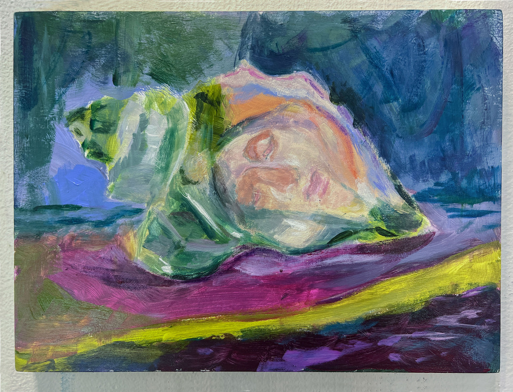
In your statement, you mention the metaphor of humans being like mollusks, enclosing soft interiors within hard shells. How do you see this idea reflected in the modern world and within your own artistic practice?
In my painting Pearlborne, I depict knights’ armor with a rough, oyster-shell-like finish. Humans are inherently vulnerable creatures, and we adopt different personas to blend into the herd—much like oysters shielding their delicate flesh. In this way, knights become both human and mollusk, embodying this duality in my work.
Knights are like walking oysters with two legs; beneath the polished sheen of metal lies a reflection of modern society, where beauty and strength serve as both armor and disguise. In essence, humans are no different from mollusks—we enclose our soft, fragile interiors within rigid exteriors, seeking protection from the world.
The symbolism of knights is central in your work. Could you elaborate on why you chose this figure and what it represents to you personally?
Painting knights in my work is both a recollection of my childhood growing up in Europe and a way to create an imaginative space—a journalistic ground on my canvas, where history, fantasy, and personal narrative intertwine.
I call myself Reversed-Chinoiserie—fetishizing the West through my Chinese lady eyes, observing Western aesthetics and mindsets objectively while expressing them subjectively. As a Gen-Z artist, my creative soil is the internet; I play too many games and read too many comics. What fascinates me most are works created by people who are not inherently part of the cultures they depict—recreational fantasies built on deep research and observation. Some of my all-time favorites include The Adventures of Tintin, The Good Earth by Pearl S. Buck, the Dark Souls series, Final Fantasy, and many Japanese and Chinese comics.
My obsession with knights originates from video games. Their character designs blend classical and bizarre elements, appealing to modern tastes while preserving the essence of knighthood as a symbol. This connection fuels my love for role-playing in games, allowing me to embody these figures in different ways.
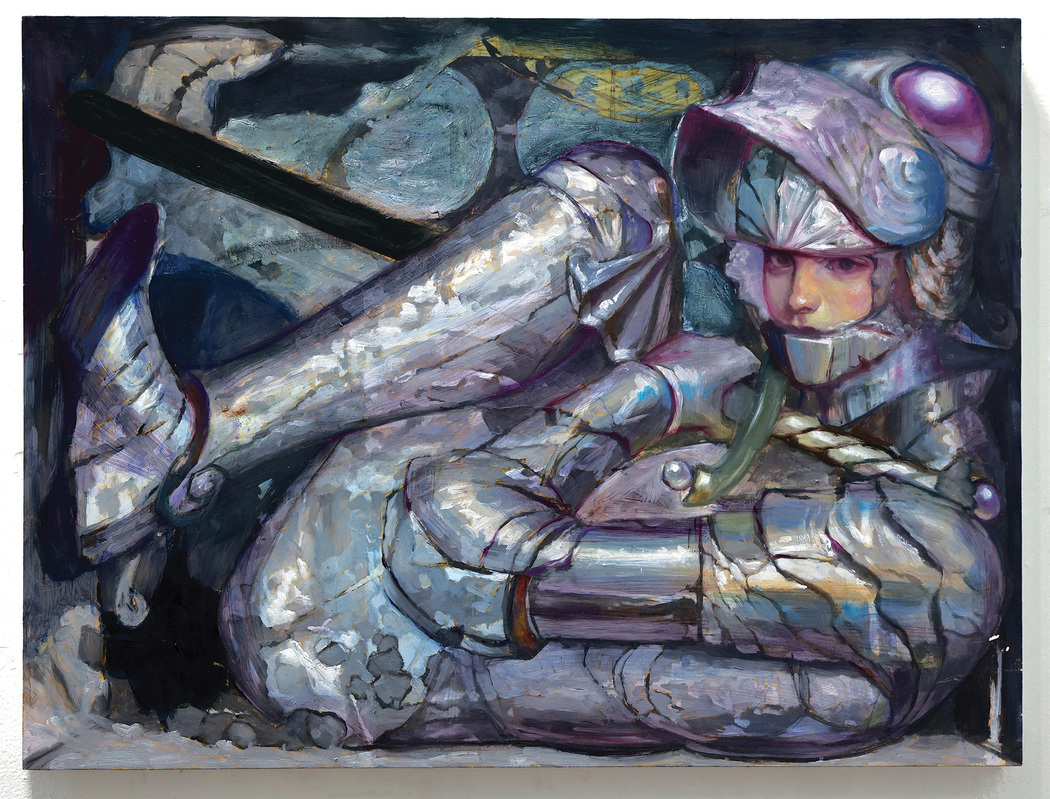 Theresia Zhang | Sinking Chivalry | 2025
You discuss the intersection of gender fluidity and societal allegories within fairy tales and mythology. How do you plan to explore these themes through your upcoming projects?
I merge these influences with literature. To me, the resonance people feel while reading novels is a fluidity of consciousness—one that transcends gender, class, and any real-world identity, allowing readers to connect with characters entirely different from themselves.
I plan to create a series based on Greek and Roman mythology, drawing inspiration from Metamorphoses by Ovid. With my signature dainty character designs and explosive colors, I aim to explore androgynous love and hate in a way that feels universal, using the beauty of my painting revealing these hidden emotions.
Your artistic practice includes the use of both oil paints and soft pastels. How do you decide which medium to use for a particular piece?
Actually, I don’t mind what medium I use. Oil, acrylic, and pastel are all the same as long as you know what finish looking you wanna achieve. It just depends on what I feel like playing with at the moment. Even my acrylic paintings often get mistaken for oils. That said, I wouldn’t use pastel for large pieces since it’s too delicate to ship, but when my intention is to highlight the freshness of pigment and mark-making, pastel is always my first choice.
Could you share how you integrate your academic background in illustration with your current studies in painting?
My background in illustration helps me simplify the process of creating intended visual qualities, and over the years, I have learned how to communicate with people through pictures to let my audience know exactly what I am trying to convey. The alluring beauty of my visuals attracts people and makes them spend an extra second stopping in front of my paintings—maybe they will think about the meanings behind them.
As an illustrator, I have to have the ability to execute a fully elaborate painting within a five-hour window to meet an emergency commission deadline. Now that I am painting for myself, this ability buys me more time for thinking and planning or altering parts later instead of wasting time struggling with form or shape. People say it looks like witchcraft watching me paint, but of course, that ability comes from a ton of practice over the years.
Painting allows a work to elaborate more on the deeper meaning behind visuals. The vagueness that illustration doesn’t tolerate becomes the soil for critical thinking since illustrations always have text alongside them to assist. My visual communication skills, sharpened in the illustration industry, help me aim at the target more accurately and efficiently.
Leave a Reply
You must be logged in to post a comment.