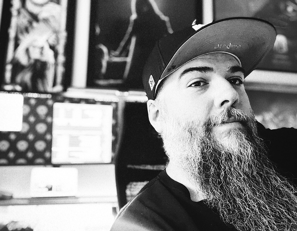
Josh Dunaway
Year of birth: 1983.
Where do you live: Northeast Alabama, United States.
Describe your art in three words: raw, visceral, gritty.
Your discipline: mixed media + digital collage.
Website | Instagram
Your work is a blend of analog textures and digital precision. Can you tell us more about how you balance these two mediums in your creative process?
The balance comes from seeing both mediums as tools that work together rather than as opposing forces. Analog textures — whether it’s paint splatters, concrete textures, or something more chaotic like distorted scans — all bring this unpredictability and rawness that I love. The digital side allows me to shape and manipulate those textures, and use them to destroy or “rough up” the pristine-pixels of digital photos and vector typography.
How has your background in graphic design, branding, and web development influenced your artistic practice and the way you approach art?
Design over the years has taught me how to be intentional with every element on a page. Branding has encouraged me to think about voice and identity, while web development has given me an appreciation for structure and interactivity. I feel like all of that shows up in my art, even when I’m working in a more expressive or abstract/grunge style. There’s always a layer of strategy underneath the surface guiding the “chaos” in my work.
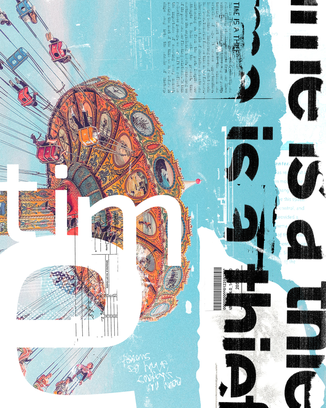 Josh Dunaway | Time Is A Thief | 2024
You embrace imperfection and individuality in your work. How do these values manifest in your designs and artworks?
Honestly, one of the main reasons I love grunge is because of the imperfections. All of us are flawed people, but we try to mask it and “put on our best face” for the world each new day. That’s exhausting. My artwork lets me break free from all of those constraints and, in a way, lets me lay bare my own imperfections for all to see. I also think there’s something beautiful about the marks and elements that can’t be replicated, like scratches, dripping paint, torn edges, distorted scans. I want my artwork to feel like it came from a real place, like it has fingerprints or a soul — not just “nice and neat” or striving for perfection. And whether I’m building a brand for a client or creating a collage, I always try my best to let some of that rawness come through however I can.
Your portfolio features grunge-inspired visuals and handmade typefaces. What draws you to these specific styles, and how do they reflect your personal artistic vision?
Grunge, to me, is the visual language of resistance. It pushes back against polish and conformity, and against what we’re supposed to be molded into to “fit in” with society. I’ve always been drawn to things that feel a little broken, a little loud, and a little “rough around the edges.” I just really enjoy creating things that feel like they’ve lived too, like they have their own history and a story to tell just from how they look.
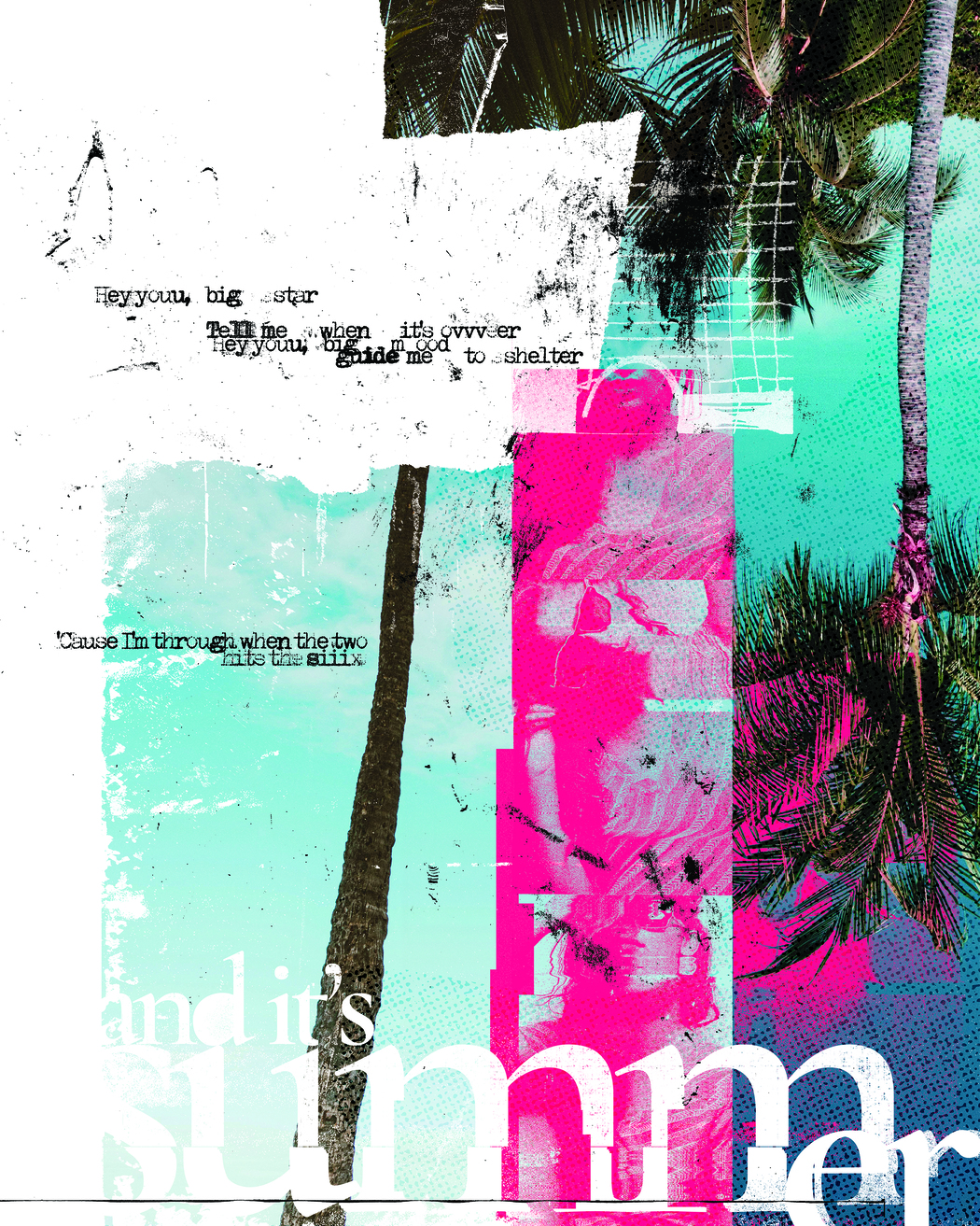 Josh Dunaway | My Own Summer | 2024
As someone with a long history in the creative industry, how have your influences and creative techniques evolved over the years?
Early on, I was obsessed with clean grids and minimalism because that’s what I thought “good design” had to be. Don’t get me wrong, there’s absolutely nothing wrong with that and I still love and admire minimalism. But as I matured in my work, I started gravitating toward the things that felt more visceral. I started experimenting with collage, hand-drawn type, and more experimental layouts. I still respect structure, but now I use it as a starting point — not a boundary. Over the years I’ve just learned to trust my instincts more and embrace the imperfections.
How do you approach storytelling in your visual work? Can you share a specific example where your art conveyed a powerful narrative?
For me, storytelling isn’t always linear. It’s about creating a feeling, a memory, or even sometimes a sense of unease.
One piece that stands out was part of a collage series I did last year. The whole series dealt with the passing of time. For this particular piece, I used layers of handwritten text, torn typography, and some vivid photography to remind people that time slips through our fingers even as life races towards the future — so try to always be present in the moment as much as you can. People connected to it in different ways, and I love when a piece gives just enough room for someone to find their own meaning inside it.
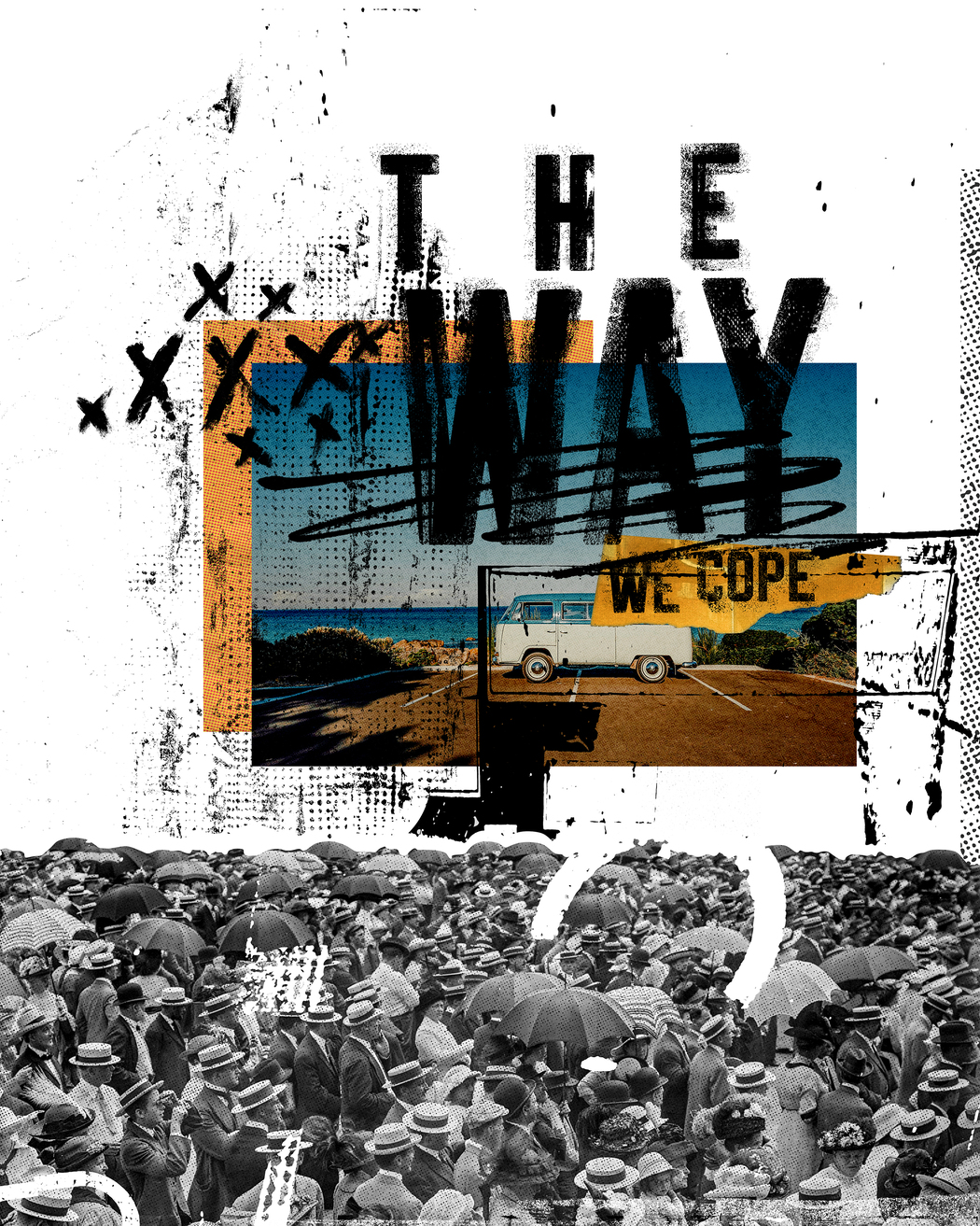 Josh Dunaway | The Way We Cope | 2024
Your work spans both print and digital mediums. Do you have a preference for one over the other, or do you find that both offer unique opportunities for expression?
Well, they each bring something different to the table. Print has this permanence to it. It’s tangible, textural, and has weight. On the other hand, digital lets me create a bit faster and explore some techniques I might not be able to accomplish off of the computer. I honestly don’t think I could ever pick one over the other, so I’ll likely always try to bridge the gap between them with the things I create.
Leave a Reply
You must be logged in to post a comment.