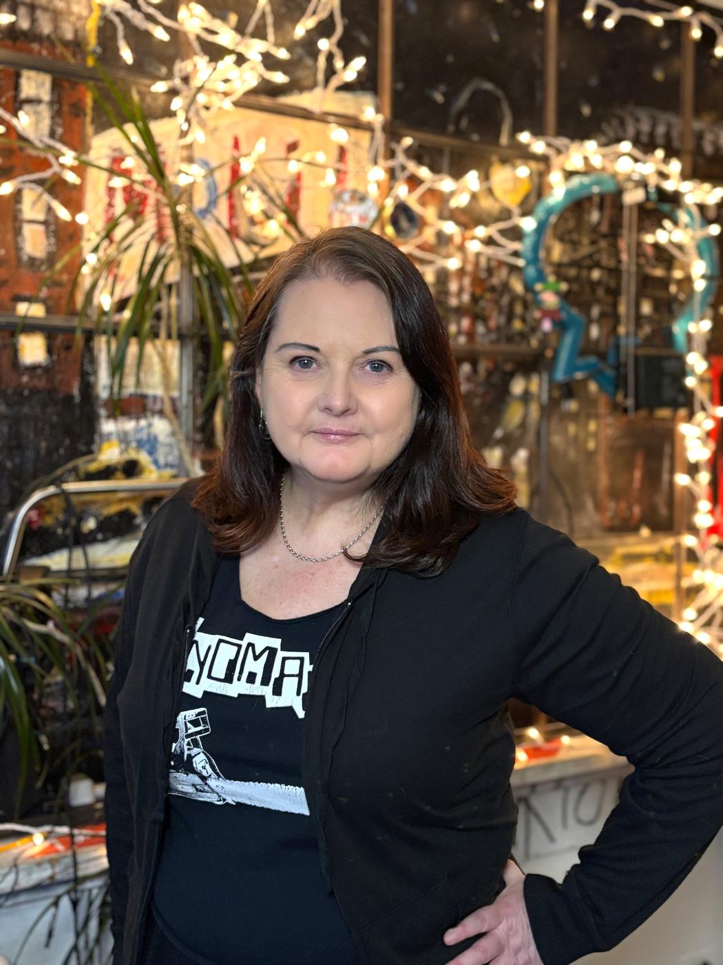
Karen Parry
Can you tell us about the story behind the name “Kaz and Kika”?
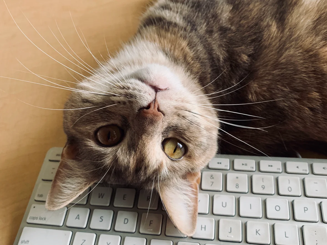
Kaz is my childhood nickname — it’s short for Karen — and Kika is my cat and studio sidekick. I made up her name and it’s short for “kitty kat”. She was rescued as a kitten in Brooklyn and has been by my side for 8 years now. The name Kaz and Kika just felt right!
How did your upbringing in Australia and your current life in New York influence your artistic style?
Growing up in Australia, you have big skies, bold color, and that intense, strong light — it trained my eye early on to really see color and contrast. The landscape there is so dramatic and full of texture, and that definitely shows up in my work. I’ve always loved living in large cities – I’ve lived in Sydney, London, Berlin among others – and now that I’m based in New York, there’s this whole other layer. The pace, energy, and graphic shapes of the place. I think my work blends those two worlds: the bright, sun-drenched vibe of Australia with the structure and rhythm of city life.
Your work is full of vibrant colors and energy—what draws you to this bold palette?
In Australia, everything is turned up a notch — the sun, the sky, the sea — nature is very bold there and so I always loved strong bright colors. I’m drawn to color that makes you feel something — joyful and happy mostly. I use it to create rhythm and movement, like a visual beat that runs through my patterns and illustrations.
What is your process for turning everyday objects into captivating art?
Often I decide on a theme to make a collection of art and patterns around and it’s all planned out from the start. But sometimes it starts with noticing something small — a shape, a shadow, a bit of texture or crumpled leaf on the sidewalk. I’m constantly collecting visual scraps on my phone’s camera. Once I have the idea or theme, I’ll sketch, doodle, or play around in my sketchbook or Procreate until something clicks. I often add a bit of fun too — taking the ordinary and letting it surprise.
Which of your recent works feels most personal to you, and why?
One of my most personal recent projects was creating artwork from a typeface that I had designed called Saison. I made Saison during the type design program at Cooper Union here in NYC a few years ago. It’s a revival and you can read more at https://www.karenparry.com/saison.html. I really loved the “S” in the original specimen and I always wanted to do something graphical using the font. So I created a collection called Letter Set and it felt like a full-circle moment — combining my love of type – I’ve been a graphic designer for over 35 years – with my visual storytelling in a way that felt really true to me. The artwork Sunny Day Blue, chosen for the Times Square showcase, is from this collection.
How do you approach designing for surface licensing versus creating purely for artistic expression?
When I’m creating just for myself, it’s all about exploration — following an idea or visual thread and seeing where it goes. I’m not thinking about where it’ll end up. It’s more instinctual, more about the joy of making. It’s usually just filling in pages of a sketchbook.
But when I’m designing for licensing, I shift into a more strategic mode. I’m still drawing from the same inspirations, but I’m thinking about how the artwork might live on products — how it repeats, how the colors translate across surfaces, what season or market it fits. It’s a mix of creativity and intention. I love both approaches — one fuels the other. When I have space to play, the licensed work ends up stronger, and when I have clear parameters, I get more inventive.
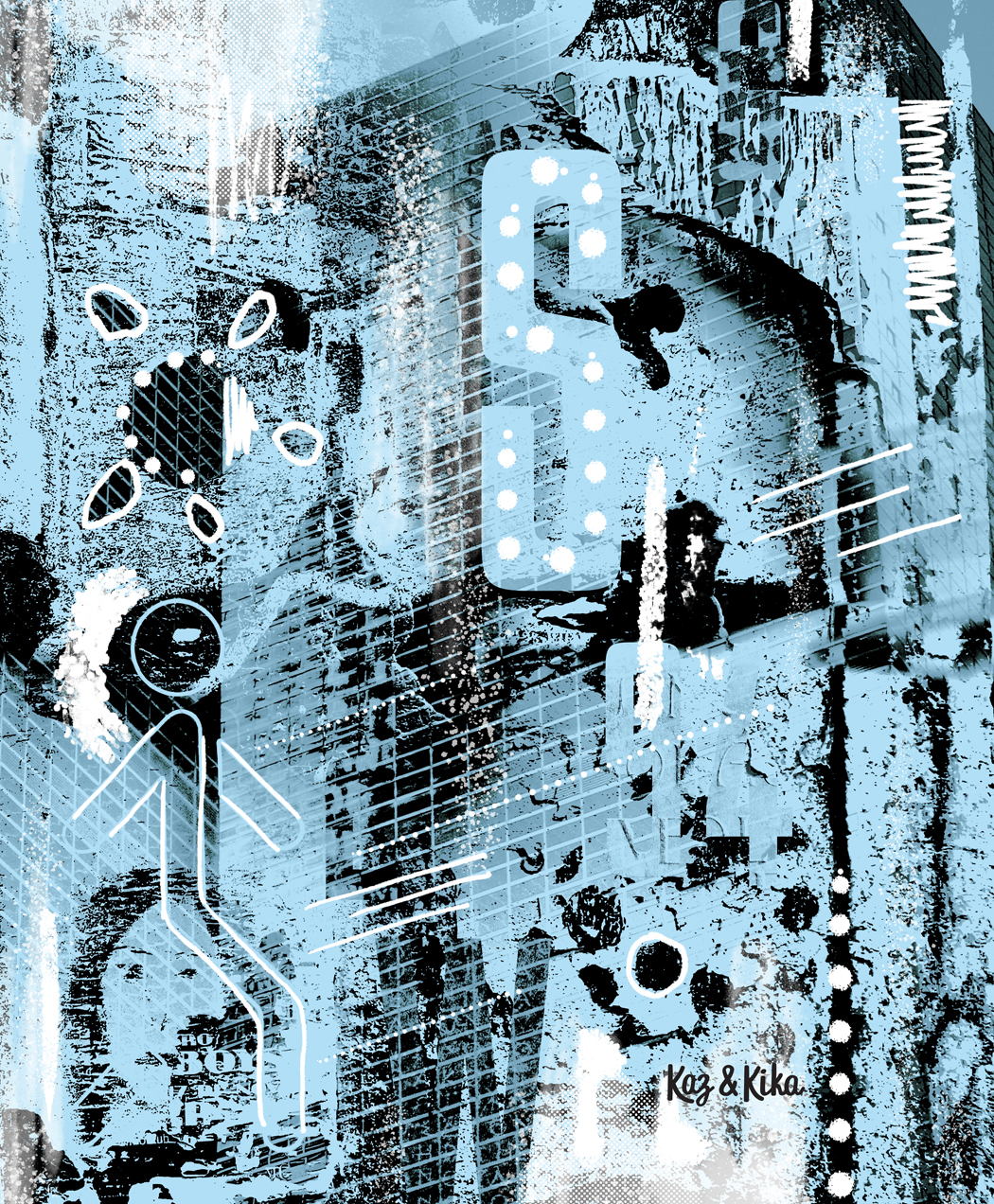 Karen Parry | Sunny Day Blue | 2025
Are there particular themes or motifs you find yourself returning to in your illustrations?
I always come back to bold shapes, rhythm, color and a sense of movement — whether I’m drawing fruit characters, sun motifs, animals or flowers. There’s usually a playful energy running through my work. Nature shows up a lot — but not in a hyper-realistic way. I’m drawn to organic forms, symmetry in chaos, and that tension between structure and spontaneity.
Leave a Reply
You must be logged in to post a comment.