Chelsea Ferguson
 Chelsea Ferguson | Watching Me | 2025
How did your background in advertising and marketing influence your transition into visual art?
Advertising is one of the most ubiquitous, and pervasive, forms of visual communication there is. Working in the industry for so long taught me how to master a specific kind of visual language, one that’s accessible given how familiar everyone is with it. Like it or not. Advertising is also about efficiency and effectiveness of messaging, which has greatly influenced my style.
In my current work I’m looking to do a lot, well, in one hardworking image. I’m using a lot of that same visual grammar I learned in Advertising to efficiently and effectively express myself, rather than communicate on behalf of a brand. I’d also like to think that beyond expressing myself, I’m working to advertise an idea, a concept. To market a point of view, in hopes that a viewer will recognize, understand, or connect with what I’m saying.
Your work often intersects with pop culture—what draws you to this subject matter, and how do you choose the references you include?
I like that pop culture, or the zeitgeist, creates a common language of shared references. And, it’s one thing to share an opinion or a feeling, but adding a metaphor or simile using this common language allows us to add depth and layers of meaning to that opinion or feeling. In everyday conversation I’m constantly quoting movies, songs, TV shows to color what I’m communicating. On a canvas, it adds an intimacy to the conversational feeling of my work.
I definitely prioritize references that reflect my unique point of view. And I love how doing so helps keep the memory of important and valuable cultural artifacts alive. I also choose references based on how well, and how quickly, they telegraph a sentiment. Though, I am not afraid to ask the viewer to work a bit harder to get the reference. After all, I am not trying to introduce so much as I am working to remind. There’s an expectation of familiarity that is also commentary on the references.
 Chelsea Ferguson | Wake Up Call | 2025
In your current series In Conversation, you use newsprint as a canvas. What does this material represent for you?
Newsprint is interesting to me for a lot of reasons: It’s a larger format – providing a lot of room to get an idea out. It reveals a lot about my process in the final result – crinkling and creasing from paint or glue. It decays – showing the passage of time earning more and more color. And there is a lot happening within the content itself – the news that has been printed. All of these things add a richness to the narrative I’m trying to construct and provide many levers to pull when it comes to making creative choices.
How do you balance personal expression with archival storytelling in your collages?
I’m not sure I feel the need to. I believe documenting my personal expression is archival storytelling. By responding to the moment, I am preserving it. Each of us, at any given moment, we’re having a truly unique experience of the world. I think that’s worth archiving in some form, because it will absolutely be worth looking back on for someone else. Even if just one person. Or a future scholar, or librarian.
You describe yourself as a memory keeper of Black popular culture. How does this archival role shape your creative process?
Black American culture is an incredibly high context culture. Even jokes have layers of meaning you often need multiple references to truly appreciate. With the internet, the speed of culture moves so fast, and there’s a feeling of “losing recipes” that is often voiced. For me, when once iconic cultural references fall out of vogue, that common language I work in is eroded. My feeling of responsibility in preserving that language informs a lot of the references I choose to use.
As an example: On TikTok I post videos of my process, often soundtracked by a song the news article may have called to mind for me. While reading one particular article I found myself singing aloud, “make me wanna holler, way they do my life…” from Marvin Gaye’s “Inner City Blues”, and made a print trying to communicate that heartbroken sentiment I was feeling. I don’t really care that I won’t benefit from trending audio in using that song for a post, but I do care that the song is remembered and remains part of our shared cultural language.
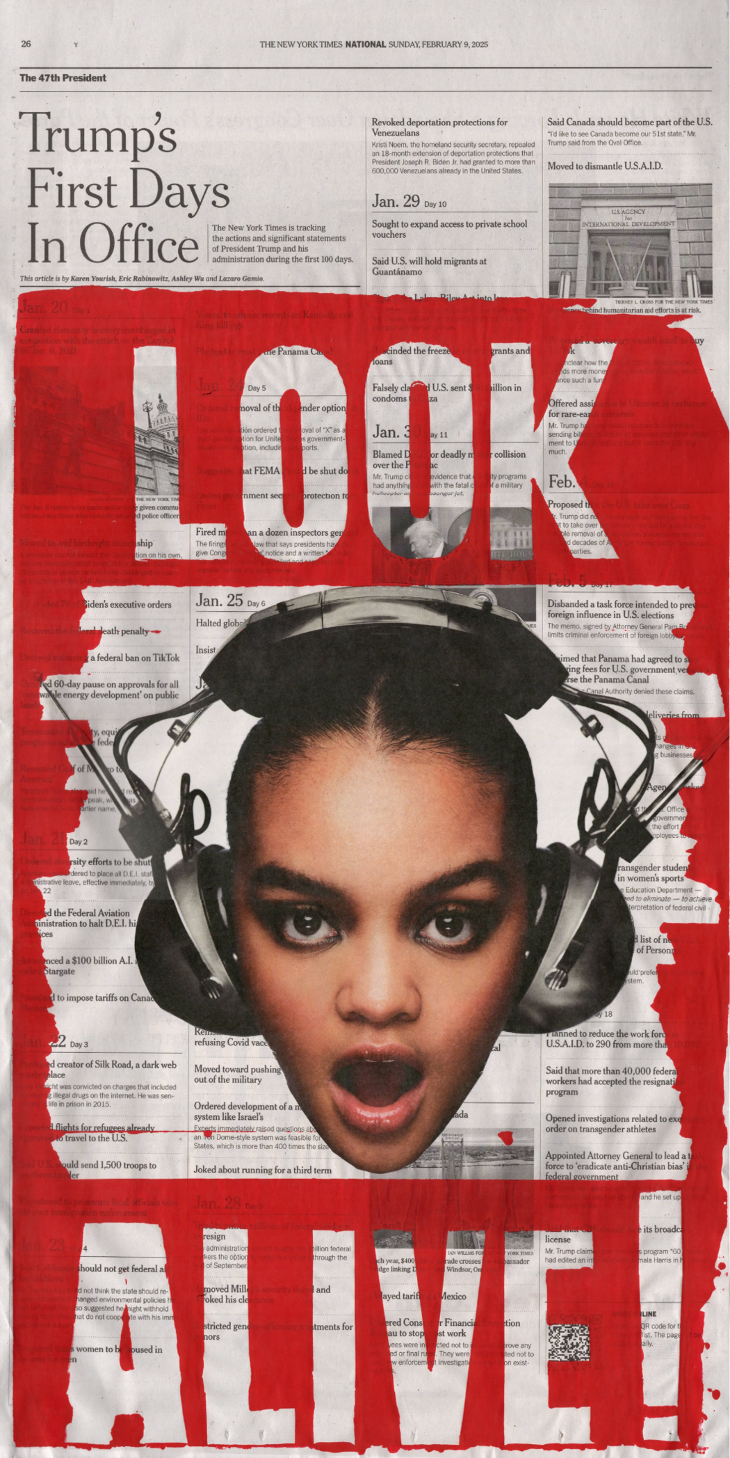 Chelsea Ferguson | Look Alive | 2025
Many of your pieces involve bold text and visual contrast—what role does typography and design play in your work?
Since each creative choice holds meaning, alone and also in relation to each of the other choices, I’m always looking for an opportunity to make a new choice. Whether it’s the color of the ink, the size or placement of the letters, texture, dimension. Playing with typography and design reveal more creative choices that not only layer meaning, but also create the space for me to express more accurately. To that end, I have begun experimenting more with drawing my own characters. Me creating my own typefaces is probably the natural next step.
What is the significance of juxtaposing pop culture imagery with political headlines or historic newsprint?
Using pop culture imagery on newsprint, with advertising grammar, is all about my need to deconstruct the world/culture around me (the irony in who we elevate to “celebrity”, the movies and shows we’re watching, the ads we’re seeing, what counts as “news”), reconstruct, and broadcast it in a way that feels most authentic to me.
The pages of The New York Times are a snapshot of history. And, if my work is about responding to the moment, what better canvas than where I am at once becoming informed of, and often viscerally reacting to, the moment. I’m using the visual language(s) I know to document what we’re living through. What I think, what my communities think. How we see ourselves.
Leave a Reply
You must be logged in to post a comment.